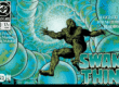
Standstill #1

Theron Couch
Recap
Meet Ryker Ruel, an enigmatic, lecherous, and clinically insane sociopath who is suddenly in possession of a top-secret device that can freeze time! Now, as the bodies of world leaders pile up, famous works of art go missing, and other strange crimes dominate the headlines, only the device's creator, a run-of-the-mill science geek, knows what's happening and sets out to stop Ryker's seemingly endless revenge tour. If you could stop time, what wouldn't you do?
Review
Strange things happen in a biker bar, a diner, and an airplane. The thing they all have in common is receiving a visit from a darkly eccentric, antagonistic young man. And he has a big question in Standstill #1: “If you could stop time, what wouldn’t you do?”
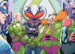
Ryker Ruel walks into a biker bar in Standstill #1. After flamboyantly ordering drinks the bar doesn’t have and antagonizing the bikers to the point where they pull guns on him, he seems to jump about the room. Then he is suddenly gone and one of the bikers is holding a bloody knife while all of his fellows lie dead at his feet. Ryker has a device that lets him stop time, and he’s on a vengeance tour.
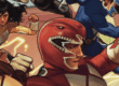
The exclusive use of two-page layouts is Standstill #1’s most striking quality. The first two pages give Ryker a grand entrance–he seems to race across the biker bar, from entrance to barstool. Continuing as it does through the entire issue, the two-page layout scheme speeds up the issue’s pace. Loughridge creates an “on the edge of your seat” urgency before the story really gets going.
These two-page layouts let Robinson lean into very cinematic feeling compositions. A pulled back “wide angle” in the biker bar sees Ryker sitting at the bar with almost the entire gang staring him down but doesn’t sacrifice detail in the process. Robinson is still able to communicate Ryker’s arrogant amusement and the bikers’ overflowing hostility because the extra space prevents his line work from getting lost.
That cinematic feeling allows for more energetic close-ups as well. Robinson is able to get close in on Ryker in profile as he is slammed against a wall while also showing the pulled back fist of a biker about to punch him in the face. It’s a high energy moment because the one panel sells the whole emotional beat, and this is something that is repeated throughout Standstill #1.
Two-page layouts definitely speed Standstill #1 along in the early pages, but the issue is engrossing largely due to the main character. It’s worth noting that Ryker goes unnamed in the issue. He is named only in the solicit copy. Whether or not this was a conscious choice on Loughridge’s part or an oversight is unclear. Ryker’s anonymity in the issue does work in a way. As a kind of avenging angel, the blank slate that is Ryker’s identity makes him feel like something more than the average person. Ultimately, his lack of a name is, for good or bad, very conspicuous.
Truthfully, though, it doesn’t really matter whether Ryker is identified by name or not. He’s a darkly funny character. His insistence on drinks that are unusual for the biker’s bar is antagonizing all by itself. Then Ryker launches into a discussion connecting bikers wearing leather to Marlon Brando being a method actor and how it is therefore more of a gay style choice. By the time the biker bar scene is over, before there is any exposition or suggestion of a plot, Ryker is fully engaging.
Loughridge uses softer hues for his varied color palette. The issue has some lift to it. Most noticeable, though, is how he highlights important characters in each scene. In the biker bar, the man holding the bloody knife after Ryker leaves stands almost in a spotlight. The waitress Ryker speaks to in the diner wears a blue green dress which is completely different from the surroundings. An airplane stewardess wears bright red. The color choices always give the reader a specific focus.
Tweedie’s lettering choices are understated. Standstill #1 isn’t particularly text heavy, and the two-page layout structure provides a lot of breathing room for Tweedie to work. But the panels are still full of detailed art. Tweedie does a good job organizing dialogue bubbles around it.
Final Thoughts
Loughridge is most well known for his strong coloring work. But as a writer he delivers an offbeat and compelling first issue that carries with it a lot of potential. And the design and art choices enhance its narrative strength. Standstill #1 is a great pickup for readers who like darkly funny stories.
Standstill #1: What Wouldn’t You Do?
- Writing - 9/109/10
- Storyline - 8.5/108.5/10
- Art - 9.5/109.5/10
- Color - 8/108/10
- Cover Art - 7.5/107.5/10