3W / 3M: Foundations #1

Jamison Nilsson
Recap
The following recap section was borrowed from the Dark Horse Comics official website (darkhorse.com): “Across a distant solar system and countless millennia-long cycles, a war has been fought between the forces of magic and science, and order and chaos. When astronaut and explorer Tajo Vallar undertakes a doomed expedition to a dormant moon full of mysteries, the conflict begins anew, and more dangerous than ever before!”
Review
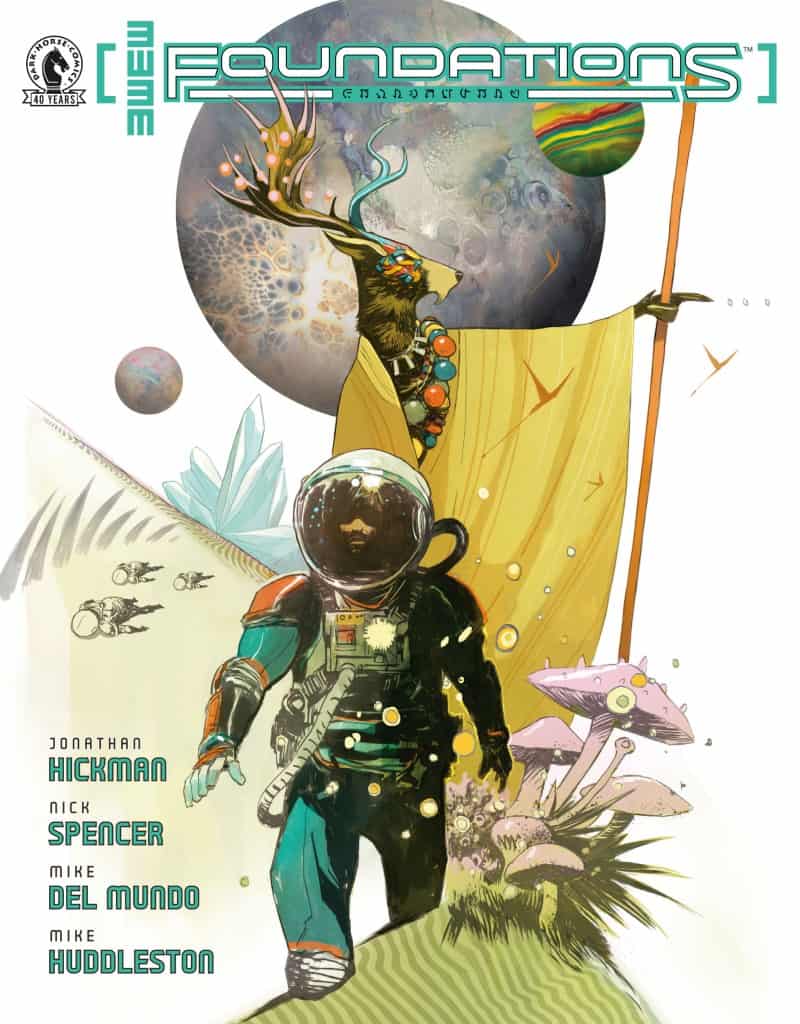
 What began as a new, originally all-digital comic book universe on Substack has finally come to physical print. Foundations #1 is the beginning of 3W / 3M’s connected comic book setting and the story of Tajo Vallar, an institute researcher.
Below I have split this review into sections based on the three stories told in Foundations #1.
Warning:
Spoilers for all three parts of Foundations #1 are included in this review.
“FABLE”:
FABLE acts as the readers’ introduction to Tajo Vallar, the protagonist of Foundations, and the setting of 3W / 3M.
The primary criticism I took from FABLE is that it is very heavy-handed in how it delivers information about the setting to the reader. The entire story is a bedtime story, or fable, that hints at an interesting larger narrative quite well but comes across like it’s talking down to the reader and giving them a workbook. Even the dialogue, such as Tajo’s child asking why he has to wear the suit and helmet on Kaoso, comes across as a lot of telling rather than showing.
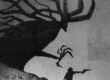
Aside from that, the narrative is packed across FABLE’s five pages and does set up Tajo and the literal Three Worlds and Three Moons quite well. Each of those worlds and moons immediately jump off the page, thanks in part to Huddleston’s incredible artwork, because they are introduced to us side by side as visually and narratively distinct locations. Of the worlds, there are the “motherworld” Akva and “fatherworld” Fayrii, and then the third world Therra, “from which come all myth and legend, and hopes and dreams.”
Mike Huddleston’s artwork on FABLE is beautiful. While they exude high-concept sci-fi ambiance, the five story pages have a unique look to them that is unlike most sci-fi comics on shelves right now. The color is all about the tone and shifts with the perspective of the individual panels. The line art is neat, and angled panels actually look like they are at an angle, which gives a sense of layering to the pages.
“RUINS”:
RUINS is much more of a blending of experienced artwork and subtle storytelling than FABLE, using character dialogue that reveals more about relationships than it does provide heavy expositional elements.
By opening with a speech addressed to his daughter, RUINS immediately contextualizes Tajo’s character and gives readers a way to empathize with him by providing both his motivation and the reason he hasn’t fulfilled it yet. His motivation is simple: everything he does, he does for his daughter. Tajo inhabits an imperfect setting, and thus nothing will ever be good enough for his daughter, who means more to him than even three worlds or three moons.
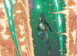
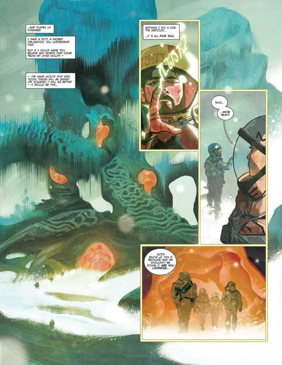
Mike del Mundo joins Mike Huddleston for RUINS, and it’s immediately noticeable from the opening page. The aesthetic is elevated to a painterly texture that forgoes comic book gutters for thin panel lines and lush background artworks that immerse the reader in the setting. The coloring has a natural grainy texture to it that enhances the “sci-fi expedition to a ruined planet” theme that the aptly named RUINS thrives on. The line art on individual pages, primarily in the above-mentioned backgrounds, is dense with fine details and contrasting elements such as soft flora and the hard faces of tired researchers.
“BREATHE”:
Despite being longer than the opening story of FABLE, BREATHE felt like the shortest read in Foundations #1. This is because the story has a literal breathless quality to it, relying on the artwork to tell a large portion of the story in the aftermath of RUINS. It’s a natural buildup and a satisfying conclusion to this one-shot that leaves readers with a sense of intrigue and enough questions to continue onward to the direct sequel “Academy” (currently only available via the 3W/3M app, Substack, or on MythicPowered.com).
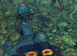
Jerome Opeña’s pen is supported by Matt Hollingsworth’s colors for BREATHE. The art is noticeably different from Huddleston’s and del Mundo’s but with a lot of cohesion to the visual direction and pacing between the panels. Standard comic book gutters return in BREATHE, but the artwork still dominates the page. The characters are drawn with an intricate precision to the line art and are carefully colored, making each one of them stand out from the wild and weird backgrounds, which Opeña also hides a handful of details in.
Final Thoughts
As a whole, Foundations #1 is an expansive and immersive opening to an epic three-world and three-moon spanning saga that pushes the sci-fi envelope as hard as it can. Every page quickly sparked new ideas in me as a reviewer, and there were a dozen or so things I wanted to but did not include in this review for the sake of brevity.
As a last thing to note, each copy of Foundations #1 includes a free 90-day trial of 3W / 3M’s MythicPowered.com, which carries all of their currently released comics in digital format. For that reason alone, the $7.99 price tag of Foundations #1 has a bit of extra value for readers to consider, as a monthly subscription to 3W / 3M is the same price itself, so readers are getting somewhat of a two-for-one here.
3W / 3M: Foundations #1: Upon an Epic Scale
- Writing - 9/109/10
- Storyline - 9.5/109.5/10
- Art - 9.5/109.5/10
- Color - 9.5/109.5/10
- Cover Art - 8/108/10