Absolute Wonder Woman #1

Dustin Gebel
Recap
EISNER WINNER KELLY THOMPSON AND BREAKOUT ARTIST HAYDEN SHERMAN REINVENT WONDER WOMAN FROM THE GROUND UP! Without the island paradise... without the sisterhood that shaped her... without a mission of peace... what's left is the Absolute Amazon!
Review
Reinventing mythology is more difficult than it seems at first glance, due to the sheer magnitude of what exists and has already been done. For as long as stories centered around the Greek pantheon have existed, variants to the stories have also occurred. The malleability of mythology is a double-edged sword, offering a vast canvas to which countless others have contributed. To take to it and conjure something that feels unique is a Sisyphean task that the creative team behind the newest addition to the Absolute Universe achieves.
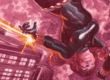
Absolute Wonder Woman #1 – written by Kelly Thompson with art by Hayden Sherman, colors from Jordie Bellaire, and lettering by Becca Carey – is a straightforward debut issue that splits between two moments in time. The first occurs in the present day as Wonder Woman makes her public debut in Gateway City, battling a giant upside-down pyramid spewing pterodactyl-like creatures called harbingers. Shifting back in time, the issue also shows the origins of this new interpretation of the character, who was raised by Circe. The two are in exile deep within hell, with the word Amazon itself stricken from the memories of reality by the gods.

Thompson’s scripting takes a spare approach to its storytelling, offering the most characterization and plot possible within the issue. As a result, it reads at a moving pace that immediately centers the character and reality of the world even as the audience learns more. The decision is a sharp contrast to Absolute Batman, the other debut in this burgeoning reality, which felt much denser in terms of world-building. Absolute Wonder Woman’s advantage is that it moves faster and clears the way for the ongoing story versus building out the central mysteries of an origin.
Much of that efficiency is a result of Sherman’s concise, expansive layouts for the issue. The artist makes full use of the page and space between panels, often creating staggering juxtapositions that feel like precise strikes against wasted space. By doing so, Sherman charts a path forward for the visual style of this book that somewhat evokes the aesthetics of the ancient Greeks while still offering a unique twist. These are not images or scenes that would adorn a vase or urn, instead taking the rough shape of that iconography and twisting it into something with a bit more edge.

That strong sense of reinvention and vaguely similar feeling feels in line with the narrative choice to scratch out the word Amazon for the majority of the issue. Carey’s lettering choice is a stark scribble of black that haunts the page and Diana alike, creating an almost violent sensation of something being taken. Diana’s people, history, and culture are removed not just from herself but seemingly from the world, and as a result, the lettering tries to claw the word back. When Diana remembers towards the end of the issue, it becomes a powerful moment that results in a shift that seemingly will be paid off in the next issue.
All of the book’s elements operate in that sense of thematic harmony as they work to establish this Diana and her history, with the coloring selling the darker aspects of the origin. The bloody reds seep everywhere in this issue, from Diana’s gear to the harbingers and even the atmosphere of hell. The hue sticks and infects every aspect of this book, making for a dynamic visual approach to the character often associated with peace and hope. Instead, rage, violence, and punishment hang over the issue and larger story unfolding, so the choice of primary color is a fitting one.

Sherman’s artwork is similarly suited for the establishment of that tone, operating with a layer of twisted anatomy and deliberate linework that expresses the harshness of the story. Even in the smoother elements like the bodies of Harbinger Prime, baby Diana’s face, and the radiant figure of the god Apollo, the additional details lend to the depth of texture throughout the issue. This is a harsh and unforgiving world, and even the moments of connection between Diana and Circe are not free of that influence. It’s an effective and subtle way to inform the audience of how this world operates, and what it costs to live within it.
Final Thoughts
Absolute Wonder Woman #1 is a gut-punch debut issue that transfigures the familiar beats of Wonder Woman (and Greek) Mythology. The final result is a story that feels rooted in tragedy versus triumph, from the artwork all the way through. Thompson’s script cleaves through pretense for a bared tale of arrival and heartache while Sherman’s pencils and compositions parry those ideas into reality. Rounded out by Bellaire’s vibrant, evocative colors and the raw lettering choices by Carey, the ideas and images of the debut issue will linger long past its last page.
Absolute Wonder Woman #1: Hell Hath No Fury…
- Writing - 10/1010/10
- Storyline - 10/1010/10
- Art - 10/1010/10
- Color - 10/1010/10
- Cover Art - 10/1010/10