


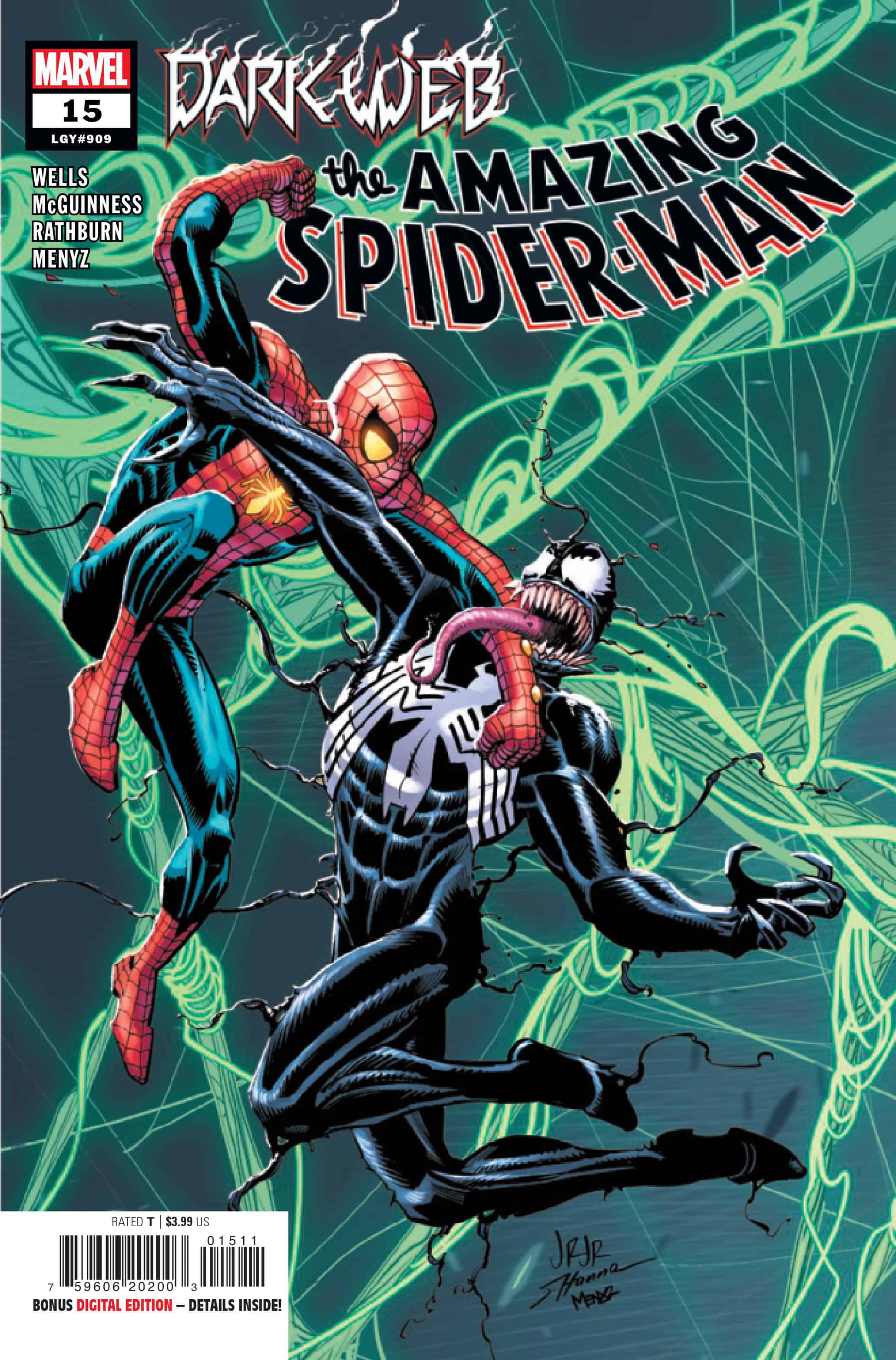
Amazing Spider-Man #15

Recap
Spider-Man VS. Venom! ‘Nuff Said? What is Chasm’s plan, and why is Venom helping him?
Review
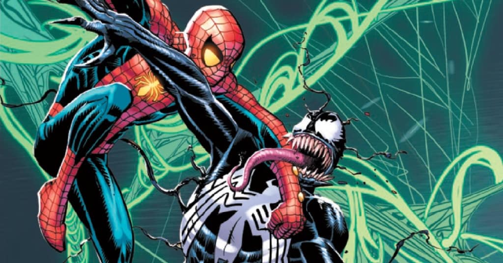
The Amazing Spider-Man #15 – written by Zeb Wells with pencils from Ed McGuinness, inks from Cliff Rathburn, colors by Marcio Menyz, and letters from VC’s Joe Caramagna – focuses on the fight between a regressed Venom and Spider-Man teased in the first issue of Dark Web, taking place right after this week’s Dark Web: X-Men #1. The issue opens with Venom, referring to themself as ‘Lethal Protector’, rescuing citizens from demonic strollers and other typical items.
After the cold open, Venom attacks Spider-Man and threatens to eat the hero’s brain. Meanwhile, Ben Reilly aka Chasm is jumping around the city in an attempt to gather resources for a spell or ritual, crossing paths with Norman Osborne/Gold Goblin (their fight seen in Dark Web), Ms. Marvel, and J. Johan Jameson. As Peter defeats Venom, Madelyne Pryor, the Goblin Queen, appears and collects the symbiote and its host right before Chasm returns to handle Spider-Man.
Well’s script for this issue highlights the issues with the overall Spider-Man run so far, in that it only tells half a story so that it can set up future issues. Moments like the visit to Jameson and the Bugle are seemingly irrelevant, offering no insight or crumbs that add to the larger plot. There are no notes about where the story is leading, but it feels so disjointed from the rest of the story and Chasm’s plans, it causes a stumbling in the reading of the issue.
The inherent structure of Dark Web is going to ensure that other events happen in non-ASM titles, but instead of feeling like natural divergent points, the referrals to the concurrently released Dark Web: X-Men and upcoming Dark Web: Ms. Marvel and Venom are disjointed. This issue can roughly be broken into the fight with Venom and the scattered scenes with Chasm. While the Venom plot is coherent and the bulk of the issue, the Chasm portions are set up and references that are well-illustrated editor notes rather than meaningful moments in the overall story.
The Venom plotline offers a glimmer of hope for this crossover, channeling a fun, quippy tone bolstered by dynamic art. Wells captures the flippant tone of a regressed Venom with massive try-hard energy, calling to the character’s roots and big-screen appearances. The battle is a nice refresher of Peter’s weakness to the symbiotes and allows for the wallcrawler to get creative in battling this physically changed version of the alien.
Sonics remain the only weakness of the symbiotes, having bypassed the fear of fire thanks to recent Marvel events. The art and lettering in this solution is a high mark of the issue, with the use of the tree’s screaming to completely overwhelm Venom. The moment channels what made books like Inferno so much fun, with the absurdity of demonic spirits inhabiting inanimate objects to creative effect.
The art of the issue is consistently solid, but some moments/panels are questionable. These rough patches are mostly hands, like when Madelyne is holding her new scythe. These moments are few and far between, but noticeable enough to warrant comment, as they take from the overall flow of the issue. They create an inconsistency that clashes with the bombastic flow of the issue. McGuinness is a master at dynamic, kinetic action sequences full of interesting perspectives. The issue opens with a webslinging Spider-Man, with a blurred cityscape behind it. The use of the blur effect creates the illusion of high-speed movement, which immediately sets a tone and momentum for the issue. This occurs through the fight with Venom, multiple Chasm check-ins, and the variety of demon attacks across the city.
Rathburn’s inks work in perfect tandem with McGuinness’s pencils, giving them thick, dark lines that give weight to this version of Venom and the resulting action. Not only does the inking imbue a bombastic sense to the symbiote, but it bolsters the design work of the demonic entities as well. The screaming trees, possessed Dean Koontz novels, and tentacled mailboxes are all taken with an aura of gravitas thanks to the darker inking choices from Rathburn in this story. McGuinness’s art can be cartoony at times, especially in series like Avengers and Batman/Superman, so it’s great that the inking here gives a layer of grounding to this story, even as it deals with these monstrous, fantastical elements.
Just like the inking, Menyz’s colors help to bring the issue together even as the story takes its tangents. The coloring creates an internal consistency for both this issue and the previous stories in the Amazing run thanks to Menyz’s work, even as regular artists John Romita Jr. and McGuinness are on opposite ends of the artist spectrum. The coloring matches the bombastic compositions and linework employed throughout the issue, utilizing a brighter palette and inkier blacks to sell the action.
The colors with Romita’s pencils are usually a bit flatter, but here the colors pop in every panel background and costuming decision. There’s a moment where Jonah is watching the city in chaos from above, and the shading for the background of the panel is a rich orange-red that evokes the shifting tone of this crossover versus the mainline book. It’s a small moment that represents Menyz’s shift in approach to the book and shows the skill of coloring to a specific artist’s style.
Like Menyz, series regular Carmagna and his lettering pops in the issue, delivering some great moments of SFX and dialogue. The moment with Johan is an excellent use of the word balloon taking the shape of the line, punctuating his declaration of Christmas being over. A similar technique is used whenever the demonic objects speak, like the baby stroller in the opening. Instead of using just a typical line of dialogue in larger font, Carmagna also shifts the coloring of the words and balloons to illustrate the influence of Limbo. Venom also gets inverse coloring from his lettering, and subtle changes in the font indicate the change in personality.
Final Thoughts
Amazing Spider-Man #15 is for better or worse a consistent representation of the series at large, blending a scattered story with mostly consistent art and great coloring and lettering. The issue, much like the previous 14 of this run, feels like it's only half interested in telling the story present and spends the other half looking ahead to other places to tell the rest of the story.
McGuinness and Rathburn’s art brings a bombastic energy to the issue that delivers on the fight between Spider-Man and Venom and the promise of weird demons attacking New York, but takes some missteps in character anatomy and physical details. The coloring from Menyz and lettering from Carmagna are the MVPs of the issue, working in new styles and techniques that level up the usual work seen on the title, matching the high energy of the story and art.
Amazing Spider-Man #15: Back in the 90s, There Was a Famous Symbiote
- Writing - 7/107/10
- Storyline - 7/107/10
- Art - 8/108/10
- Color - 10/1010/10
- Cover Art - 8/108/10