


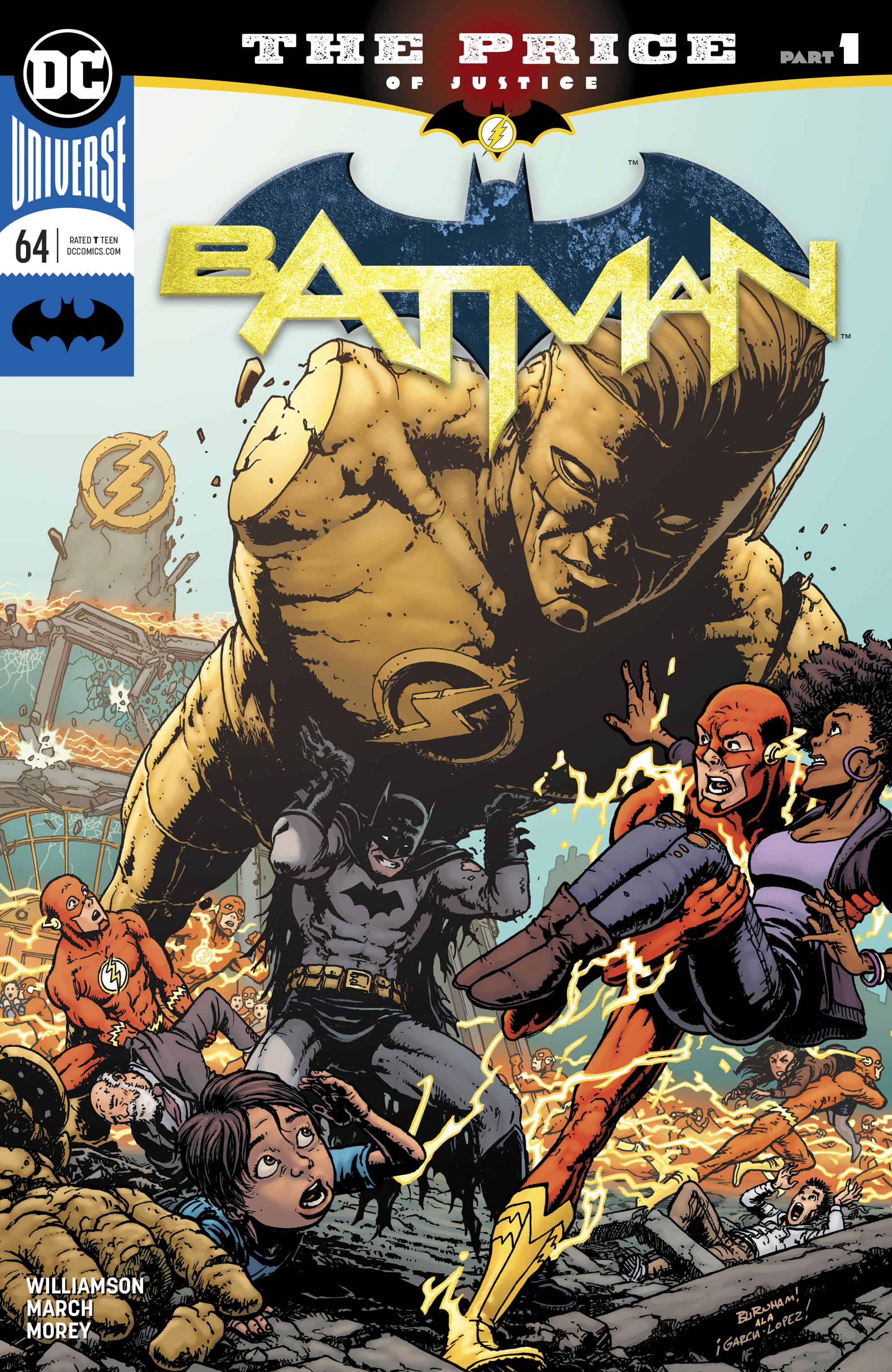
Batman #64

Recap
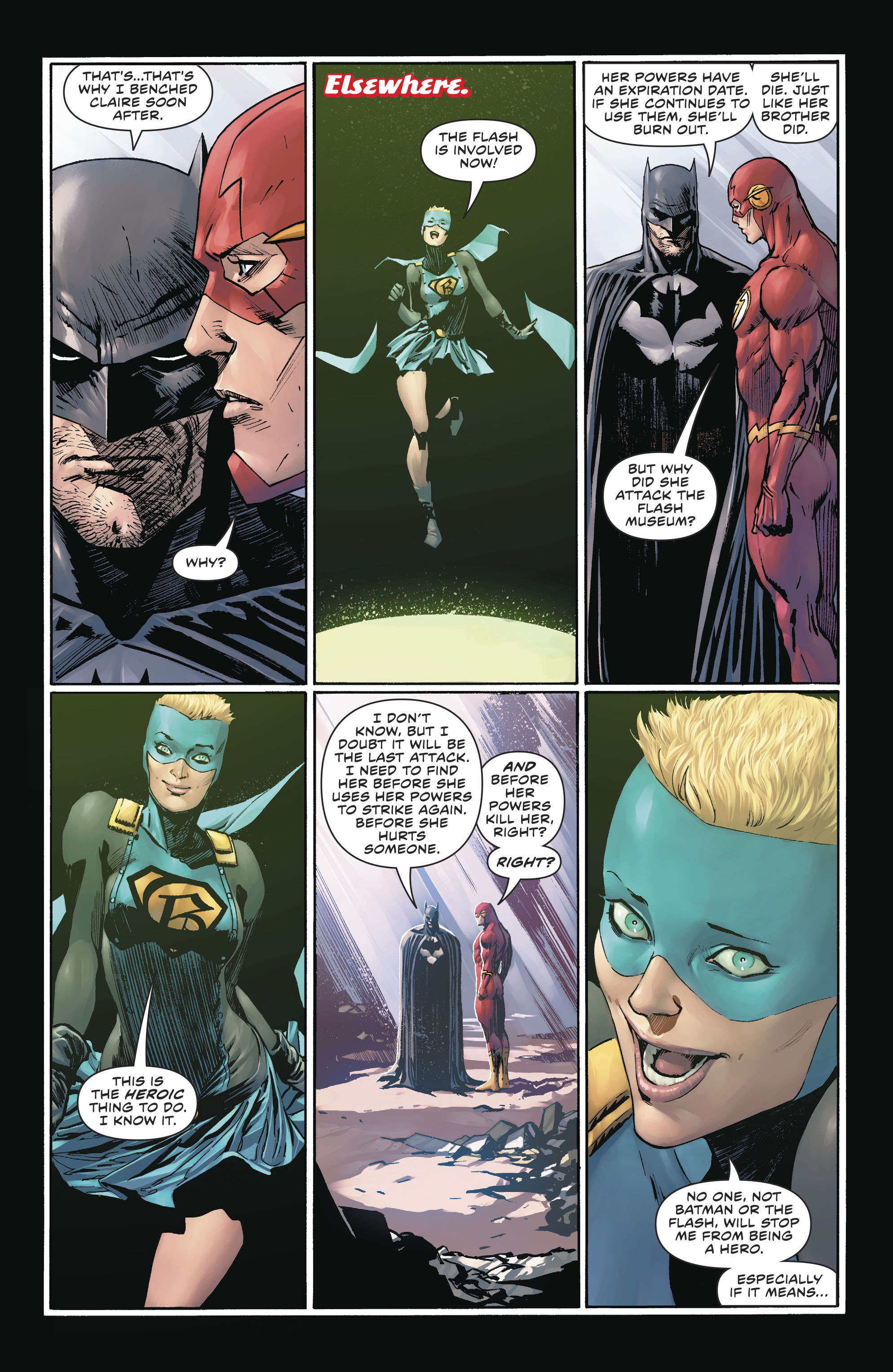
A dead body. An explosion. The Justice League. Something resembling a mystery. An incredible amount of text.
Review
I had a great deal of difficulty writing this review because so much is wrong with this issue that I had trouble deciding where to start. Do I begin with the uneven characterisation? The terrible dialogue? Do I initiate the review by breaking down the problems with the pacing, or the resulting incoherence of the plot? In the end, my husband suggested that I pick a point at random and start writing because it doesn’t really matter how I do it so long as I hit on every subject and make a note of the sole exception to the failure of this issue — the art.
I am happy to admit that a part of the reason that this issue struck such a sour chord for me is due to the fact that while Tom King is a consistently literary writer, Joshua Williamson is, at his best, a purveyor of Pulp. That’s not an insult. Pulp can be absolutely brilliant as a genre. But King had established an introspective, deeply psychological tone for the series which has been thrown, absolutely, out the window. And, in all honesty, the writing evidenced here is far from Williamson’s best work.
The pacing is terrible. This issue contains (or attempts to contain) about two books worth of story, and all of us is fed to us via long, rambling, extremely exposition-laden chunks of dialogue which (because they are so focused on delivering plot) all seem to share exactly the same voice no matter who is speaking it. Alfred should never sound like The Flash. His diction should be absolutely indistinguishable from anyone else’s because his history is unique to him. Everyone speaks like a refugee from the early-90’s EXTREME craze. Aside from a few oaths, Diana’s dialogue could be swapped with GL’s without producing a noticeable difference in the text, and that is a problem.
Basically, Williamson was in such a hurry to establish his take on the world of Gotham that all he managed to do was make every character sound exactly like a version of himself.
In writing workshops there is an extraordinarily basic tenant which is passed along so frequently that it verges on the cliché. Here it is: In fiction, you must Show, not Tell.
Good, experienced writers can sometimes turn this truism absolutely on its head, but doing so requires an awful lot of skill and practice. Know the rule. Practice the rule. Then you can effectively break it.
Is your character feeling doubt or dis-ease? Trust your artist to be able to show that through their body language and physical action. Trust your readers to be versed enough in the language of comics to be able to decipher the subtext you intended. This level of The is an insult to both readers and artist.
Guillem March deserved a much better script to work with, and it is a miracle that he managed to do so much good with the material he had. He tries to outline the pages into something coherent. He tries to use body language to add emotional impact and depth to a fountain of babbling dialogue. Looking at his work I felt a mixture of admiration and deep pity. I admire March for his constant professionalism. I pity him for the constraints he had to labor under here. Steve Wants, the letterer, had to deal with a similar problem: how could he force so much spew into the panels without totally obscuring March’s line-work? He managed it, for the most part. I do not envy him the stress he must have felt in the process.
It is my hope that Williamson will relax the hold he has on the reins a little in the next issue of this crossover and allow the story to unfold itself with something resembling the nuance of art, but I’m not holding my breath.
Final Thoughts
Incoherent dialogue, a rushed pace, and a flimsy plot cannot, it turns out, be redeemed by good line art.
Batman #64: A Star-Crossed Event
- Writing - 5/105/10
- Storyline - 5/105/10
- Art - 7.5/107.5/10
- Color - 8/108/10
- Cover Art - 8/108/10