


Break Out #1

Recap
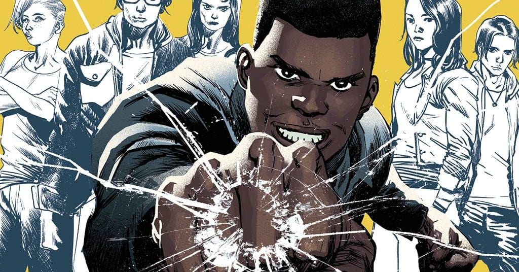
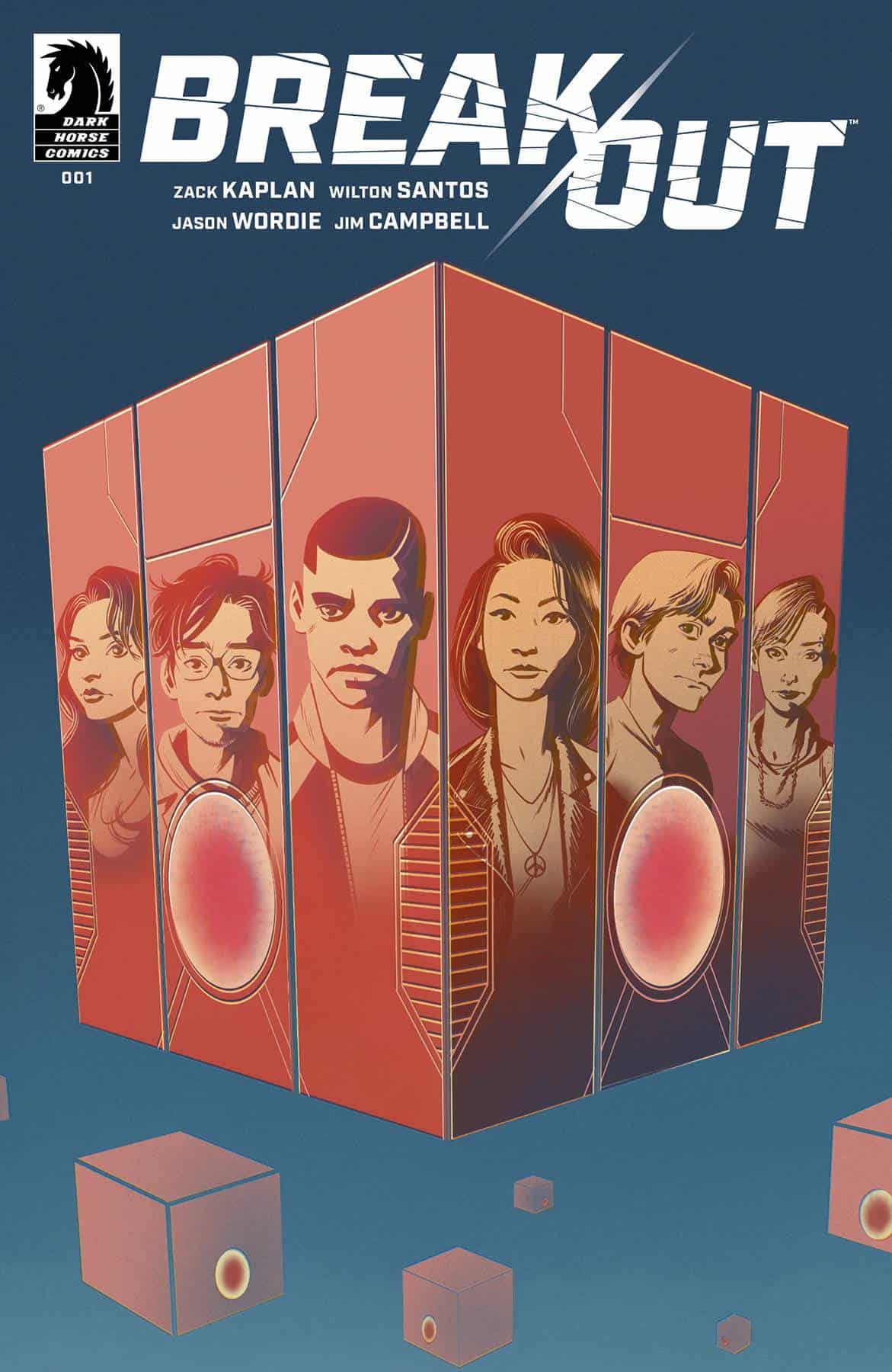
"When massive cube spaceships from another dimension materialize over our cities and routinely abduct teenagers to be held inside their mysterious floating prisons, Liam Watt's younger brother, Tommy, is taken. But while governments and adults across the world accept this loss as inevitable, Liam refuses to give up hope. Now, in a "take back our future" anthem, Liam assembles a skilled team of ordinary high school students to risk it all-but can they pull off the impossible and succeed in an out-of-this-world prison break?"
"Join the crew and unlock a sci-fi adventure like no other, written by rising comics star Zack Kaplan (Port of Earth, Join the Future), with kinetic art-buzzing with life-drawn by Wilton Santos (Excalibur, Dawn of X) and colored by Jason Wordie (God Country, Wasted Space)."
Review
Writing
Break Out #1 has the same hook as many “Young Adult” stories. Something is only happening to kids and they are the only ones that can stop it. In this particular incarnation some strange beings have come to our planet and began abducting young adults specifically 11-21 years old. No one knows why and what is happening to them. When high schooler Liam’s brother gets taken he decides to take action when no one else will.
Zack Kaplan delves into some interesting subtext in Break Out #1 with or post-pandemic world and kind of living within craziness happening and a “new normal”. That is probably more of the interesting part of the story is how all these different kids and people end up re-acting to this craziness that is happening. Kaplan plays with that idea well and pulls in a lot of real world stuff on how we as a people have recently re-acted to our own world events.
Basically though Break Out #1 is a Young Adult, Sci-fi, heist story. I am all for a good heist/get the team together story and this sci-fi setting definitely sets it apart from others, it does though the first issue is missing some type of “hook” or a point to get the reader invested in the story and characters. There is mystery of what these creatures are and what they are doing, but it never feels like “hey I want to know this” or has that gripping notion in the story. The characters are also missing some kind of connection, it seems to be missing that latching on point we need from the main character.
Nothing story wise is bad about Break Out #1 it just feels a little bland. Even with the sci-fi twist it needs a little something extra to get us to come “a long for the ride” in my opinion. I think the whole “get the team together” scenes could have been better. I am a sucker for those and it felt a little rushed. I wanted a little more info on those characters or just a sentence or two more explaining exactly why they are needed.
I feel myself more interested in how the characters and world is re-acting to these new beings than the actual heist and saving Liam’s brother. This on one hand is great as Kaplan captures that weird chaos and feel of a world experiencing something crazy and dealing with it incredibly well, but also not getting the reader invested in the actual story at the same time.
Art
I believe the art gives off that same vibe of just missing a little piece to grab the reader’s full attention. Wilton Santos is a talented artist and no one would look at Break Out #1 and say the art is bad. It is missing some fluidity and motion to me though. The characters and actions feel very stagnant. The emotions on the characters faces do not feel visceral or real. It is just missing that little extra “oomph” visually. Maybe some different panel angles or different viewing perspective for the reader would have helped for a more engaging visual experience.
There are two pages where Santos uses some cubes and rectangles outside of his page borders that do bring something different to the table. Those two pages that deal with the initial response to the invasion are extremely well done from a visual storytelling standpoint and are the highlight of Break Out #1. The character designs are also well done. Santos does a fantastic job of making the young adults look age appropriate and he has some wonderful character designs for them.
Jason Wordie also has some solid coloring work in Break Out #1; He does a wonderful job of balancing the light and darkness, giving a bit of grit to the story while still letting that hopeful youthful breakout through the issue.
Final Thoughts
Break Out #1 has a strong core but is missing something in the story/art to make it stand out. The story concept isn’t going to blow your hair back, but really no concept is, every story has been told it is more of “what you do with it” and the first issue does not offer us anything different or a hook to keep us engaged. It is missing some pizzazz in the art department and the story has yet to let us latch onto the characters. It is not a bad book but, it just needs a little something extra that hopefully the second issue will deliver.
Break Out #1: Youth of the Nation
- Writing - 6.5/106.5/10
- Storyline - 6.5/106.5/10
- Art - 7/107/10
- Color - 7.5/107.5/10
- Cover Art - 7/107/10