


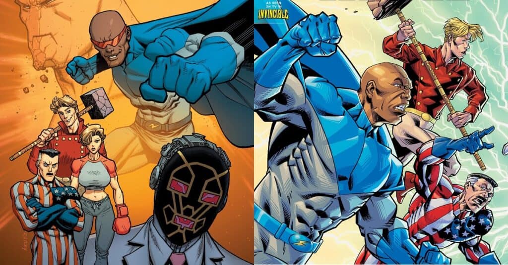
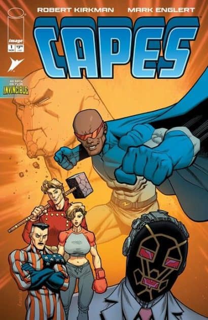
Capes #1

Recap
Originally released in 2003, Capes was a superhero comic series by Robert Kirkman that was later integrated into the growing Invincible universe in Invincible #8 and later with the Capes back-up stories starting from Invincible #28.
More Image Comics coverage from Comic Watch:
Transformers #26: Across Enemy Lines
Assorted Crisis Events #6: Faces of Stone That Watched From the Dark
Review
The year is 2003, and Robert Kirkman’s Invincible is just starting to hit its stride as an offbeat and openly raunchy superhero comic series. It would be years until the release and mainstream success of the Amazon original TV show, so Kirkman decides to capitalize on his growing success by releasing Capes, a superhero comic set in the same world as Invincible with a similar tone and original characters that are thinly disguised analogues to popular superheroes from Marvel and DC.
Now, in 2025, Kirkman is relaunching Capes with new art, dialogue, and additional stories on top of retelling the same story the title was first released with.
Mark Englert’s artwork is only a slight improvement 20+ years later and suffers from the artistic DNA of the original style, which itself screams Image Comics’ notorious ’90s style of overly dramatic and unoriginal superhero character designs. The characters are the best example of where the artwork falls short, with female characters that have obnoxiously large chests and male characters that look vaguely like conceptual sketches rather than finished designs. While action is easy to follow and crowds of characters manage not to blend together despite their lackluster costume design, the art is little more than a vehicle for a mediocre setup to a larger story.
Robert Kirkman as a storyteller is known for subverting tropes and deep character growth with believable motivations, but Capes is where he tries something outside of his comfort zone, and it ultimately falls flat. The characters that punch in at Capes Inc. are punching above their weight when it comes to superhero satire, which is what Capes #1 ends up feeling like. It’s as if the world of Capes is either so painfully self-aware that it’s trying to end its own misery with an excess of superhero-flavored minutiae, or the satirical and archetypal characters like the obnoxious “Commander Capitalism” or the sultry “Clare Voyant” are somehow being used as anything other than a punchline. Unfortunately, Image’s relaunch of the Capes comic feels more like a joke on the reader instead of feeling like a joke on the bloated superhero media industry.
One minor strength of the issue worth noting is the overall atmosphere and vibe created by Kirkman’s dialogue and Englert’s art. The atmosphere of Capes #1 feels like the world of a cop show from the ’80s, which for some fans could be its saving grace. Bringing out the blue-collar texture of old weekly crime series, Capes captures what one might expect from a superhero-for-hire corporate structure.
Fans of superhero satire come to these kinds of stories for deconstruction of theme and character arcs. Deconstruction that both makes fun of what makes comic book characters silly and also highlights what makes telling these kinds of stories worthwhile for both creators and readers. However, Capes #1 veers into trope and archetype, with the heart present in more successful satire stories.
Final Thoughts
Capes #1 by Kirkman and Englert is an irreverent and raunchy superhero series that falls just a bit short of the satire greats like its Invincible backdrop or The Boys. With characters that try something outside, it is hard to be overly offensive to evoke comedy, and art that feels outdated for the year and genre, Capes #1 is a misstep in what could have been a major expansion on Robert Kirkman’s Invincible universe.
Capes #1: Superhero Salaries
- Writing - 6.5/106.5/10
- Storyline - 7/107/10
- Art - 7/107/10
- Color - 7.5/107.5/10
- Cover Art - 7/107/10