


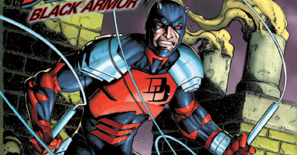
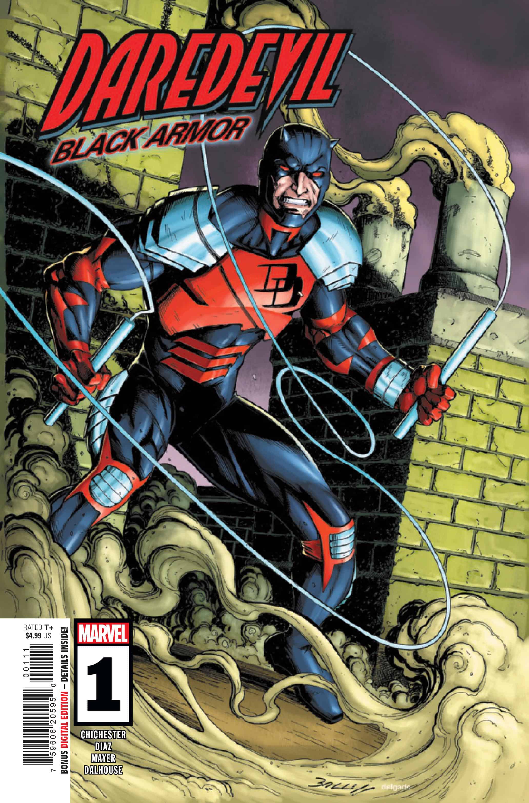
Daredevil: Black Armor #1

Recap
BACK IN BLACK! D.G. Chichester returns to Hell’s Kitchen to spin an all-new DAREDEVIL story set during his landmark run with the character! Joined now by rising star Netho Diaz with covers by industry legend Mark Bagley, this is one DAREDEVIL series you can’t afford to miss!
Review
Daredevil: Black Armor #1 – written by D.G. Chichester with pencils by Netho Diaz, inks by JP Mayer, colors by Andrew Dalhouse, and lettering by VC’s Clayton Cowles – works to fill in time during Chichester’s original run on Daredevil. It takes place right after the Fall From Grace storyline, which saw Daredevil battling an evil ninja cult and obtaining a suit of biomimetic armor. Murdock takes the slapdash costume to Melvin Potter, aka the Gladiator to make a better-constructed version of the costume.
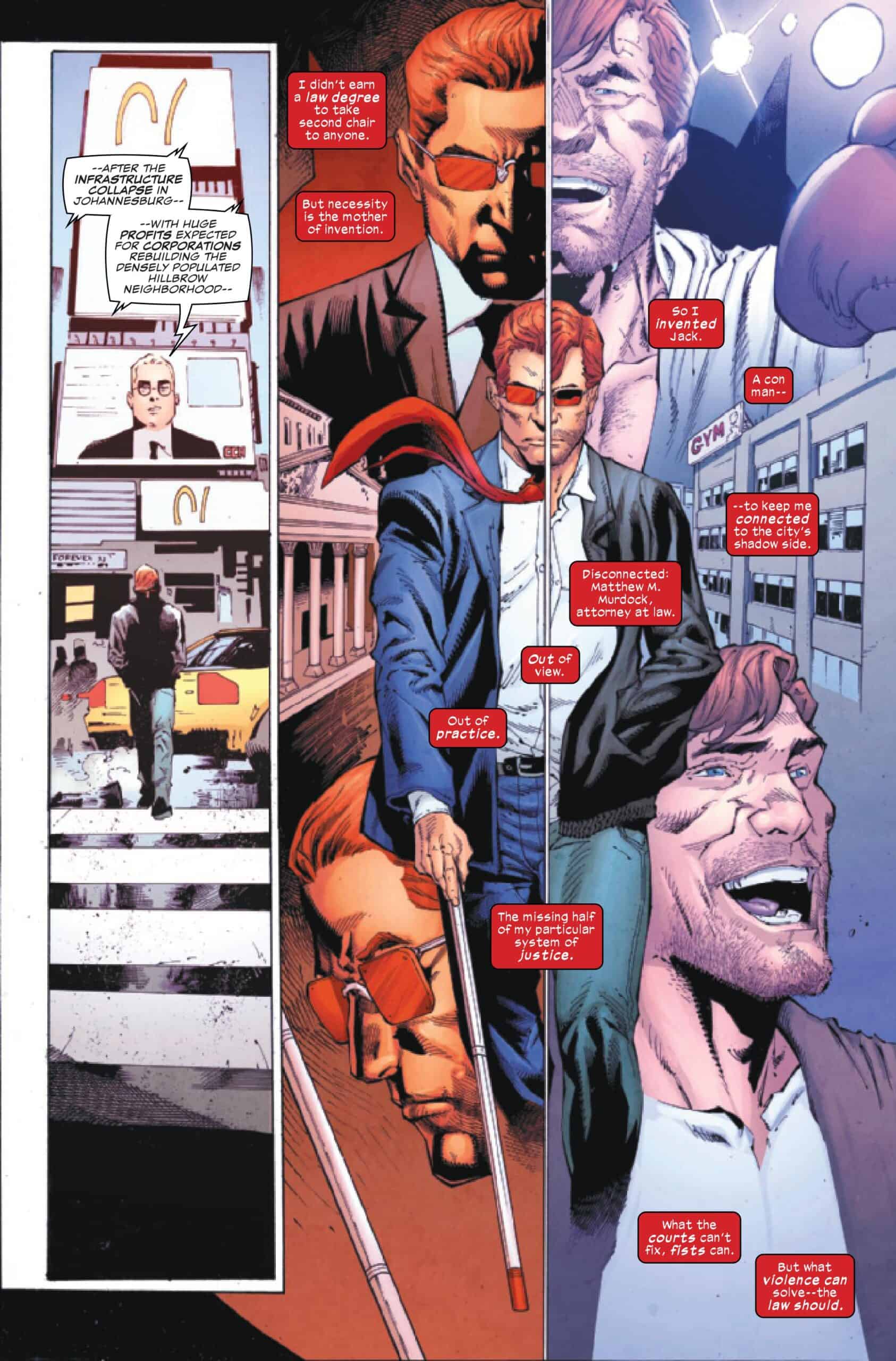
In Fall From Grace, the world also thought Matt Murdock died during the events of the story. Daredevil uses the opportunity to reinvent himself as Jack Batlin, living among the poor and disenfranchised to help protect those that the law has failed. As Daredevil establishes both lives, he comes across Sabretooth in the streets of Hell’s Kitchen, working for an unseen villain to kidnap young children.

It seems almost impossible to write this review without comparing it to Chichester’s original time on the title, as this is intended to be a part of that larger run. From page one, the feeling is clear that he has matured as a writer, more confident and economical in the narration and scripting. Some of that might be the byproduct of a limited series fitting in between the pages of continuity instead of the promise of an ongoing run. In either case, there is a simplicity that acknowledges the Fall From Grace plot without getting too bogged down in the minute movements of the story.
That simplicity is also a limitation of the series (and all of these nostalgia minis), as the book feels trapped in the confines of playing it safe. Prequels struggle to justify themselves on a plot level and often turn to emotional stakes to build drama because of the contrivance. The story of this issue is missing the frankly unhinged energy of comics from the time, which while struggling to make logical sense, was a throw-it-at-the-wall approach to frantic, highly stylized comics of the ‘90s. While the story of Daredevil investigating kidnappings and mutants is a solid mystery premise, it is a weakness to remove the cyberpunk edge of the original run.
The strength of this issue is Diaz and Mayer’s artwork, which modernizes the titular armor while still firmly locking it into the original publishing era. The duo renders action and emotion in a way that is full of detail but still streamlined, clashing with the original artwork of Scott McDaniel. In those stories, the book pushed for groundbreaking but often becomes difficult to read, confusing detail for quality. These are two wildly distinct approaches to the same subject and work better in execution with this issue.
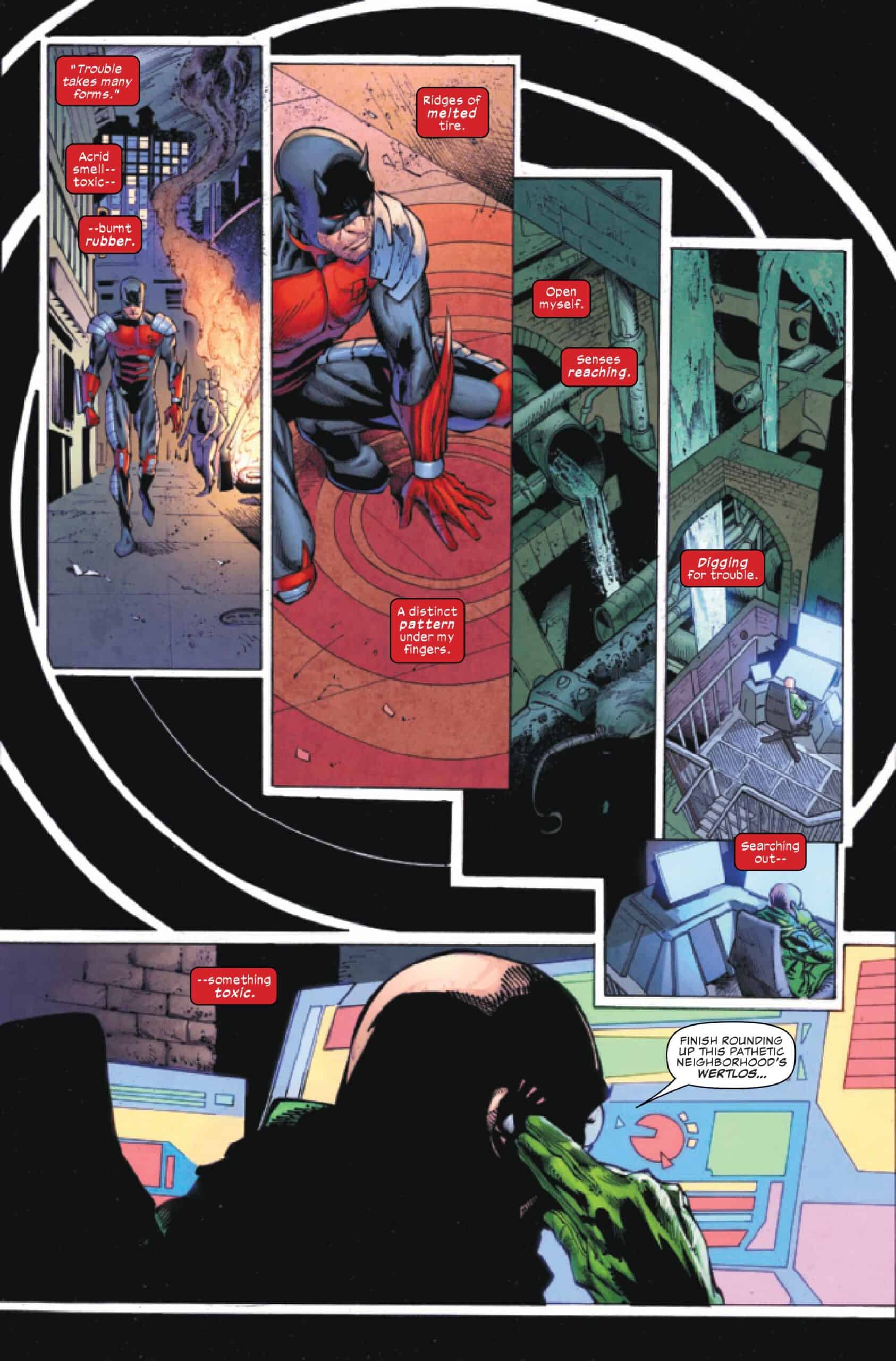
Diaz brings consistent, yet fun twists on the visual language of Daredevil (radar sense, heartbeats, etc) without necessarily reinventing the wheel. The book operates in consistent, clear layouts, occasionally breaking into stunning pages that use cascading panels evoking Daredevil pushing his senses or using heartbeats as the panel lines to merge power and form. These breaks are a fascinating way of immersing the reader into Matt’s perception, illustrating what some Daredevil comics will take for granted.
Much of the artwork and designs work thanks to Dalhouse’s colors, which lend themselves to a more timeless approach to the book. They are not in your face like the coloring of a ‘90s comic, yet have a bit of a simple quality that sets them apart from the modern coloring. There’s a sense of natural lighting in the issue that ranges from the stark darkness of night that is cut through with the lights of the city. Creating a pulsing sense of life, these uses of light and subtle colors shift to create contrasts to the superheroics.

The two standout uses of color are in those moments of Daredevil’s radar sense and the hues of the armor. The reds dropped into panels of Matt’s hyper senses at work create dynamic, striking pops of color that clash against the silhouette of the hero. This creates a rippling effect that sells the cause-and-effect nature of sensory details leading to awareness. The black armor catches light and plays up the contrast between red accents to create a powerful frame for the hero.
Final Thoughts
Daredevil: Black Armor #1 is a solid debut issue that slots too easily into the era it is harkening back to. The book is missing a vital narrative brazenness that books from the ‘90s were happy to engage with, instead opting for a more constrained introduction. That paired with an art style that is much less frantic and more modern in approach, makes for a quick but enjoyable read. Daredevil: Black Armor struggles to find an identity, trying to play as both a nostalgic look back at a very specific Daredevil era while channeling elements from the more recent runs.
Daredevil: Black Armor #1: The Man (Without Fear) in Black
- Writing - 8/108/10
- Storyline - 8/108/10
- Art - 9/109/10
- Color - 9/109/10
- Cover Art - 9/109/10