


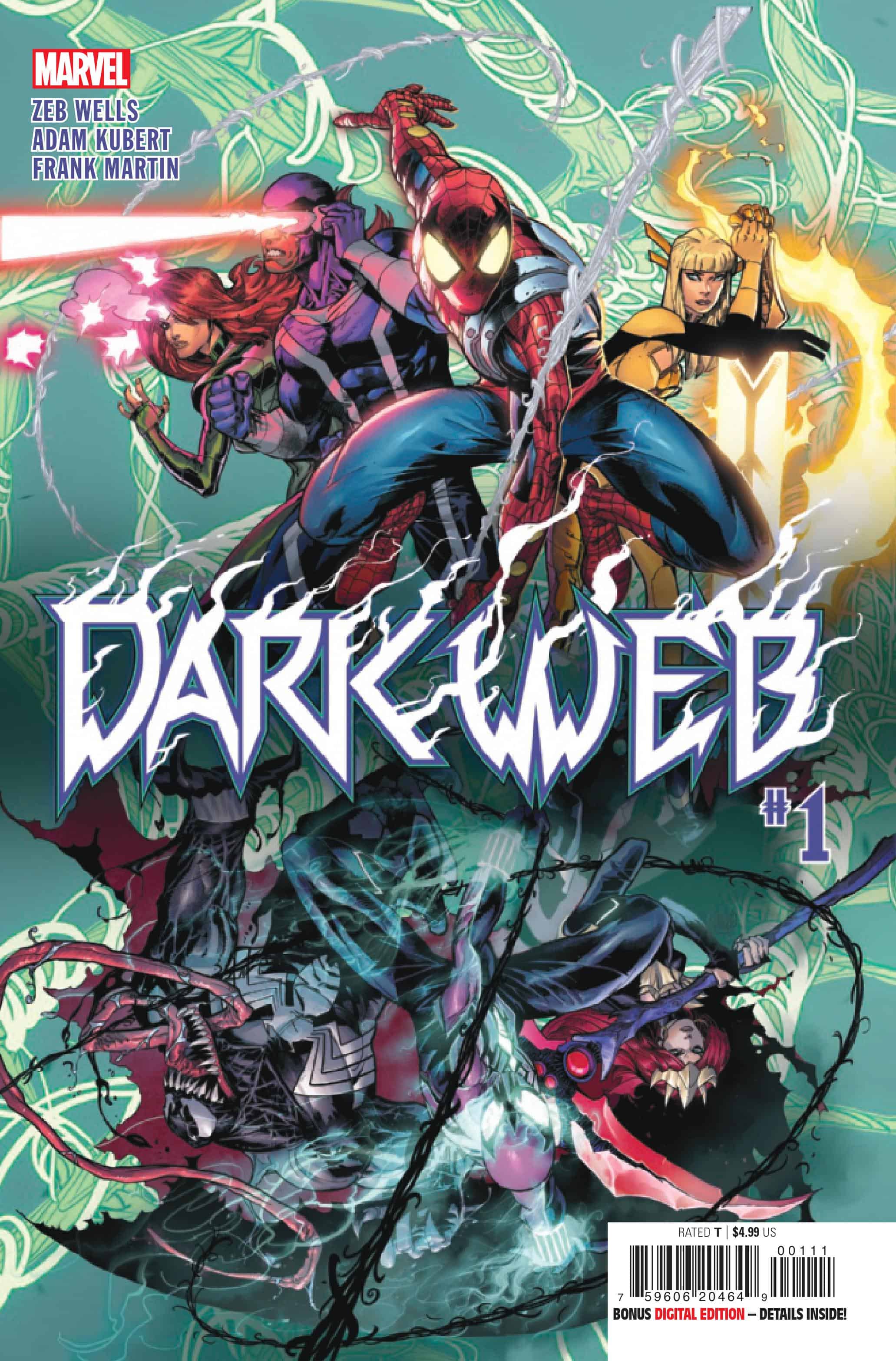
Dark Web #1

Recap
DUSK: ALL THE REAL BOYS AND GIRLS
DUSK! The two most famous clones ever are back to take what’s theirs. Ben Reilly and Madelyne Pryor have had enough and are reigniting the INFERNO! Spider-Man and the X-Men are not ready for what’s coming, and what role does Venom have in all of this? The sun is setting, dusk is approaching, and it’s going to be a long night.
Review
Dark Web #1 – written by Zeb Wells with art from Adam Kubert, colors by Frank Martin, and letters from VC’s Joe Caramanga – spins directly out of Amazing Spider-Man, building on plot threads woven across titles like Spider-Man: Beyond, Hellions, New Mutants, Venom and more. Ben Reilly aka Chasm and Madelyne Pryor aka Goblin Queen begin their assault on the above world, with an attack reminiscent of Inferno working as a smokescreen for Ben to begin his act of vengeance against Peter. Meanwhile, the X-Men prepare for the Christmas holiday, and Peter, MJ, and company attend a memorable dinner for Harry Osborne.
As goblins from Limbo invade toys, carriages, and more, the superheroes mobilize and Norman Osborne battles Chasm. It’s a knockdown, drag-out fight that plays to Ben’s twisted sense of judgment, and Norman’s desire for atonement before switching to the last portion of the clone duo’s plan. The issue ends with the revelation of the villainous duo’s secret weapon, a Venom that’s been reverted to a hulking monster ready to attack Spider-Man. It’s an excellent set-up issue and configures where each of the various pieces; Spider-Man, the X-Men, and Venom will be going forward for the crossover.
Wells’s script is a sharp insight into the Madelyne Pryor and Ben Rilley frame of mind, framing their discontent at their lots in life as motivation for vengeance. It’s a natural conclusion from the plot points of the preceding titles like Hellions and Beyond. The threads from those titles inform this first issue, but Wells contextualizes them to ensure there’s no problem with clarity. This is a crossover that rewards long-time fans while welcoming new readers to the unfolding story. The plot points for the current Spider-Man run are referenced and explained as well, ensuring this title is both of the era but not too entrenched in the inner mechanics of the current plot.
That scripting decision makes clear why storylines like Inferno and Mutant Massacre are referred to as structural inspirations for Dark Web. Those titles are not only relevant thanks to mutants dealing with street-level heroes and the use of Madelyne Pryor but also speak to the intertitle crossover that jumps across titles without a central event title. This ensures that all of the books crossing over aren’t derailed by the event, but allows for interesting pairings and dynamics to occur. Not only will Spider-Man and the X-Men get the chance to team up, but Ms. Marvel, Venom, and more get involved. It also gives readers the choice to determine what issues to pick up from the crossover, while keeping the list of titles manageable. This isn’t a Secret Wars or Civil War II, with a seemingly endless series or tie-ins to purchase. Instead, there are 18 installments across the various titles, but not all are necessary for a cohesive look at the larger web.
Kubert’s art is strong in a majority of the issue, offering plenty of spectacular costuming and action, but stumbles in close-up shots. The expressions of characters, specifically Madelyne Pryor and Ben Reilly, come off as odd or unclear. The majority of that ambiguity stems from Kubert’s linework, working too hard to play with shadow and emotion, and is not helped by Martin’s colors. These close-ups aren’t enough to ruin the reading experience or take away from the rest of the art, which is spectacular but is noticeable enough that it requires noting. It’s a similar case with Esad Ribic’s art, which is stunning but the facial expressions clash with the rest of the style. In Dark Web’s case, since this is a series focused on Madelyne and Ben’s emotional distress, those mixed-quality expressions can muddy the emotion that should be on display.
On the opposite end of the spectrum, Kubert’s layouts and panel compositions are breathtaking in this issue, hitting the throttle from the first page. Kubert commands every panel on the page, and this is never more evident than in the opening sequence of the issue. The opening is a sequence in which Ben recounts his trauma to Madelyne, and frames it as a terrifying fever dream of Peter and MJ stealing the literal expression off Ben’s face. Kubert renders an excellent New York in the wintertime and creates an exaggerated, distorted look for Peter and MJ. Behind the panels, the Chasm effect floats across a black background, indicating the distorted frame of mind Ben is in. Kubert ends the sequence with a twisted version of a stained glass window, with a shadowy Madelyne stepping from the dark landscape to join Ben in their machinations.
Just like Kubert’s art, Martin’s colors are a mixed bag in this issue, offering highs and lows across its extended page count. In the action sequences and more abstract moments like the opening, the colors sing on the page, giving a twisted and unsettling depiction of Ben’s fractured mental state, and the corrupting influence of Limbo. The use of black and green for the Chasm effect gives credence to the new character design, justifying the look established in Beyond. Those colors paired with the blacks, reds, and oranges of Goblin Queen and Limbo ensure that the two are complementary in their mission along with their color palette. Those colors bleed into the above (as Madelyne references New York) and when the goblins begin to overrun the city, the reds and oranges follow. It’s an effective color choice to show the transplant of hell to the modern world and proves that when the coloring works, it works well.
On the other hand, Martin’s coloring runs into a similar issue as Kubert’s art, which is it obfuscates the human character’s faces. In the opening sequence the use of shading and coloring work to create an unsettling look for the characters, but later on that same coloring effect causes uneven expressions. An example of this comes about a third of the way through the issue, with a close-up shot of Madelyne, the coloring and shading of her face make her look completely different than previous panels. Instead of giving a cohesive look to the characters, the coloring works to create an inconsistency to repeated zooms and expressive moments. The color works best in the wide shots and with masked characters, just like in Kubert’s art.
Final Thoughts
Dark Web #1 kicks off the crossover with decent results, with a strong script that the art and coloring can’t always match. Wells does a great job tying his previous works together and makes the reason for this crossover seem like a no-brainer while providing an excellent character study for both Ben Reilly and Madelyne Pryor. Kubert’s art and Martin’s colors offer both strong high points and noticeable lows, offering strong panel compositions and demented color palettes while lacking clear emotional expressions for characters’ faces. The action and spectacle work in the book’s favor, but its attempts for a character study are sometimes undercut by the inconsistent close-ups from the artistic team. This issue is a great way for non-Spider-Man readers to test the waters for the crossover and offers fans of Wells’s non-Spidey works a place to jump on for this clone story.
Dark Web #1: Crazy Clone Inferno
- Writing - 9/109/10
- Storyline - 9/109/10
- Art - 8/108/10
- Color - 8/108/10
- Cover Art - 8/108/10