


DC vs. Vampires: Killers #1

Recap
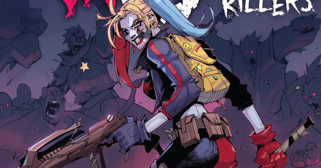
In the shadow of the new Vampire World Order, Harley Quinn rules the human underworld in this age of darkness. She has survived by only looking out for herself...but she might have just found the key to saving the world.
Review
DC vs. Vampires: Killers #1 is written by Matthew Rosenberg, with art by Mike Bowden and Eduardo Mello, inks from Le Beau Underwood, Livesay, Bowden, and Mello, coloring by Antonio Fabela, and lettering by Troy Peteri. The issue takes place after the events of DC vs. Vampires #6, with the creatures of the night, had taken over the world, blocking out the sun in the process. This one-shot follows a group of Gotham villains, led by Harley Quinn, living in the shadow of the vampires. Harley has declared herself the head of the Gotham criminal underworld and is working to take out anyone who challenges that rule, including the Mad Hatter. The issue takes a turn when Jim Gordon finds Harley and provides the sample of Lex Luthor’s blood from the main title, which can kill the Vampires. From there, Harley is forced to fight a group of former heroes, including Mr. Terrific, to keep the vial safe.
Rosenberg’s script is the best element of the book, showcasing an excellent voice for Harley and the various Batman rogues, along with a passing group of other DC characters. The characters are consistent with how they appear in the main title, and the script helps to maintain the continuity of the series. Rosenberg makes sure to keep the pace of the issue moving, giving the book the feeling of a solid, simple action story. There aren’t any gasp-out-loud twists or turns from the issue, but nothing feels out of character or tone for the series. The character beats and action feel natural and don’t meander, making the book read quickly. The end of the issue feels like it will loop back around and tie into the main story, but it doesn’t feel detrimental if you skip this issue and only read the main title.
The art is inconsistent, the multiple pencilers and inkers on the title showing the page-to-page look of characters and events. The main title set a high bar with Otto Schmidt and Simone Di Meo’s art and coloring, and it’s hard for any artists to complete. The art in this one-shot isn’t egregious or enough to completely take you out of the book, but it is noticeable enough to distract from the story. In a previous review of the main DC vs. Vampires title, the difficulty of switching styles was discussed, and how it can create a dissonance that makes the book harder to enjoy. This art is a case of that incompatibility, not feeling in sync with the foundation that Schmidt built into this universe. Instead of the kinetic, scratchy style of Schmidt, Bowden and Mello’s pencils are more contained, and less frantic, which subdues a book that is full of action sequences. This departure from Schmidt’s style, which was the defining visual aesthetic for the main title, is a detriment to the expectations of the series. It was distracting in the main title when Simone Di took over pencil work, and the same happens here.
The other element that makes this one-shot feel out of sync with the main title is the coloring. Coloring is an aspect of comics that can help to solidify a visual continuity across books, and the go-to example of this in recent years is Marte Gracia’s work on House of X/Powers of X. While Pepe Larraz and R.B. Silva had styles that melded well together, it was Gracia’s coloring on both titles that made the two books feel cohesive even as the two issues spanned timelines, dimension, and more. In the case of DC vs. Vampires, Schmidt’s coloring was a massive draw of the initial issues and remained unmatched. Here, the coloring matches the art and feels flat and safe compared to the leaps that the main title made. Fabela’s palette again isn’t egregious or a turn-off for the book, but like the art, it leaves one wanting more. As a completely standalone story, the coloring is solid, but when placed next to the other palettes in the canon of the Elseworld story, the inconsistency becomes more apparent.
Final Thoughts
DC vs. Vampires: Killers #1 is not an essential entry into the budding Vamps-verse, but its fun if uneven character study for Harley Quinn. Fans of the character, or just want to see more of the world controlled by the vampires may enjoy this issue, but otherwise, this may not be the book for those looking for a similar aesthetic as the main title. The art and coloring are inconsistent, highlighting just how distracting two distinct styles can be on a title when set next to one another. In a vacuum, this issue is a solid, fun one-shot, but it can’t help but shrink against the stunning art and coloring of the main title and Otto Schmidt. With more tie-ins confirmed for this universe, it will be interesting to see if this inconsistent style continues, or if those other works will feel more cohesive with the foundation that the main title set.
DC vs. Vampires: Killers #1: Bad Blood
- Writing - 6/106/10
- Storyline - 6/106/10
- Art - 4/104/10
- Color - 5/105/10
- Cover Art - 6/106/10