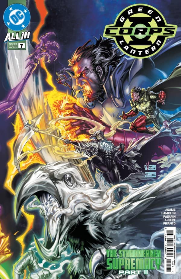
Green Lantern Corps #7

Recap
With the Sorrow Lantern ignited, all the emotion in the universe has been sucked away by the Starbreaker Corps! Now, a strange trio of non-organic Lanterns devises a plan to bring the spectrum back, leading the Corps to the Source Wall and the secrets therein!
Review
Green Lantern Corps #7 is surprisingly accessible for being part of a major Green Lantern storyline. Hampton and Adams are able to succeed here in a way that Green Lantern #25 didn’t by including only the most necessary backstory and stripping out excess details. The opening pages clearly establish the problem and the actions that the issue’s two main characters must take to work that problem.
Dedicating so little space to exposition gives Green Lantern Corps #7 space to open up other storytelling possibilities. One of those is centering the story more on characters than nuts and bolts plot. Hampton and Adams present a different side of some characters thanks to their being stripped of emotion. Guy Gardner is particularly noteworthy as he concludes that his emotional responses (such as his tendency toward punching) are a liability.
An extension of the character exploration is a paradox presented by Green Lantern Corps #7. The heroes aren’t easily persuaded to react to the Suneaters’ threat to other worlds because they lack emotions such as anger which would predispose them to action. On the other hand, it’s this very lack of emotion that allows Kyle Rayner to realize a potential solution. The issue doesn’t comment on this at any length, but it’s an interesting idea to ponder that is made possible by Hampton and Adams’ economy when it comes to plot and exposition.
Contrary to most comics where the goal of facial details (or lack thereof) are intended to convey feelings of some kind, the need here is for that work to keep the characters appearing consistently neutral while still making them engaging. Green Lantern Corps #7’s opening page contains four horizontal panels tracking John Stewart’s face as his ring attempts to elicit some kind of response. The first panel sees the character staring downward. In the next two he is staring ahead, his face blank and identical in both panels. The final panel sees him slightly raise an eyebrow as he rebukes his ring.
The first panel isn’t as successful as the rest; John’s downcast stare comes across as almost sad. The remaining panels are very effective. In this particular case, depicting him identically in the second and third panel works well since the character has no reason to speak and interrupt the ring. John is nearly identical in the final panel as well. But in this case, his mouth is slightly open and his eyebrow slightly raised as he responds. The artists make minute details in the lines and patches of lines that shade his face to account for the motion of the character’s mouth and eyes–mostly along his cheekbones–but otherwise keep his face the same.
These three panels set the tone for the rest of the issue. Many panels and pages use pulled back angles that feature larger groups of characters at once. There is a high level of detail here, clearly depicting individual characters of varying species into the distance as opposed to vague silhouettes and outlines that could be almost anything. A result of these wider perspectives is a lack of close detail of characters’ faces. But the early John Stewart sequence has supplied a template for the reader to understand what these characters are like even if there are very few closeups on them in the rest of the issue.
Prianto makes a brilliant coloring choice for Green Lantern Corps #7, giving the entire issue a faded quality. This is in contrast to his work on every other issue in the series, including an earlier issue where he collaborated with the same artists as he does here. Prinato typically favors a vivid style with rich colors and a higher level of contrast between them which often leads to different elements seeming to jump out at the reader. That is not the case here as everything looks muted, the brightness sandpapered away. Nothing pops off the page. The far less vibrant coloring fits the overall mood of the comic. It’s an incredibly effective marrying of narrative and color art–and something that might easily be overlooked because an issue’s coloring is so strongly associated with its art.
John Stewart’s ring does a lot of talking in Green Lantern Corps #7. Indeed, it’s one of the chattiest characters. Sharpe doesn’t use any tails for its dialogue bubbles, though. He merely puts them next to the ring, usually slightly offset to the side, either above or below. It’s a minor detail, but it sets the ring’s “speech” apart from everyone else’s. It’s a nice nod to the ring being something truly other (whether intended to be taken that way or not).
Final Thoughts
As strange as it sounds, part two of Starbreaker Supremacy is almost a better entry point into the crossover than part one. Readers won’t get much of anything when it comes to Starbreaker’s backstory or motives. But the easier to digest bits of exposition are clearer and leave room for real story and character development. As far as Adams’ second big Green Lantern story arc is concerned, Green Lantern Corps #7 is a must have. But beyond that, it’s just a damn good comic.
Green Lantern Corps #7: Starbreaker, Heartbreaker
- Writing - 7.5/107.5/10
- Storyline - 8/108/10
- Art - 7.5/107.5/10
- Color - 9/109/10
- Cover Art - 7.5/107.5/10


