


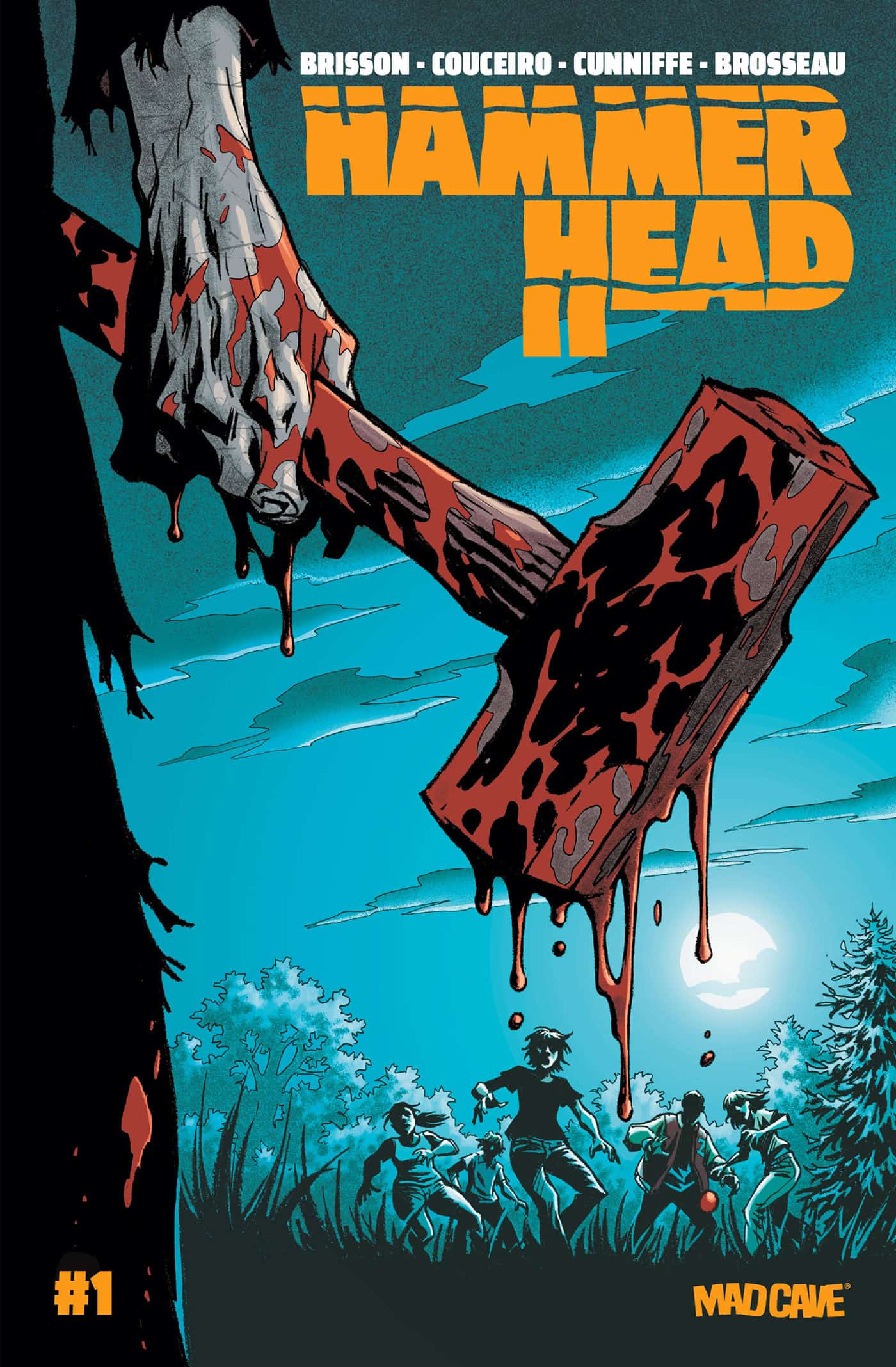
Hammer Head #1

Recap
TERROR CAN'T BE CONTAINED!
For 20 years, Jules has been hiding from her past. As the only survivor of the Hammer Head killing-spree, she carries the guilt and trauma of having watched as everyone she loved was brutally murdered. Every couple of years, Hammer Head rises from the dead to continue his reign of terror anew, and with each repeated massacre, Jules falls deeper into the warm embrace of her own dark coping mechanisms. When she's thrown into prison with no trial and no hope, Jules finds herself part of a dark ritual built to force her back into the past that she's spent her life trying to escape.
Review
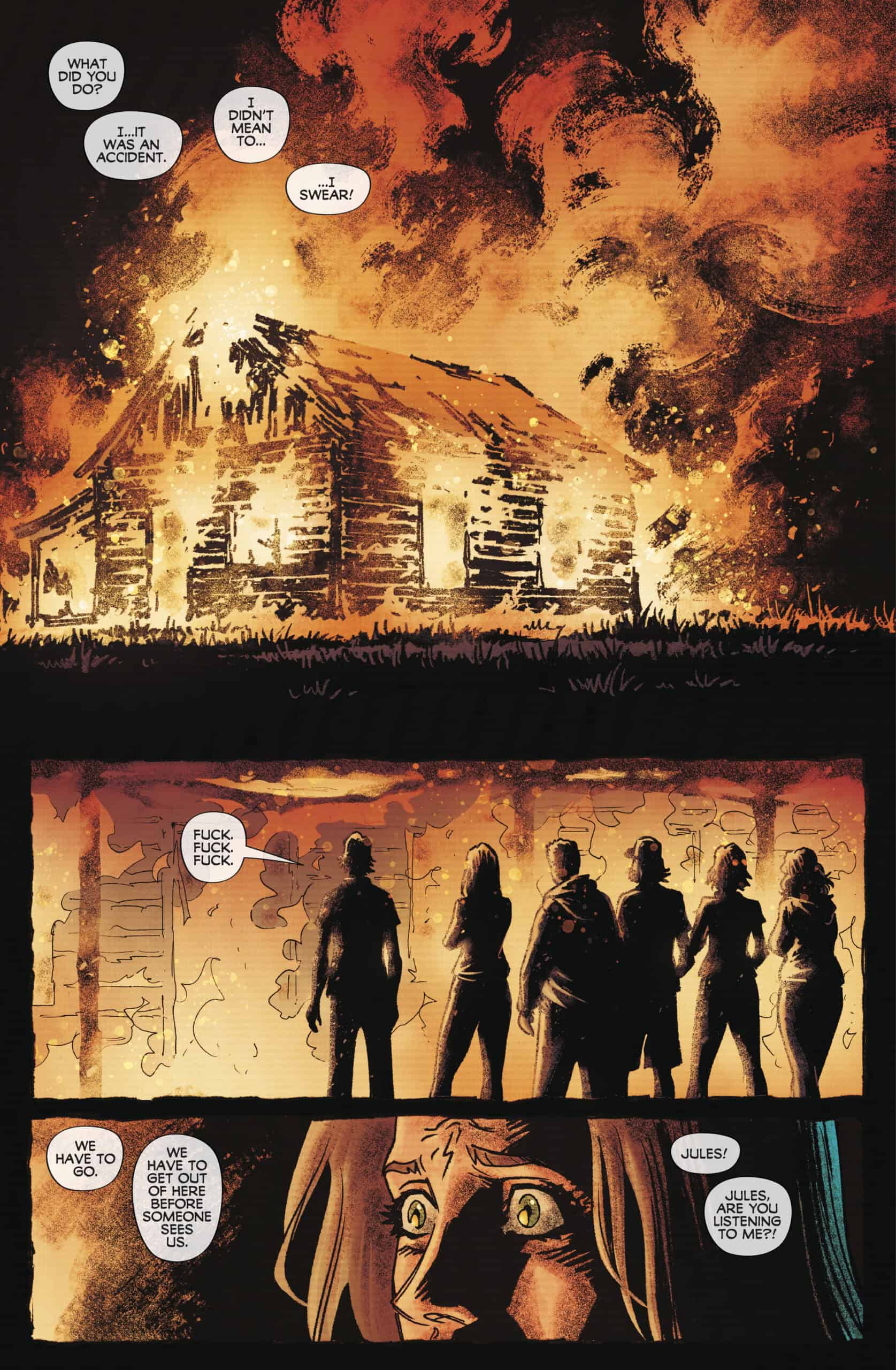
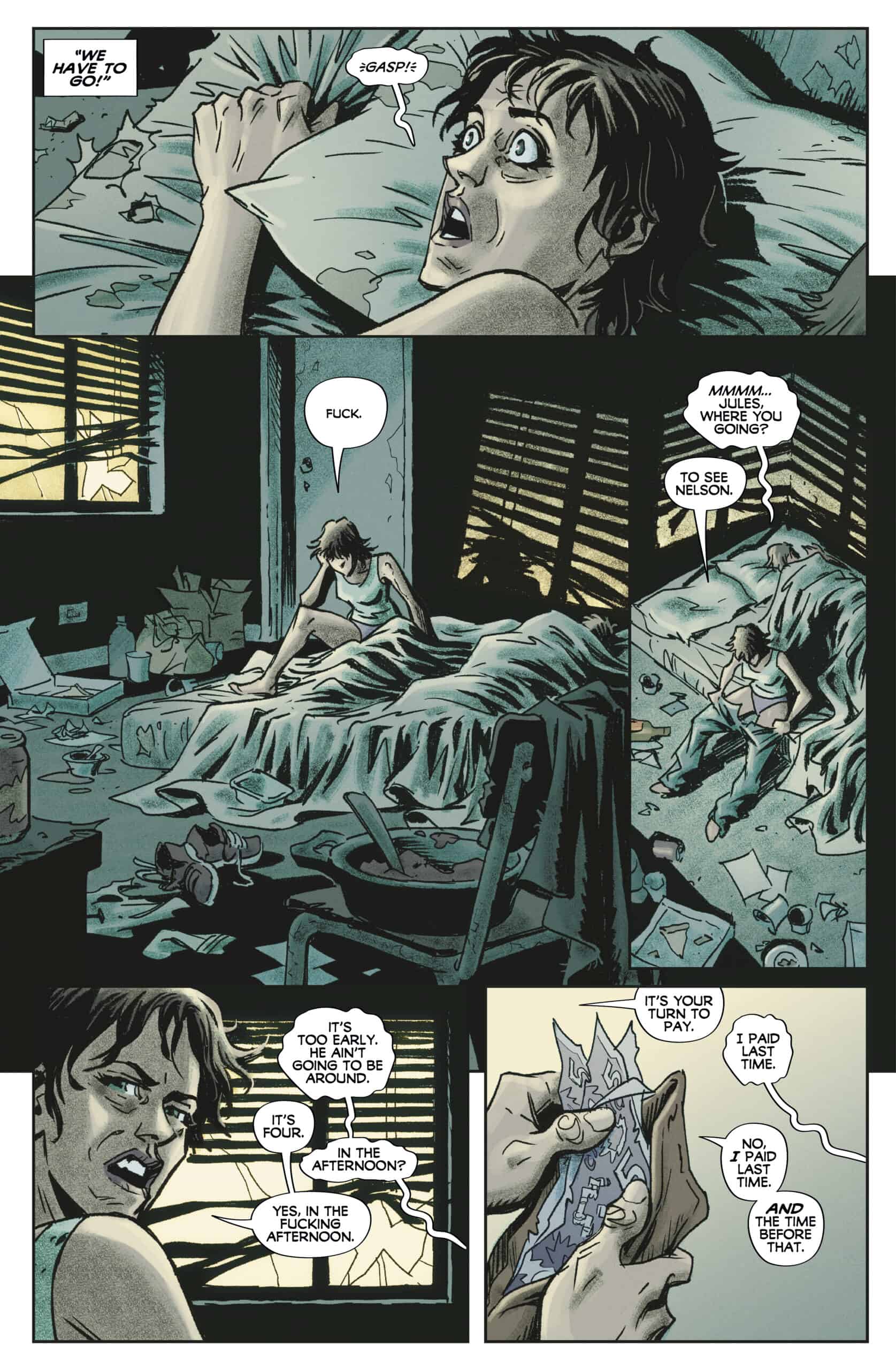
Hammer Head #1 opens on a burning house. But for most of the issue, Hammer Head #1 is more a mystery story than a horror story. Brisson follows Jules, a drug addicted survivor of a murder spree in the town of Spence’s Bridge. Jules is arrested in a drug bust early in the issue, and that’s where the story begins.

Brisson’s story puts Jules through the ringer, and Couceiro’s art realizes her struggle in excellent fashion. Couceiro brings a good amount of detail for characters’ facial expressions without going overboard. Smaller lines around characters’ mouths, on their foreheads, and along cheekbones do a good job delineating features from the start. Lines get a little thicker and longer for moments of heightened stress and emphasis. But for the most part Couceiro doesn’t employ heavy shading or thick dark lines which might subtract from any visual nuance. Jules is the greatest beneficiary of this.
There isn’t much horror imagery and straight up gore in Hammer Head #1, but when it finally arrives, Couceiro delivers. Hammer Head’s hammer (it flies out of the darkness before the character himself is fully seen) makes a big entrance, delivering the issue’s most shocking visual. If this is an example of what is coming, there will be very good horror visuals in future issues.
Hammer Head’s character design is immediately gripping, and the variant covers that show Hammer Head don’t do him justice. His clothing is torn in places and looks like ruined hand me downs. The covering on the top half of Hammer Head’s face is less a mask and more a torn piece of fabric. Though there’s no evidence that Hammer Head is supernatural in any way, his visual design feels like it’s in the vein of Jason or Michael Myers.
Cunniffe’s scheme is soft even as he picks brighter hues of the colors he chooses. Early in the issue there is very strong contrast between the characters and their surroundings as Cunniffe puts a variety of colors against a very cold looking blue background for the prison. This is a good setup for the issue’s final scene that takes place outdoors at night. Cunniffe bathes everything in a dark blue. Nothing stands out in this sequence until the issue’s final pages where the red of puddles of gore and pools of blood jumps off the page.
Brosseau does a good job keeping dialogue bubbles well organized and out of the way of the issue’s art. There aren’t a lot of changes to font in the dialogue. Emphasized dialogue is bolded. The one major style adjustment Brosseau makes is late in the issue when Jules is shocked by the surroundings she finds herself in. Brosseau shrinks the font inside her dialogue bubbles considerably in a series of panels. It very effectively communicates the emotional power of the moment.
Final Thoughts
Hammer Head #1 holds its cards close to its chest for the entire issue. Brisson builds Jules up and leans into the mysteries he creates before ever getting to the horror story proper. The issue goes out with a bang and all but demands that readers pick up the second issue. Every horror fan should check out Hammer Head #1.
Hammer Head #1: Mysteries
- Writing - 7.5/107.5/10
- Storyline - 8/108/10
- Art - 8/108/10
- Color - 7.5/107.5/10
- Cover Art - 7/107/10