


Knight City #1

Recap
A brand-new action-adventure series by BRZRKR’s Matt Kindt and Stray Bullets’ David Lapham that’s Fight Club meets Superman.
A legendary hero is caught between two worlds. By day, he soars as a symbol of hope, but the moment he falls asleep, he enters a universe devoid of heroes and he leads a mundane life. As the pressure of his dual universes mount, his heroic self begins to crack, pushing him toward a mental breakdown.
In a world that measures the loss of human life that occurs when he takes one night off, the weight of his responsibilities becomes too much. Ultimately, he’s left with a choice: embrace his extraordinary abilities or seek solace in the ordinary.
Will he stand tall in a world that needs him, or find peace in a simpler existence?
Review
Knight City #1’s first half is a strange blend of borderline dark pastiche and borderline parody. It’s a blend that shouldn’t work but does. This owes largely to the way that Kindt uses both literary styles as lenses with which to view the issue’s main character.
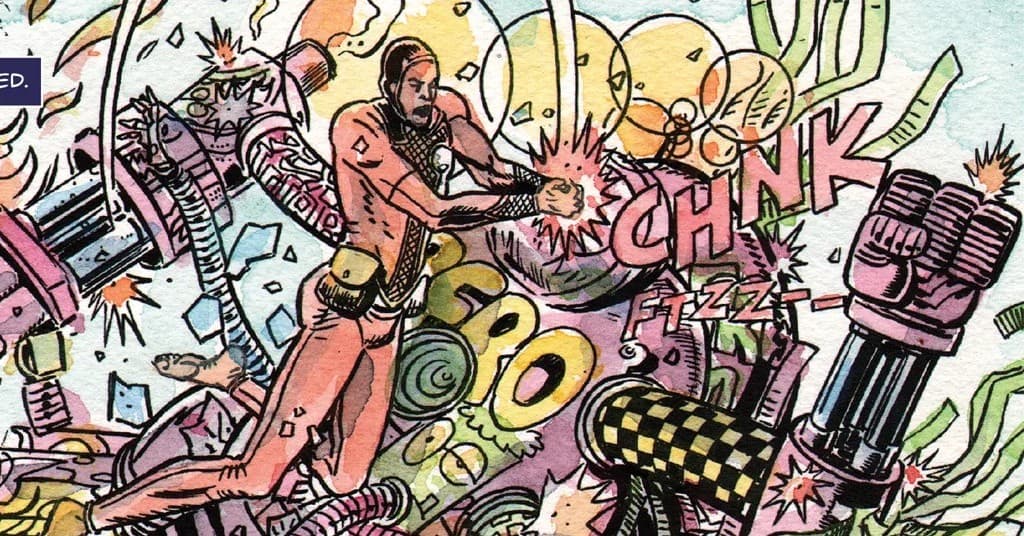
The issue starts off with titular superhero Knight in a battle with his apparent nemesis, Zero–a villain who is obsessed with Knight and who, no matter how many times Knight defeats him, never stays in jail. Tired of that dynamic, Knight almost kills Zero, stopping because he knows it would only take one murder for people to turn on him which would in turn diminish his powers. This opening argument is what readers make with the likes of Batman and Superman–why not kill the worst of the worst rather than deal with their perpetual escapes and attacks?
Kindt goes on with these sorts of reader arguments in Knight City #1. How can Knight have a personal life when it means people who need help don’t get it? How can Knight sleep when he has super hearing? And most ridiculous, why does Knight bother with clothing when he’s invulnerable? But rather than present this as a purely metatextual exercise, Kindt makes it all part of Knight’s somewhat pessimistic internal monologue.
Shortly after these ruminations, Knight City #1 morphs into something else entirely–a new reality. Is Knight dreaming about an ordinary life? Is an ordinary man dreaming about Knight? Are they even dreams? Kindt takes a straightforward idea–the sort of dark pastiche, sort of parody–and chucks it out the window for something altogether unexpected. At this point, roughly halfway through the issue, the story becomes much more compelling.
Lapham delivers a very visceral opening fight sequence. The visuals are chaotic. He pushes home the conflict Knight is experiencing over whether to kill Zero, and the art absolutely makes it look like that’s what is going to happen. The good artwork makes for a high energy entrance into the issue.
An intense opening fight notwithstanding, the visual key to Knight City #1 is expressive characters. This is especially true for the second part of the issue that is heavily centered on normal people. These sequences are mainly ordinary interpersonal relationships, and Lapham draws very open people. For the most part, everyone’s appearance syncs up perfectly with their dialogue. Because it is so easy to interpret these characters most of the time, the few instances where Lapham provides extra visual subtext, somewhat subverting characters’ dialogue, is very noticeable and effective.
The first half of Knight City #1 sees somewhat less complexity in character presentation because Knight is almost the only character in the story. Even in his best moments, Lapham keeps the character visually in near constant states of anger or malaise. There’s no subversion between art and text here. Knight looks exactly as dour as he talks.
Coloring in Knight City #1 is done in a painted watercolor style. Contrast between different shades of a color and different primary colors altogether is minimal. Transitions between shades that suggest light sources or shadow are gentle. There are at times some patches devoid of color–or lacking as much color as the surrounding area. This largely occurs near the edges of panels, suggesting a kind of imprecise big brush application. The color palette overall, especially in the second part, is warm with soft light orange, peach, and very light pink making up much of the backgrounds and highlights. Even in the most chaotic moments, the coloring style makes this a very inviting book.
Lettering choices in Knight City #1’s two parts are different for good reason. For the first half Reed chooses an all upper case font, and he colors Knight’s internal monologue caption boxes a dark purple with white text. In the second part, which could be considered the quitter of the two, Reed chooses a font that is smaller overall and employs both upper and lower case letters. The caption box color is a much softer light orange. The second part is comparatively peaceful from a lettering point of view.
Final Thoughts
Knight City #1 begins in fairly straightforward fashion before morphing into an entirely different comic roughly halfway through. That change makes the issue considerably more compelling and adds a lot of uncertainty (especially in the final pages). Knight City #1 is a fun entry for readers who want a mind bending, unconventional superhero comic.
Knight City #1: Here and There
- Writing - 7.5/107.5/10
- Storyline - 8/108/10
- Art - 7.5/107.5/10
- Color - 8/108/10
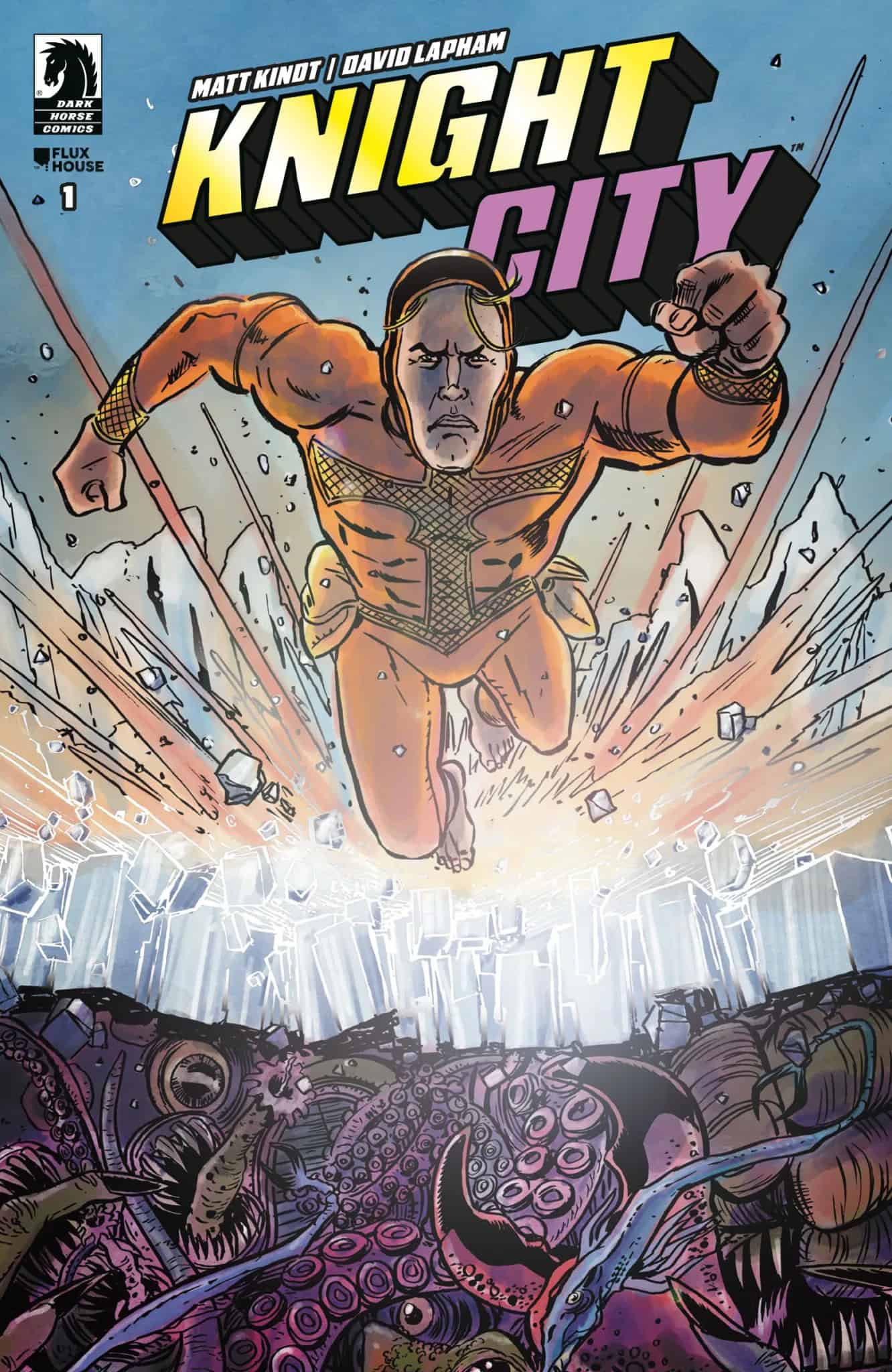
- Cover Art - 7.5/107.5/10