


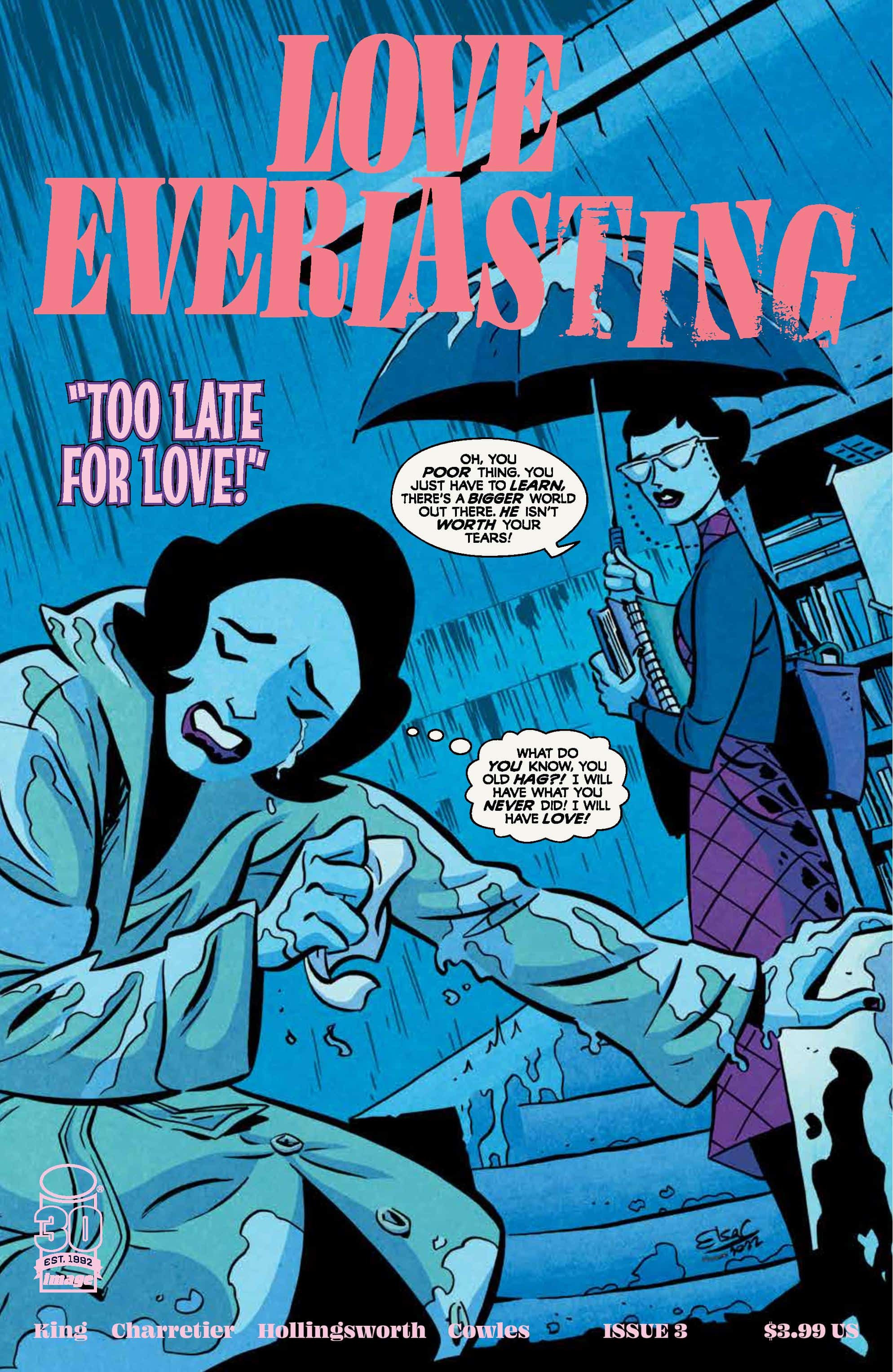
Love Everlasting #3

Recap
After the bloody end of issue two, Joan finds herself free in the pristine suburbs of the 1950s. But again love pulls at her, demanding her attention, her life. She fights it, fights to escape, but still it pulls, and Joan must find a new way to fight this terror.
Review
It’s an interesting phenomenon that when the mainstream voices in a creative field (movies, TV, comics, etc.) moved away from romance stories, where the DNA and spirit of the genre found their way too. Fanfiction and webcomics seem to be the natural inheritors to the genre, taking the ideas and interests that creators aren’t seeing and transplanting them into their works. Both mediums seem to prioritize the genres, either focusing on them as the leading genre or at the very least, a vital element to the stories being told. It seems like an instance where demand sways the interest of the creator, and makes it so that these newer, constantly evolving mediums can find inspiration in the past.
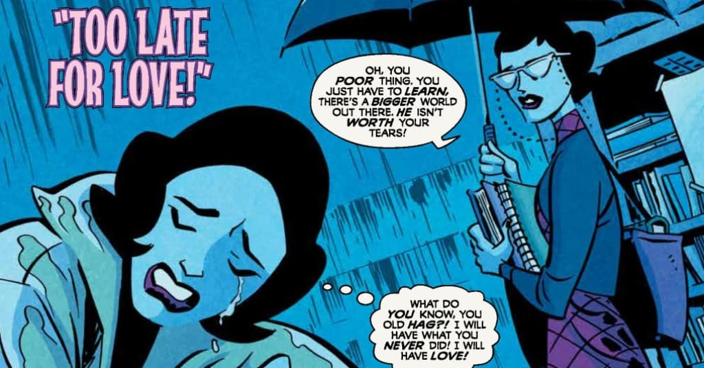
Love Everlasting #3 – written by Tom King, with art from Elsa Charretier, colors by Matt Hollingsworth, and letters from Clayton Cowles – once again jumps to a new time and place, this time focusing on the romance between Joan and her high school sweetheart, Fred, in the days before graduation. As the school year wanes, Joan debates whether to accept Fred’s proposal for marriage and stay in their small town or escape her home filled with her parent’s stagnant marriage and go off to college. Joan flees to the local library and asks advice from the spinster librarian. As the librarian details her own decision to leave or stay, Joan accepts the insights and makes her decision to stay. Afterward, Fred makes a visit to the librarian and reveals he’s the man in black, and the librarian is another Joan, having chosen to run instead of accepting love, and her fate remains the same as in previous issues.
King’s script does an excellent job of creating an internal rhyme in its structure, at first indicating there are clear parallels beyond design between Joan and the librarian, before revealing the truth about the two. The stories of romance and life choices are carefully laid out as the librarian recounts her story to Joan, and it becomes clear that the motions are similar. But King breaks the rhyme scheme once the librarian departs town and Joan decides to stay, but makes clear that in the end, both paths lead back to the man in black and their fate. It’s an excellent bit of structuring that ensures that the book doesn’t feel repetitive as the same basic beats are reiterated in the issue. That experimentation with structure is one of the biggest selling points of the issue and works wonderfully with the romance genre to tell something that feels fresh and original.
While never explicitly stated, the art gives the sense that the story is unfolding in the 1950s, channelings the aesthetic and set design of works like Archie comics and Grease. Charretier’s style is a perfect fit for this era, blending that timeless and timely style to play into the cyclical and familiar undercurrent that’s running through the story. The styling is paired with a modern sense of panel composition and layouts that speak to the modern lens the book is reflecting through, utilizing page-height vertical panels and wide landscapes to break away from a structural resemblance to comics past. It’s an effective way to train the eye to see the past while rooting itself in the present and illustrates the levels that the story and craft are interacting on.
It’s never clearer than on a page where the younger Joan is sleeping and has two opposing dreams, one where she is marrying Fred, literally floating on clouds with heavenly light beaming. The other dream is a dour fate where she follows in the librarian’s footsteps and lives alone, finding a singular solace in the books she reads. Here, Charretier illustrates the opposing dreams with the two vertical panels on either side of the page, separated by a small gutter. It’s the type of composition that would work perfectly in the modern webcomic format (which, in many instances, is where the romance comic has come to thrive in the modern era) but matches with the book’s stylized art to reflect a timeless emotion behind the dilemma. It’s a marriage of old and new that functions as a perfect example of what the book is working to do, which is to blend the two to say something original about the themes of love and romance.
Just as Charretier captures that sense of eternal recognition in her linework, Hollingsworth does something similar with his use of colors. The shades of blue and pink evoke the feeling of spring feeding into summer when the heat of the season is just on the horizon and sells the precipice that Joan finds herself on. But the coloring is the strongest in the described scene above while Joan dreams, clashing two distinct colors to indicate the paths that lie before the young woman.
The dream of marriage is bathed in a golden light, and paired with a pink background that’s warm and inviting, a dream of hope and comfort. Compared to the dream of the librarian’s life, which features a black background that seems like an endless void that even books can’t fill, it’s clear through the colors why Joan makes her decision. Hollingsworth’s color speaks volumes to the emotional crux of the issue, and it’s fascinating that no matter what decision is made by Joan, no matter how different life, art stylizing, or color palettes are, they all lead to the same inevitable place.
Final Thoughts
Love Everlasting #3 plays with its structure and establishes an internal rhyming scheme that ensures that familiar plot beats avoid feeling worn while delivering an excellent bit of insight into Joan’s doomed loop. King’s script is an excellent execution of familiar tropes and the diverging paths of romance, while Charretier mixes modern and classic artistic sensibilities to highlight that immutable endpoint for Joan. Pairing that sense of finality with Hollingsworth’s beautiful and sensory-evoking colors is an excellent decision that sells the sweeping emotional core to the book and makes it one of the best titles on shelves.
Love Everlasting #3: Summer Lovin’ (Had Me a Chat)
- Writing - 10/1010/10
- Storyline - 10/1010/10
- Art - 10/1010/10
- Color - 10/1010/10
- Cover Art - 10/1010/10