


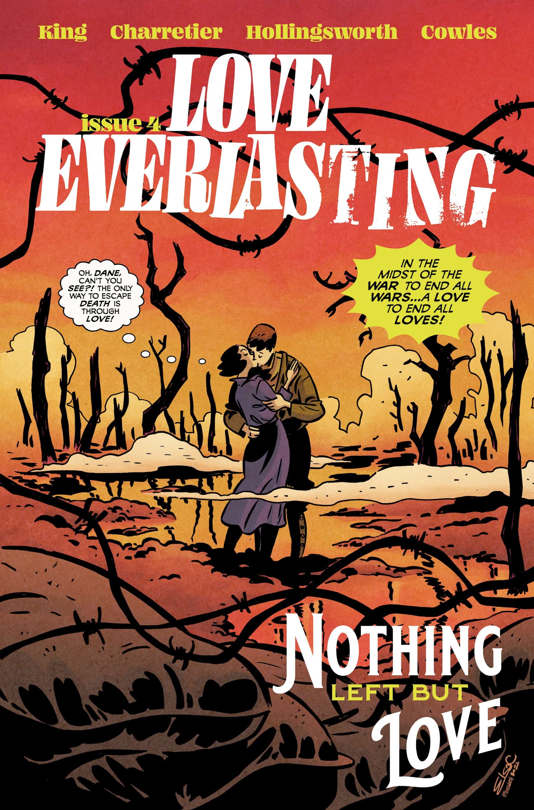
Love Everlasting #4

Recap
Review
There’s an implicit edge that romance stories have when set during wartime, in that they offer a dynamic tension between a soldier on the battlefield vs. off of it. It speaks to the conflict between matters of duty and the longings of the heart and makes for compelling tales that often end in sweeping passion or bitter tragedies. It’s why there’s a cottage industry of World War I and II romance stories, often still popping up even in an era where romance has taken a backseat in terms of genres. So, it makes perfect sense for Love Everlasting to zone into the wartime romance subgenre on its exploration of romance across a multitude of times and places.
Love Everlasting #4 – written by Tom King, with art from Elsa Charretier, colors by Matt Hollingsworth, and letters from Clayton Cowles – jumps to a new point in time and space, away from the suburbs of the 50s, putting its roots into 1915 France, just miles away from the trenches of World War I. This version of Joan is a singer at a small bar that’s patronized by soldiers on leave from the battlefield. It’s here she meets Dane, a green soldier who’s immediately fallen for the woman, sparking a quick connection before shipping off. Each time Dane returns to the bar, it’s to honor one of his fallen brothers in arms, having made a pack to return to the bar each time one dies on the field.
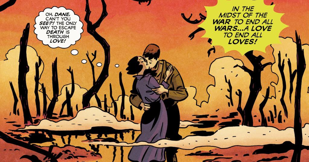
Each return visit brings Dane a little closer to Joan but also reveals his descent into an undiagnosed case of post-traumatic stress disorder from the horrors seen in the trenches. After an overt experience of trauma, Dane returns to drown himself in his liquor, a long departure from his distaste of the stuff in the opening encounter. It’s in this last embrace the two find one another, and Joan opens herself up to love, but in a cruel but expected twist of fate, time and space shift once again, and Joan is trapped in a love triangle on a beach somewhere far away from trench warfare.
King’s script for this issue brings a harder edge, combining the overarching romance genre with the tragedy of war, making for a simmering romance that ratchets the drama to 11. As horrible as it is, there’s something about wartime in fiction that adds a new dimension to romance stories that fuels both the passion and the looming tragedy of a connection. It speaks to the clashing dichotomy of love and violence and reinforces that while in battle, soldiers are expected to shed their humanity, it can still exist and thrive beyond the trenches.
King’s style of melancholy men burdened with trauma also gets its chance to pop into the issue, and this issue, in particular, feels more akin to usual work. But in that familiarity, King can subvert expectations by rooting the perspective in Joan, who observes the man but doesn’t see into him. It allows the audience to learn with her and works to ensure the horrors of war and the psychological traumas are seen but somewhat unknown to Joan and the audience. That removal also makes the transition to the next point in time extra heartbreaking, as Joan and the audience both are forced to leave before knowing what happens between the two, and leaves lingering questions about Dane’s fate.
That sense of fleeting romance and passion set against the backdrop of atrocities is exemplified by Charretier’s art and Hollingsworth’s colors. The blocking of the issue, which takes place exclusively in the bar, except for the last page cliffhanger, contracts the world of the issue, isolating it from the horrors beyond its walls. While the bar is a respite, Charretier’s design and blocking don’t overtly show it, rendering the space as worn and hazy from the clouds of smoke. There’s a weariness in the pencils that show just how much the war is weighing everyone down, from the legions of soldiers that come through to the bartender and even Joan.
Charretier’s style usually plays to an idyllic, pop aesthetic that plays against the grain of the story but fits perfectly for the tone. The only time that the art on the pages comes to life or breaks from the weary atmosphere is when Joan sings or embraces Dane. Charretier renders the music as though it’s come to life from the page, and it’s their passionate kiss towards the end of the issue that channels this. In a panel that resembles ones from the previous issues, the two lock lips and the backdrop is a bed of flowers, as the two are framed in an ornate shape. Then in that shape behind the lovers are staffs of music that evoke a swelling musical score. It’s an effective image that imbues the power of romance in connection, breaking the monotony of the bar.
Hollingsworth’s colors work in tandem with that art direction in both the reinforcement of the shell-shocked aesthetic of the bar and in the moments of connection between the two leads. In that panel where the two embrace, Hollingsworth switches to two shades of pink, both muted but with a stronger pop of color than much of the pages. It works in conjecture with the musical and floral imagery to sell the romance, breaking the established look of the issue right before Joan is thrown through time once again and reinforcing the tragedy of the situation. It’s also in contrast to the rest of the book’s colors, which occupy shades of stone grays, fatigue greens, and other muted hues.
The backgrounds of the bar are interesting, existing in shades of blue-greens and purples that evoke a sadness of the time, offering no warmth of revelry in the bar while echoing the shades Joan dresses in. These colors allow for others to pop, especially when Joan sings and her speech bubbles are enhanced with little musical notes. The notes appear in brighter colors, like pinks, greens, and yellows, contrasting on the page and livening the space up slightly. Even when the lyrics are a more crooning melancholy, the act of music still brings some comfort to the soldiers.
Final Thoughts
Love Everlasting #4 is the best issue yet of the series, which speaks to the high quality of the series as a whole. Much of that praise is thanks to both King’s script and Charretier’s art, which play in realms they’re both familiar with, but make subtle changes, ensuring that the story and craft on display feel new and experimental. Adding Hollingsworth’s excellent colors that reinforce the emotional core of the issue, the inherent tragedy of love during wartime, and the respites from that crushing reality in the form of Clayton’s lettering, it’s impossible not to be affected by the issue. With craft at this level, it’s insane to think people aren’t picking up the series, and should go to the top of every pull list.
Love Everlasting #4: Love and War
- Writing - 10/1010/10
- Storyline - 10/1010/10
- Art - 10/1010/10
- Color - 10/1010/10
- Cover Art - 10/1010/10