


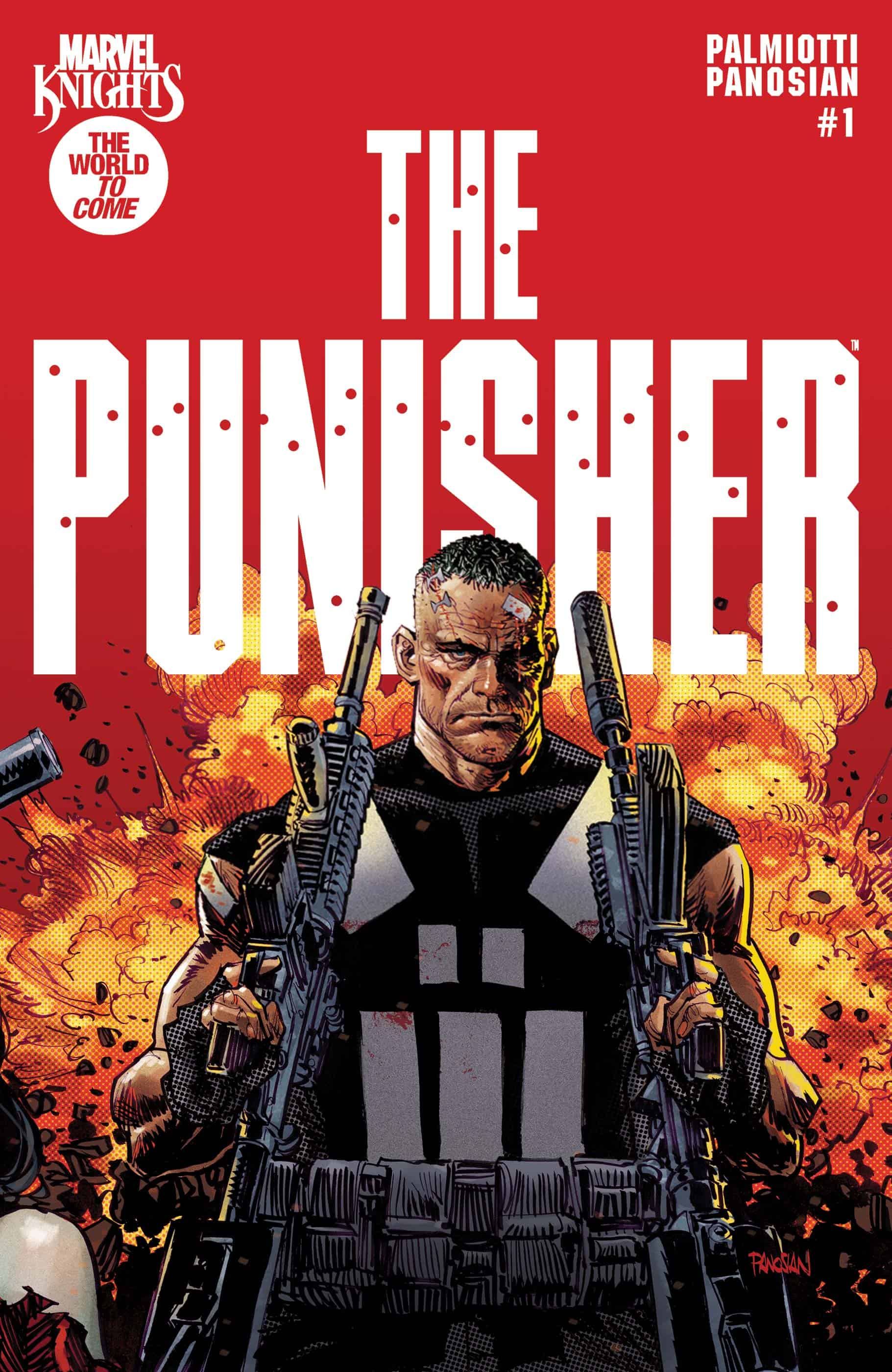
Marvel Knights: The Punisher #1

Recap
In the world to come, Frank Castle's war continues still... but is even his brand of justice enough to stop the onslaught of new designer drug "zombie?!"
Review
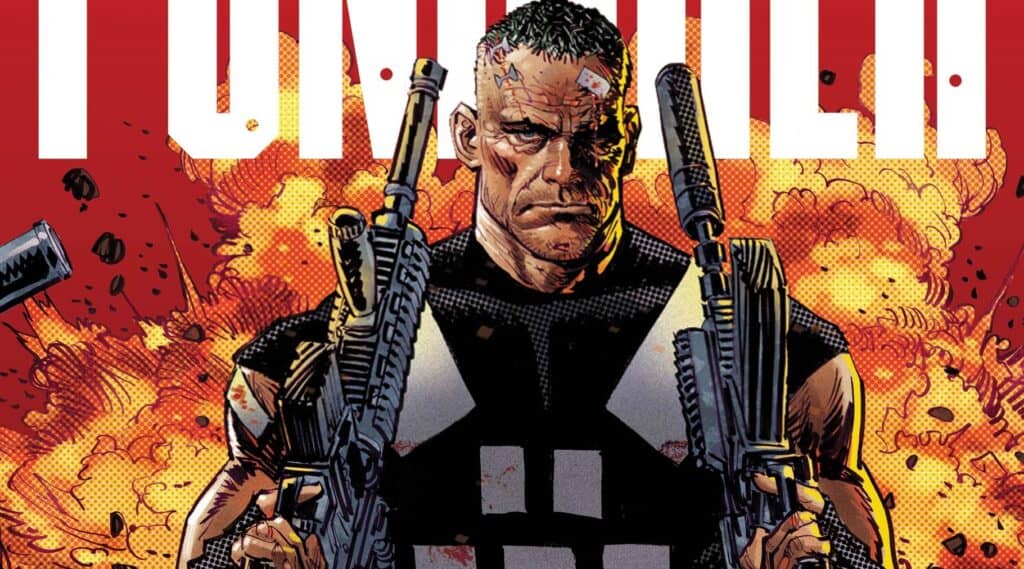
Marvel Knights: The Punisher #1 really, really wants you to believe that it’s a dark new day for the Frank Castle. It has an amazing cover and logo, a world-class creative team in Jimmy Palmiotti and Dan Panosian, and the umbrella of “The World to Come,” which has served Black Panther pretty well over in that other Marvel Knights revival book. The problem is this, though: it has nothing new to say about our boy Punisher’s world. But that’s not necessarily a killing stroke, so buckle up, buckaroo.
But there’s a problem with that critique, though – the Punisher, by nature, doesn’t grow and change. He doesn’t have character arcs or development; he’s static by design and that in and of itself means that his stories have to be plot-driven rather than character-driven. And that’s just fine; better than fine, the best Punisher stories by luminaries like Garth Ennis and Chuck Dixon and Matthew Rosenberg understand this and play to it with great strength. Writer Jimmy Palmiotti understands this, too – his Frank neither grows nor changes, despite being of a particular vintage when the story starts. That’s good! So what’s the bad? Why doesn’t Marvel Knights: The Punisher live up to its potential?
By necessity of the above premise, any plot in a Punisher story had better be damned engaging, and unfortunately, this comic’s isn’t quite there yet. The nuts and bolts of it are that a new drug called “zombie” (or “Z” for short) has hit the streets, and Punisher is out to put a stop to it before it becomes too widespread. This leads to some unfortunately by-the-numbers run-ins with local gangsters, mob bosses and underbosses. Ultimately, Frank gets captured after a run-in with the gang’s lead henchman; tortured for months, and then – well, that would be spoiling.
The problem is that the way all of this plays out isn’t particularly gripping. Some je ne sais quoi is missing that elevates the plot from “okay” to the level of excellence Palmiotti is capable of. It may be a misstep of trying to lay too much foundation out in the first issue; it may be an editorial issue. Needless to say, though, the comic doesn’t do enough story-wise to justify its existence past surface-level. And, well, as far as surface-level Punisher goes… we’ve seen it before, too many times.
Dan Panosian’s art and Dean White’s coloring, however, are another story. Their Punisher is a behemoth of a man, skulking through each page and stomping skulls with methodical precision. Panosian’s art is rough-hewn; a fitting look for Punisher’s dusky corner of the Marvel Universe. His characters skirt the line between being cartoony and gritty, if such a line exists. It’s a wholly unique look not just for art but for a Punisher story in general, and I’m all here for it. Dean White’s coloring is dark and muted, keeping the proceedings at a street level that is perfectly suited Panosian’s pencils and inks. Even the lettering, by Tyler Smith, has a rough edge to it that, for lack of a better description, “just feels right.”
Final Thoughts
It's unfortunate that this first issue didn't hit the ground running with its plot, because art-wise, it's a home run. Hopefully subsequent issues will flesh out the proceedings better, and make it feel like more of a unique tale than has been presented thus far.
Marvel Knights: The Punisher #1: Zombie Stomp
- Writing - 6/106/10
- Storyline - 5/105/10
- Art - 8.5/108.5/10
- Color - 9/109/10
- Cover Art - 10/1010/10