News from the Fallout #1
Theron Couch
Recap
MINISERIES PREMIERE Writer CHRIS CONDON (THAT TEXAS BLOOD, Ultimate Wolverine) teams with visionary artist JEFFREY ALAN LOVE (The Last Battle at the End of the World, The Thousand Demon Tree) for a thrillingly dark sci-fi horror story unlike any you've seen before! In 1962 Nevada, a nuclear bomb test goes horribly awry and unleashes a contaminate into the atmosphere that turns people rotten. Otis Fallows, a private in the U.S. Army who is present for the test and is the only known survivor, flees the secret army base in search of a safe haven-but does such a place exist?
Review
Southern Nevada. 1962. A nuclear bomb test. But this time it’s on people, and the result is News from the Fallout #1–an attempt at a minimalist thriller/horror story.
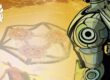
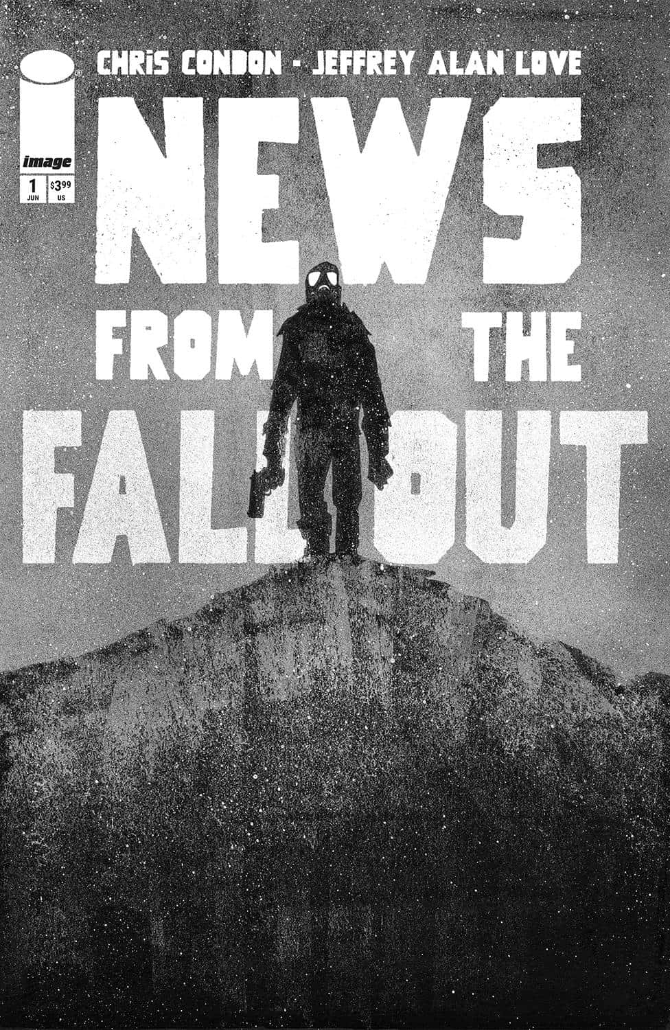
Love’s art dominates News from the Fallout #1, pushing the issue into horror territory long before Condon’s story gets to that point. The choice to use black and white here, rather than a broad color scheme is more than a mere style decision, instead transcending that to create a full on identity from the first page. People, items, and structures are surrounded by a basic, undetailed gray background. The gray isn’t monochrome, though; irregular blotches of light and dark create a constant haze even before the nuclear test. Whereas a white background might create a sense of calm or even safety in the issue’s early pages, this ever present haze insists that something is wrong from the very beginning.
Something similar happens thanks to how Love draws News from the Fallout #1’s characters. Lines on older characters’ faces are exaggerated, creating a sense of menace around them. Mouths are stretched wide. Characters in authority are drawn with broad, flat shoulders. They come to hard angles at the characters’ arms before their bodies taper slightly going down their torso. It’s an imposing look that implies power over everyone else in the panel before extending into the scene as a whole.
The main character in News from the Fallout #1 wears a gas mask throughout the issue, and Love is very successful at using the mask’s wide eyes to convey emotion.
Furthering News from the Fallout #1’s visual identity are powerful lettering choices from Otsmane-Elhaou. The lettering never disappears into the background. Instead, it becomes an extension of Love’s art. Sound effects are written in an uneven font that looks like it was scratched into the page. Just as the splotchy gray backgrounds creates a constant sense of foreboding even before the issue’s principal action begins, this font choice, used for sound effects from the start of the issue, suggests danger and even destruction–both of which are integral feelings in the issue’s second half.
Dialogue bubbles convey characters’ feelings and statuses all on their own. Bubbles and their tails are normal when nothing is wrong with characters, but they become irregular in a variety of ways depending on whether characters are loud or sick or scared, and so forth. The work reinforces and somewhat enhances the already strong art. It also adds emotion to mostly unimportant characters early in the issue.
News from the Fallout #1’s story is barebones. Most of the explicit narrative happens early in the issue, setting up a burst of action followed by a largely silent second half. While this may sound detrimental for the issue in the abstract, it actually adds a strong thriller aspect to what is developing into a horror story. This near total lack of dialogue might prove to be highly underrated. Essentially, Condon knows when to get out of the way so his collaborators can showcase the medium, telling a story through art rather than dialogue and other text.
Final Thoughts
News from the Fallout #1 isn’t like any other book on the shelf right now. Less is very much more here. The black and white and relatively low detail art combine with an essentially text-free second half to create a truly distinctive experience. Horror fans owe it to themselves to pick up News from the Fallout #1.
News from the Fallout #1: Black & White, Silent & Terrifying
- Writing - 9/109/10
- Storyline - 9/109/10
- Art - 8/108/10
- Color - 9.5/109.5/10
- Cover Art - 8/108/10