


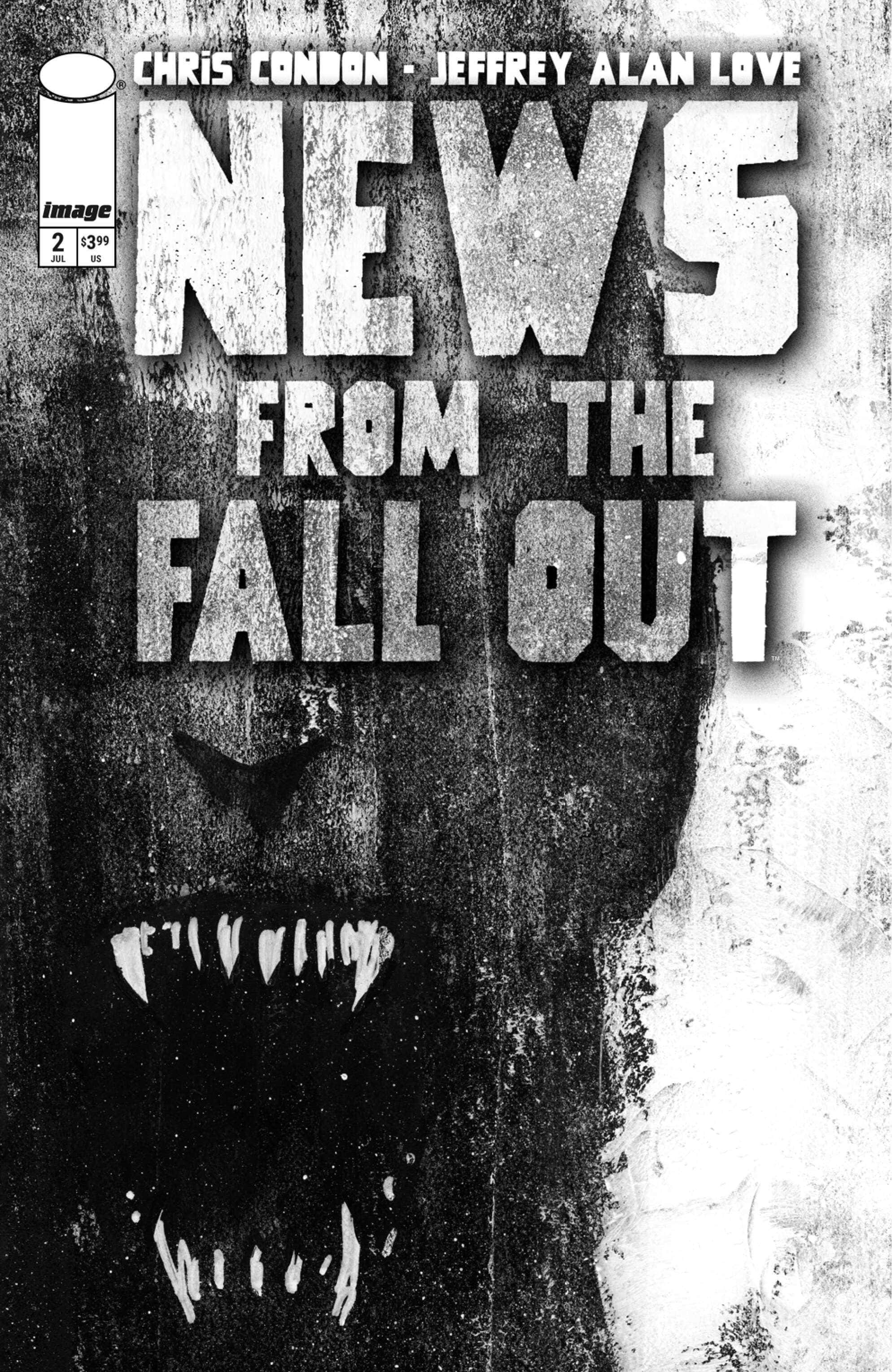
News from the Fallout #2

Recap
Tempers flare as the horrors from the nuclear fallout creep ever closer to Old Joe's Diner.
Review
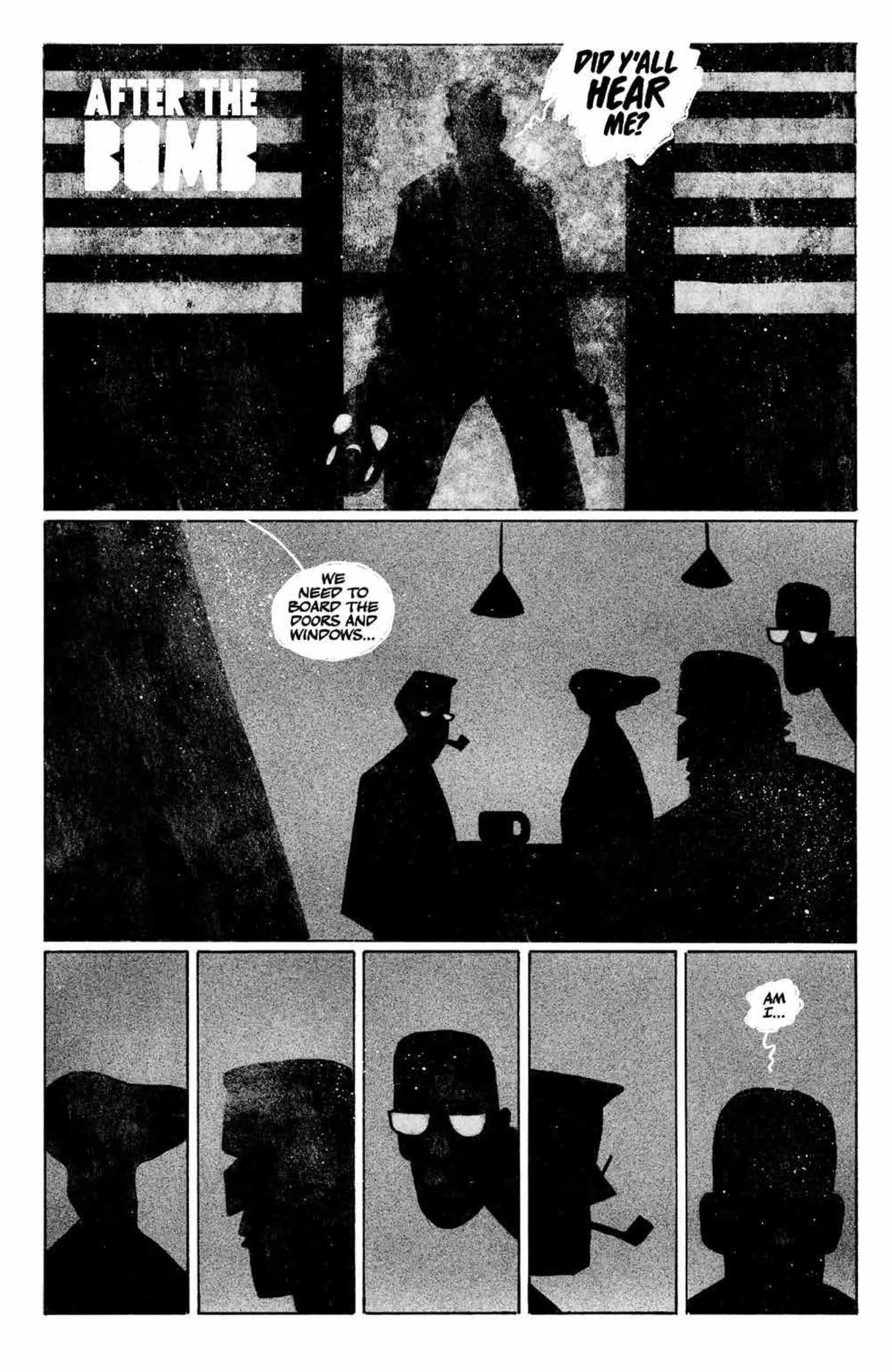
Minimalism is still the order of the day for the art in News from the Fallout #2. The second issue consists almost entirely of one extended dialogue sequence between the main character and the people in the diner where the previous issue ended. Once again, Love’s work is as simple as can be. There is no real grayscale when it comes to the black and white style. Virtually the entire issue depicts full black people and objects set against an empty gray background. The background continues to create a sense of foreboding within the comic.
Love makes a particularly brave choice in News from the Fallout #2 to depict the diner patrons entirely in black, much the same way as the main character was in the previous issue with only the gas mask to identify him. This choice was safer in the first issue when so much of it was the gas mask protagonist fighting his way through the transformed soldiers. Here readers have to pay much more attention. Some characters are easier to identify in profile and silhouette than others. It is more difficult with others. For instance, there are two characters with glasses. Both sets of glasses are half oval with one pair being thinner than the other. The character with the thinner glasses also has a pipe. When the pipe is visible, it is obvious which is which. When the pipe isn’t visible, the only visual clue for which is which is the shape of the glasses.
Attentive readers will also realize that the characters’ basic shapes in silhouette and profile communicate information about them. The character with the thin pair of glasses and a pipe is the most thoughtful and reasonable of everyone in the diner. The character with the wider pair of glasses is more emotional. The character with the big square jaw, hook nose, and cigarette is the most assertive and aggressive. This is why “minimalist” should not be confused with “simple.” Love’s art is still heavily communicative.

This ongoing dialogue is also a strange source of black humor. The protagonist knows that there’s a problem. The reader knows that there is a problem. But the characters in the diner stubbornly refuse to believe anything is going on. It becomes almost exasperating.
The horror/monster story continues to develop slowly. Though the extended dialogue sequence that makes up most of the issue concerns that part of the story, elements of it aren’t truly seen until the final pages. This actually benefits the entire story, especially for readers who picked up the first issue. The reality of the monsters hangs over the entire issue, helping to maintain the tension.
Otsmane-Elhaou makes a choice that seems obvious but makes an incredible difference on the page in a dialogue heavy issue. Love doesn’t use white as a color choice anywhere in the issue. The lightest anything gets is a dull, splotchy gray. Dialogue bubbles, though, are white with black text. In the first issue this was less striking because panels in the early part of the issue where dialogue was more prevalent were much busier and the latter half of the issue was almost dialogue free. Here, where the art remains limited but the issue is dialogue heavy, the bubbles leap off the page. The white creates a striking contrast with the characters who are speaking, giving the dialogue a sense of great importance.
Final Thoughts
It’s a mistake to discount News from the Fallout #2 based on the seemingly limited art. The issue invites readers to go through it quickly because on first glance, there is very little going on visually. This was the case with the first issue. But in truth, the art deserves significant consideration. This series continues to show how art can tell stories in different ways in comic books. News from the Fallout #2 is an excellent example of how less can be more when it comes to visual storytelling.
News from the Fallout #2: Profiling
- Writing - 9/109/10
- Storyline - 9/109/10
- Art - 9.5/109.5/10
- Color - 10/1010/10
- Cover Art - 7/107/10