


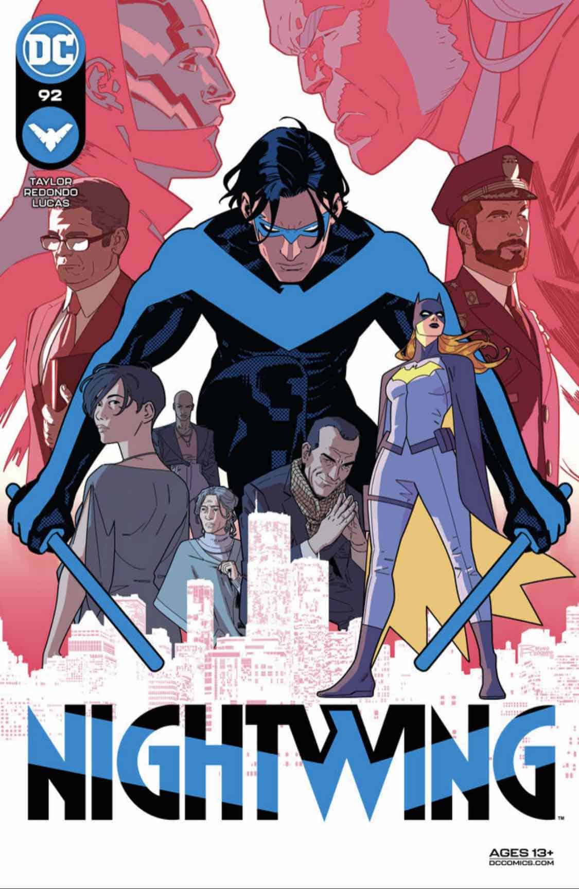
Nightwing #92

Recap
Blüdhaven mayor Melinda Zucco is in trouble-pretending to work for Blockbuster while secretly trying to take him and his gang of criminals down, while also working alongside Dick Grayson to uplift the city. But as his half sister sharing the last name of the man who killed his parents, it’s…a lot to juggle, and enough for one to accidentally let slip a secret or two in the wrong company if she’s not careful… Meanwhile, Nightwing and Oracle cuddle up and decide to finally define their relationship.
Review
Comics, like all creative mediums, grow with every passing generation. The sensibilities and aesthetics of the form, from art, to story, colors, and lettering all changed based on the cultural influences and era in which they are created. Look no further than comparing the artistic style of a Neal Adams’s Batman page alongside a Greg Capullo. That progression is neither good nor bad necessarily, just like changes in technology have altered the aesthetic principles of film and TV. While that change is non-linear, it’s always fascinating to watch a creator work to try and contextualize their style into those previous sensibilities. It’s the reason why when a movie is shot on film, it picks up a texture that sets it apart from the mainstream body of works being released. In the case of comics, watching an artist, writer, or colorist trying to blend their design elements with a classic style to evoke a certain period or era of a character, is one of the greatest joys of the medium.
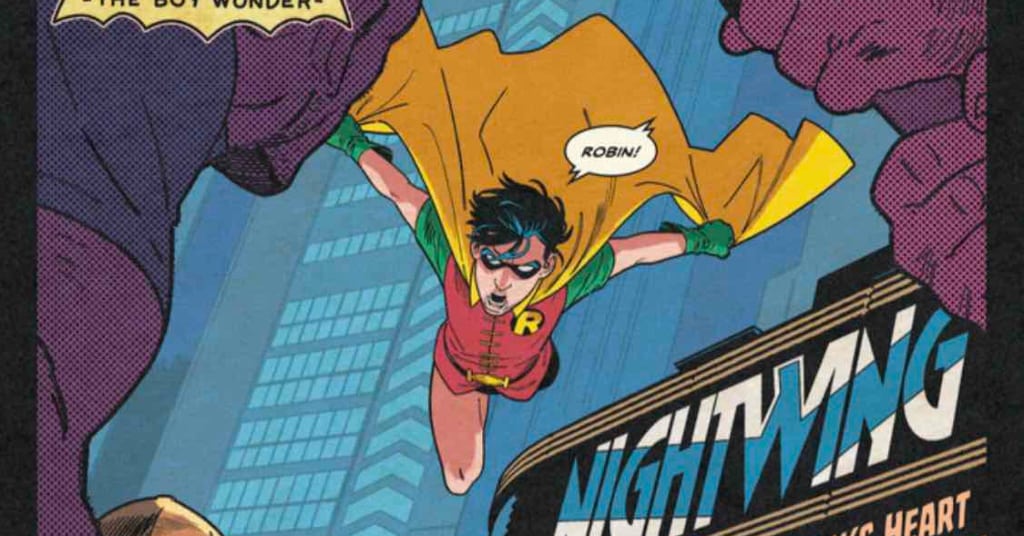
Nightwing #92, written by Tom Taylor with art from Bruno Redondo, colors by Adriano Lucas, and letters from Wes Abbott, opens with a flashback to an early adventure of Dick as Robin and shows the young acrobat in over his head when someone needs help. From the flashback, the issue picks back up into the current storyline of Dick trying to use his inherited wealth from Alfred to open a community center, and Blockbuster’s attempts to shut it down by killing Grayson. The issue also continues the train of cameos from Dick’s life, adding Bruce Wayne in civilian garb and Ace the Bat-Hound alongside Wally West’s Flash and the Jon Kent Superman.
Taylor splits the script into the flashback for the first half of the issue and then progresses right into the action of the current day. Outside of a quick caption box on the first page, Taylor drops the audience straight into the action of the flashback and allows the art and colors to mark the era of the continuity. Taylor’s script quickly moves from beat to beat and does an excellent job setting up the Dick/Bruce dynamic both in the past and the current day. It’s a fine line that Taylor walks in the characterization of these dynamic characters across their publishing history, but he presents and writes dual emotionally resonating scenes that carry the weight of that history, and the time between the two points.
Redondo was born to draw superheroes, that much is evident in his work in Nightwing since joining the series with Taylor, but beyond that pitch-perfect ability to render people in tight costumes beating up villains, Redondo’s style is a perfect fit for capturing the spirit of classic comics as well. With this issue, Redondo gets to stretch his Silver Age-inspired pencils and blend sensibilities to tell a fun story from the era of Dick as Robin. Redondo embraces the pixie-booted, booty shorts aesthetic of Robin, and does so without making a joke about it. It’s an honest and joyous homage to a brighter and more vibrant era in comics, but given the gravitas and emotional storytelling flourish from a modern approach.
Even in this stylistic approach, Redondo still conveys his usual style of highly kinetic, fluid action layouts for Robin, even if the then sidekick is rougher around the edges. Like the panel design of the book, it’s a multitude of smaller details that are added together and form an aesthetic principle that blends retro and modern into what could be a compelling micro-story in the first third of this issue. That choice serves well to provide the context of the large issue and serves as a perfect method of conveying the flashback’s place in the canon, doing so better than any caption box or editor’s note ever could.
Joining Redondo’s perfectly stylized pencils is Lucas’s inspired coloring, blending with the art to further heighten the sense of classic comic conventions to tell this seemingly lost Robin story. Lucas employs a limited palette throughout the book, and the past lives in hues of blues and yellows, with purple splashing in from time to time. It’s a simple element but locks into place the clear inspirations of a time passed in comics.
Just like Redondo’s pencils, Lucas’s color is a revisionist approach to those directions taken by the artists and colorers of the Silver Age. There is something intrinsically modern in the way in which Lucas colors every scene, adding a dimension to not only the fight scenes but also the quieter moments of the book, including a heart to heart between Bruce and Dick, both still learning how to be open and partners in this era of Batman and Robin. The blues Lucas chooses to bathe the scene in allows Dick’s melancholy and regret, and pairing it with a faded purple gives the impression of a giant bruise across the entire page. It’s a gorgeous touch to an already emotionally resonant scene and sets a precedent for the rest of the issue.
Beyond the flashback sequence that feels like the highlight of the issue, a place that sees the synergy of art and colors channeling that Silver Age spirit is a little panel towards the end of the book. In a sequence of Nightwing battling against various goons/police officers under the thumb of Blockbuster, the art breaks from the fight and instead offers a panel composed of nothing by a stark maroon background and a series of onomatopoeias. Abbott’s lettering for the sound effects for the fight feels lifted straight from an episode of the ‘66 Batman TV show. The effects are all brightly colored and match the font aesthetic that has found its way to different mediums, including TV, film, and even video games.
In the larger scheme of the issue, this is a small, blink and you’ll miss it type of panel, but it’s a simple, yet striking way of depicting the fight that offers a sense memory that unlocks the work that Redondo and Lucas presented in the first half of the issue. It’s another one of those smaller elements that feed into the retro aesthetic that the book is courting throughout its page count. The logical, but more rout version of this sequence would have been to either overlay these onomatopoeias over a few panels of Nightwing taking out the goons, or even just show the fight with more contained effects. Instead, by giving the audience just that interlude panel with the effects, it allows the audience to fill in the fight and makes it more rewarding to read as the mind will conjure its own interpretation that the team would have a hard time rendering. Though, knowing Redondo and Lucas’s past work, it would still be a sight to see.
Final Thoughts
Nightwing #92 proves that the character is in good hands under the pencil of Taylor and Redondo. The entire creative team’s ability to weave their way from the past and present of the Dick Grayson character, and by extension the supporting cast of the Batfamily, Titans, and Justice League, is a testament to their understanding of the characters. The writing, art, colors, and lettering are all able to find the sweet spot between modern and classic comic styles and infuse a refreshingly simplistic take on action and depth into standard sequential storytelling. Redondo, Lucas, and Abbott’s stylistic choices also make the case for an interlude mini-series diving into the gaps in Batman and Robin’s continuity.
Nightwing #92: Silver Age Sensibilities
- Writing - 9/109/10
- Storyline - 8/108/10
- Art - 10/1010/10
- Color - 10/1010/10
- Cover Art - 9/109/10