


Refrigerator Full of Heads

Recap
Hill House Comics is back and heads are going to roll for making readers wait! The new wave of titles begins with a rancid return trip to bloody Brody Island. For a year now, the mysterious axe that unleashed pandemonium during the hurricane of ’83 has waited at the bottom of the bay but nothing that powerful stays buried. Brody Island has new visitors, and a new sheriff in town, too-not to mention a dangerous great white shark spotted in its waters-and when vacationing couple Calvin Beringer and Arlene Fields find themselves on the wrong side of Brody’s unsavory elements, their beachcombing will turn up something a lot sharper than sea glass…
Review
Lettering makes or breaks a comic book. The most beautiful art and the most emotionally inviting, compelling story can be dashed and stained by the mediocrity of bad lettering. It’s an element that sometimes does its best in the background, and in many cases, is most successful by feeling invisible. What exceptional lettering does is capture the attention of the reader in such a way that makes the text, either in captions/dialogue or sound effects (SFX), feel like a character of its own. With Refrigerator Full of Heads, the lettering is an intrinsic and inescapable part of the book and works in tandem with the art and colors to turn the story’s knob to 11.
Refrigerator Full of Heads, written by Rio Youers, with art from Tom Fowler, colors by Bill Crabtree, and lettering by AndWorld Design, feels like a lost late 80s/early 90s action movie with plenty of visceral action. The book follows as two agents investigate a series of Norse relics, specifically an ax that keeps the severed heads of its victims alive. This instrument of violence and carnage is the carryover from the original Basket Full of Heads and is a straightforward enough premise that works in a vacuum. Like the best sequels, Refrigerator Full of Heads maintains a strong balance of standing on its own, while contextualizing the original work and making it interesting enough to make the reader want to learn more. The latter half of the series picks up on previous plot threads from Basket Full of Heads and grows more into a direct sequel, but the plot never gets away from itself and makes it too confusing for a new reader of the world to enjoy the ride.
Fowler’s style is reminiscent of caricature art, especially the style that can be found in a subset of movie posters from the 80s and early 90s. It’s a hyperbolic stylistic flair that perfectly fits the tone and atmosphere of the book. Fowler’s art is the linework equivalent of Terminator 2: Judgment Day or Aliens, in that it heightens the crazy action and makes it more visceral. That style is mostly consistent through the six issues, but there are places where the action becomes a little mudded, in instances where panels seem to be missing that interrupt the flow of a good action sequence. There is no egregious instance of these missing or murky subjects in the panel, but when they do pop up from time to time, it does take the reader out of the otherwise solid sequences.
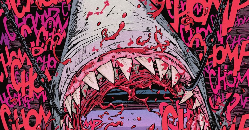
The lettering from AndWorld Design is the standout element of the book, specifically in its ability to exaggerate and heighten the world. The letter works in perfect sync with Crabtree’s colors, creating vibrant, bombastic onomatopoeias and SFX that beg to be adapted in Dolby Atmos soundscapes. The most striking, and sometimes almost oppressively rendered lettering choice is the mawing of the shark’s severed head, literally stealing every page that it appears on. When that shark’s head opens its jaws and begins to consume the page, the lettering, and coloring pair into this red, blood-inspired text that washes over and calls to mind gory and violence, even before teeth meet flesh. It’s a compelling and visually stunning choice that pays off and makes the book one of the most vivid examples of lettering from a book from the Big 2 (though, the Hill House lines do always feel a step closer to the indie scene over the usual DC fare).
Final Thoughts
Refrigerator Full of Heads is a schlocky, visceral action story in the best possible ways. It’s a book that starts with the foot on the gas and doesn’t let up in any component of the book, from its gory, Viking-inspired story to choices in lettering and color that make the book's action sequences scream bloody murder. Any fan of high octane action stories and pulpy, wickedly devious fun will find something to enjoy in Refrigerator Full of Heads, no matter if they’re familiar with the original series, Basket Full of Heads.
Refrigerator Full of Heads #1-6: Blood in the Letters
- Writing - 8/108/10
- Storyline - 9/109/10
- Art - 8/108/10
- Color - 9/109/10
- Cover Art - 9/109/10