


Refrigerator Full of Heads #2

Recap
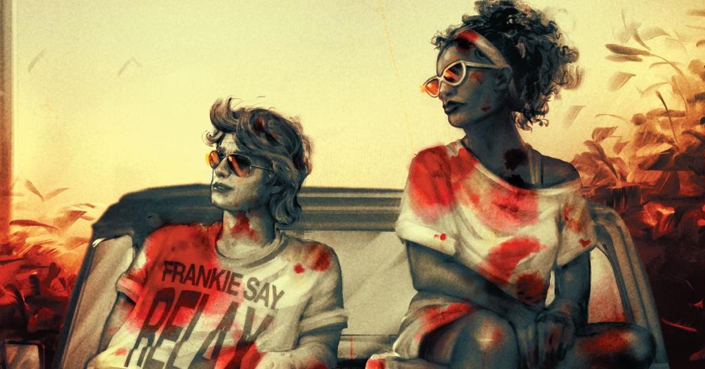
It took Cal and Arlene one day on Brody Island to piss off a homicidal biker gang-and to find the magical axe so memorably wielded by June Branch one year ago. But what else have Cal and Arlene come to Brody to do? And now that you mention it…where is June Branch?
Review
Lettering is the secret tool that can make or break a book. The best books are the ones that employ a lettering style that allows for the flow of a book to move uninterrupted, while still bringing something to the way in which the story is told. Poor lettering distracts from the art on the page, while great letters enhance it. Refrigerator Full of Heads #2 written by Rio Youers, with art by Tom Fowler, colors from Bill Crabtree, and lettering from AndWorld Designs, is an issue that can be sold on its letters alone, raising a mild sophomore outing into a thrilling read.
Youers’ script feels mostly expositional, with flashes of action. It helps to build the connective tissue to the original series but makes it feel like a slog for readers picking up this book on its own. It’s easy to see that narratively this is probably the calm before the story, but for a book promising Norse weapons and sentient decapitated heads, Refrigerator Full of Heads #2 is lacking in both categories. This issue feels like a stopgap to a more interesting issue, and it’s understandable why it would be issue two in the layout of the narrative. Youers hooked in the audience with a bloody break-in, and axe vs shark fights in the last issue, but only delivers a single biker fight in this issue. Hopefully, as the script and book continue, the balance between action and plot will be a little more balanced, feeling more like the first issue over this second one.
Fowler’s art feels restrained, only getting to stretch in the book’s two action sequences. The thrill of the art is how Fowler renders the bodiless heads moving around and interacting with the outside world. The movement’s frantic and unique, playing to Fowler’s strengths which contrasted with the rest of the book’s sluggish pencils makes it pop in those specific segments. It might be unfair to typecast an artist but Fowler’s definite strength is in the vicious action, but also heightened representations of evil and grotesque expressions. Both are only in the background of the issue, and it feels like a waste of Fowler’s excellent penciling talents.
The lettering and SFX are the best part of the book, with the sequence of a separated head trying to climb up a riverbank and across the road rendered compellingly thanks to well-placed obscenities and boinks. It adds a kinetic feel to the book and helps to sell the fantasy concept of the series, giving agency and weight to an otherwise bodiless premise. Andworld’s lettering is the same flair you’d expect from an Edgar Wright movie, using technical elements to enhance the experience of engaging with the world, taking something mundane and emphasizing just how compelling a boink or chomp can be.
Final Thoughts
Refrigerator Full of Heads #2 is one of those books sold by its lettering. In an otherwise pretty lackluster sophomore issue, it’s the graphics of the issue that draw the eye and keep the story moving, while also reinforcing the premise of the book’s mythologically twinged weapons. Hopefully, with continued use of excellent lettering and the promise of more vicious action sequences, Refrigerator Full of Heads will roll into more interesting territory.
Number of Heads in the Refrigerator: 2
Refrigerator Full of Heads #2: Head in the Asphalt
- Writing - 6/106/10
- Storyline - 7/107/10
- Art - 7/107/10
- Color - 7/107/10
- Cover Art - 7/107/10