


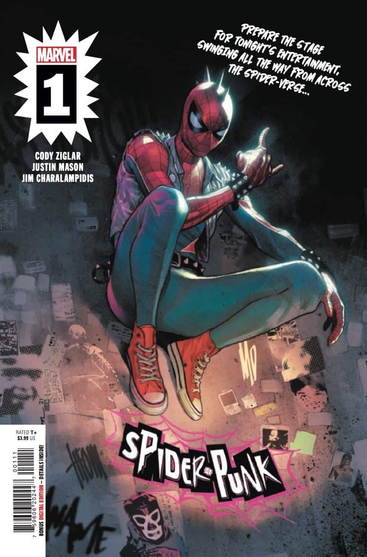
Spider-Punk #1

Recap
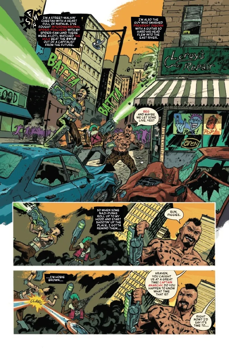
ANARCHY IN THE SPIDER-VERSE! SPIDER-PUNK GETS HIS OWN SERIES! HOBIE BROWN is THE ANARCHIC SPIDER-PUNK — set to protect EARTH-138 with his ax in hand and his chaotic band of punk rockin’ heroes backing him! NORMAN OSBORN is dead, but will the chaos he’s created be too much for Spider-Punk and gang to handle?
Review
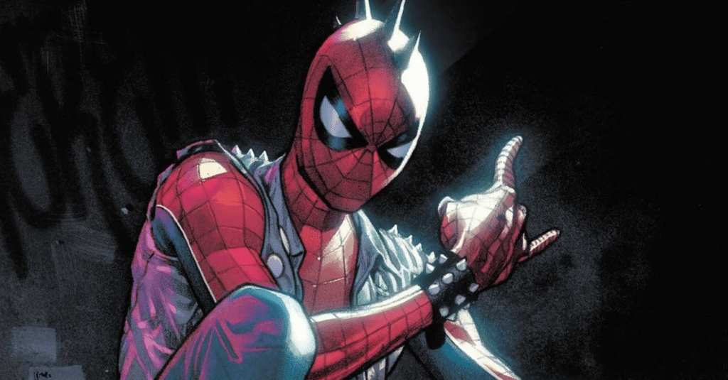
As its cover promises, fans of both the punk-rock Spider-Man variant Spider-Punk and fans of punk as a genre are sure to feel right at home in reading Spider-Punk. Energetic and refreshing, the visuals of Spider-Punk are a lesson in perfectly orchestrated chaos. Justin Mason’s artwork throughout Spider-Punk is dynamic and the issue’s lengthy action sequences are great fun to read. Conversational scenes can drag, but Mason’s use of varied line-weight adds a great deal of raw grit and visual interest to the entire issue. Colorist Jim Charalampidis, meanwhile, places bright, high-impact hot pinks and acid greens against the neutral greys and browns of a desolate cityscape. The frequent use of unfinished backgrounds furthers the comic’s punk aesthetics. Some are splotchy, others have smatterings of screentone, and sometimes the backgrounds fade out entirely. All of them are intentionally amateurish in a way that adds visual interest. And paying homage to Sheldon Vella’s lettering in Spider-Punk’s first appearance, Spider-Punk’s letterer Travis Lanham uses red ink at times where most letterers would simply use bolded type. While the main font used in Spider-Punk feels like an odd choice, the wonkily-shaped speech bubbles and uneven, blocky secondary font both add lots of character.
Of course, punk by necessity has to extend beyond unfinished, handcrafted aesthetics. It needs to be ideologically counter-cultural, too. Ironically, Spider-Punk’s publisher is owned by the largest entertainment corporation on the planet. It’s fun to watch Spider-Punk beat up a neo-Nazi while yelling “Nazi-punks **** off!” in reference to the Dead Kennedys song. But what, readers may ask, does that mean when published by a company that would rather give Punisher a new logo than take on the fascists who have adopted it?
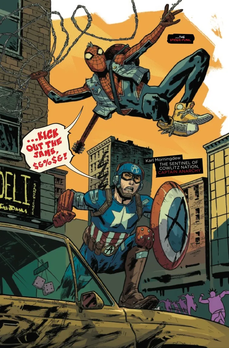
While the creative team doesn’t go meta or take on the House of Mouse, the story they tell is far from toothless. This first issue focuses tightly on a fight between the eponymous Spider-Punk (Hobie Brown) and friends/allies like Captain Anarchy (rather than America) and Iron Heart as they defend their community center/superhero base from high-powered neo-Nazis. The issue also promises further interrogation of pressing social issues like gentrification. Hobie, unlike most other versions of Spider-Man, is Black – as is Iron Heart (Riri Williams). Writer Cody Ziglar has also notably chosen to change Kurt Morgenthau (Captain Anarchy) into Kurt Morningdew, who the narrative notes is Native and queer. Ultimately, all of this comic’s protagonists are victims of systemic oppression: Ziglar’s narrative makes them the face of opposition and depicts resisting oppression as a heroic act. It’s a mystery exactly how far this comic miniseries will go, and to what extent a mass-market comic can be counter-cultural, but it’s a promising start nonetheless.
Final Thoughts
Spider-Punk #1 is a well-crafted, striking introduction to Marvel's anti-fascist arachnid.
Spider-Punk #1: This Comic Fights Fascists
- Writing - 8/108/10
- Storyline - 8/108/10
- Art - 8.5/108.5/10
- Color - 9/109/10
- Cover Art - 8/108/10