


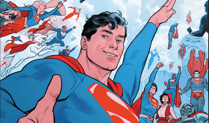
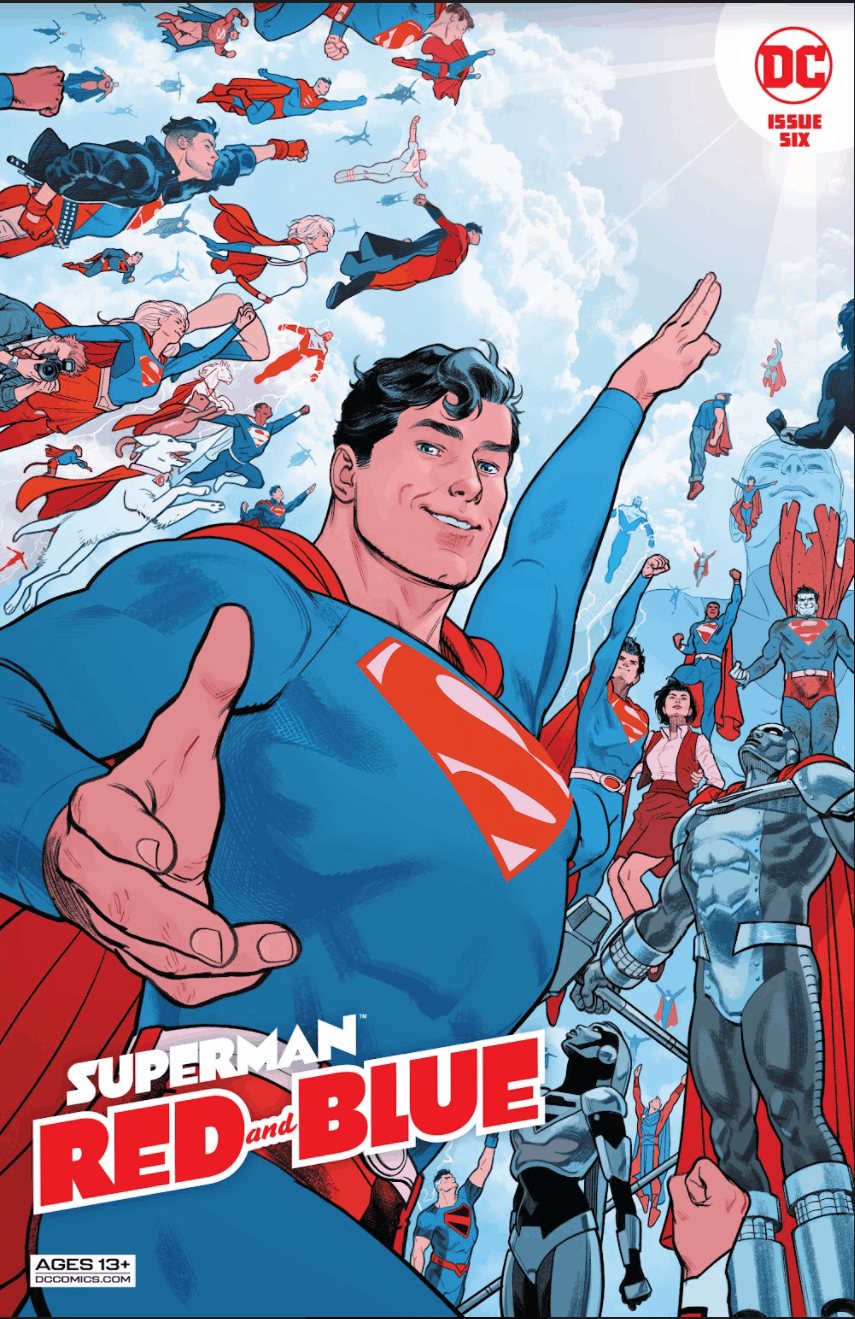
Superman: Red & Blue #1

Recap
This is an anthology of Superman stories, delivered in three colors, in which numerous writers and artists tell important, emotional stories about Superman.
Review
You’d think that I’d be sick of these gimmicky tri-color books by now, but this one is absolutely delightful, so I’m going to say no. I’ve dedicated a paragraph for each mini-review, so that nobody gets shortchanged.
Streaky the Supercat: Hissy Fit
Art and story by Sophie Campbell
Edited by Brittany Holzherr
This pastel, wordless story imagines what it would be like to live with a superpowered cat. Streaky is profoundly realistic, for a cat with superpowers: using his Laser Eyes to destroy first the crate, then Superman’s face, and being fascinated by toys. If you’ve ever lived with a real cat you can imagine what a Kryptonian kitty would be like.
Everyone else can read this book.
This story gives us a nice glimpse of Superman’s classic patience, as he moves house while trying to wrangle a hissing ball of invulnerable rage that just so happens to be shaped like a kitty.
The art is charming, reminiscent of Golden Age work, and the use of red in a way that indicates fear and anxiety rather than rage was incredibly clever.
The Scoop
Writing and art: Matt Wagner
Colors: Brennan Wagner
Letters: Dave Lanphear
This story deals with a 1940’s-era Superman struggling as a journalist to get people to pay attention to ‘the story behind the story’, the injustices that lead to the crimes that Superman stops, but having to struggle past his own publicity in order to do it. This installment was well-told, powerfully affecting, and beautifully rendered. But there was one fairly major problem that stuck in my craw a bit.
Lois Lane is more than a publicity hound. She always has been. Having her willfully overlook the important truths that Clark was pushing didn’t read as the competitiveness that she’s famous for. It read as shallow sexism. That could be a call-back to her ‘Lois loves Superman’s era, but she was mercenary, here, in a way that struck me as slightly out of character.
Having said all of that, I genuinely loved this story. The art (juxtaposing Clark’s quiet heroism against his alter ego’s flash) was beautiful. The colors were well planned.
It was a lovely piece.
The Special
Writer: Tom King
Art: Paolo Rivera
Letterer: Steve Wands
Editor: Diego Lopez
Read this story if you feel the need to cry your eyes out. Nothing much happens. It’s just a few pages long. A couple vignettes, taken across the life of Clark Kent,and set in the corner diner.
But I am telling you now, this story is a gift.
I’m not going to give you any more than that, because I want you to experience this story the way that I did. As a surprise, a delight, a kick to the guts and a balm for the heart.
Take it as a little something special, to carry you off through the week.
The art is gorgeous, totally affecting. Faces are the focus, here, and Rivera uses them well.
There are many reasons to buy this anthology, but if you ignore all of them, if you can resist those other charms, buy it for this.
Son of Farmers
Writer: Darcie Little Badger
Art: Steve Pugh
Letters: Pat Brosseau
Editor: Jamie S. Rich
Assistant Editor: Brixie Mathieu
The premise of this story seems simple (Clark learns lessons on the farm, which Superman later applies) but it takes a hard left turn into unexplored territory when Superman is presented with a problem that only a human could fix: giving a man chest compressions to restart his heart.
The story is presented in such a way that we are given stories which seem (very quickly) to devolve into tragedy: a man getting shot, a man drowning, an elderly homeless woman dying of exposure. Luckily, the lessons Clark learned from his parents enable him to see the things that other people miss, and to save the day in whatever way he can.
The colors in this story compliment the art in a way that is striking and effective. I’m not used to seeing so much pink on a page, but it worked for the story.
Ally
Writer: Rex Ogle
Art: Mike Norton
Letterer: Steve Wands
Editor: Diego Lopez
‘Progress’ Pride Flag designed by Daniel Quasar
This story was told from the perspective of a young man who was struggling with the decision to come out to his family. It was nice to see an example of how it helps us when our heroes encourage us to be our best, most authentic selves.
For the sake of the story, we’ll ignore the fact that many LGBTQ youth have homes which would not be supportive, or families who may cause them harm if they came out. My parents were not particularly happy when I did. But if this story reaches a kid from a good family and encourages them to be honest, with their loved ones and with themselves, it will have done a service for the world.
The art was fantastic, beautifully symbolic. The world seems so much duller when you are in the closet, and this story illustrated that beautifully. The way that the colors leapt in when the boy opened his shirt and revealed the truth left me positively breathless.
It was a perfect ending to a gorgeous anthology.
Final Thoughts
This book takes a premise that has become something of a gimmick among the Big Two, the monochrome anthology, and elevates it into something approaching high art.
Superman: Red & Blue #6: Tricolor Delight
- Writing - 9.5/109.5/10
- Storyline - 10/1010/10
- Art - 10/1010/10
- Color - 9.5/109.5/10
- Cover Art - 9.5/109.5/10