



Terminal #1

Recap
Robert Kirkman (Invincible) and Joe Casey (Uncanny X-Men) are two writers who carry a lot of weight in the industry between them, especially at Image Comics, where their respective types of storytelling have thrived with books like Oblivion Song or Dutch. That storytelling has focused on violent action, brutal twists, and the occasional dark deconstruction of the superhero genre.
Review
While not set in the Invincible universe as far as we see in issue #1, the idea of Robert Kirkman doing to X-Men what he did with Invincible is an interesting enough hook for Terminal #1 to market itself on. Marketed as “perfect for fans of INVINCIBLE and X-MEN,” Terminal #1 naturally carried the expectation of over-the-top violence and genetic superpowers that significantly alter the lives of the heroes and villains who wield them.
Terminal’s storyline begins with an intriguing hunt for one character’s missing sibling, Alessandra. This search unveils the secret global war being waged by two teams, one of heroes and one of villains, each wielding genetic superpowers. In action scenes, those powers become gruesome despite their simplicity. And simplicity is the name of the game when it comes to Terminal’s first issue, as everything from the narrative to the characters are all things readers have seen before in other comic books. Readers are never given a reason they should care about the characters or their stories, instead the story relies heavily on its visuals to keep readers engaged.
As the plot unfolds and we learn a limited amount about the secret war marketed in the issue’s solicitations, we eventually see the headquarters of the good guys. A large compound on a private island owned by the leader of the heroes, hard not to see the inspiration, which is made even clearer when we see its underground bunker about halfway through the issue.
As this is where the first story twist comes into play, I won’t spoil anything more other than to say that while somewhat unpredictable, none of it really differentiates Terminal from its influences. It all feels like ’90s X-Men, full of edge and action, and that’s something certain readers will love while others will not.
The reason many of the iconic X-Men are so unique is because you have characters like Nightcrawler or Colossus who look human but mutated. The villains have it, that despite all sharing the same red lines and eyes from their “Obelisk,” they all have unique mutated appearances that make each one of them memorable and visually interesting. Beyond just their designs, each of the heroes has generic codenames such as Crusher, Racer, Breaker, and Thrasher. These, compared to the villain names like Phantasm, while still generic, are far less evocative and read like background characters in a spoof TV sitcom from the 80s.
None of those characters ever show much personality either, even Crusher, who a large part of the story revolves around, is a gruff, no-nonsense type that has been done over and over again in superhero-centric comic books already. The character personalities don’t influence the story, affect scenes, or do much of anything aside from provide a reason to give some characters a bad case of RBF.
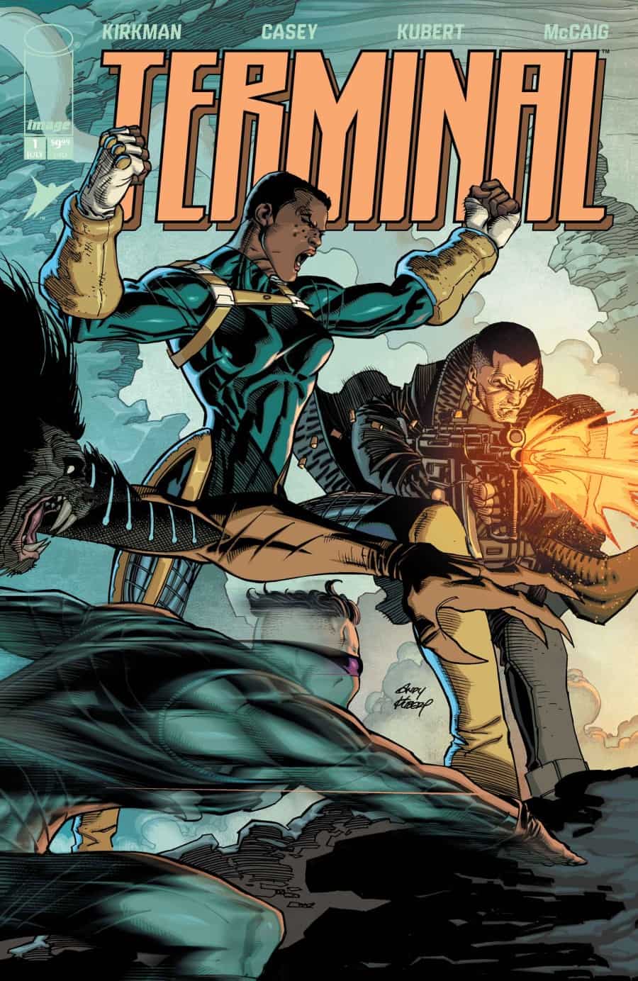
Andy Kubert (Superman: Up in the Sky) is known for his highly detailed artwork that packs characters full of bulky muscles with precise line art. Aside from the characters, the backgrounds and environments in Terminal #1 are packed full of numerous small details that make each scene feel like it occupied a larger space than what the art is actually showing to the reader. Each page varies the layout of the panels and the number of panels on the page. Some scenes play out slowly over five or six panels while others, like a fight between two characters, are compacted into beat-by-beat four-panel sequences that help alter the flow of the story’s pacing.
Dave McCaig’s (The Sacrificers) colors are not quite as sharp as Kubert’s line art in this issue. The characters each have a plastic texture to them, which makes them look more like characters in a video game. All of the special effects, such as the Imp’s fiery hands, also carry this same plastic texture. The uniformity of it all brings down the immersion somewhat when paired with Kubert’s bulky, precise lines.
Final Thoughts
By the end of it, even with its last page hook, Terminal #1 felt just decent. While Kubert’s artwork is strong, nothing in particular about the story or world carries a certain wow factor readers look for when diving into a new ongoing series.
Terminal #1: To Me, My Knock-Offs
- Writing - 7/107/10
- Storyline - 6.5/106.5/10
- Art - 8/108/10
- Color - 7/107/10
- Cover Art - 7/107/10