


That Texas Blood #17

Recap
"THE SNOW FALLS ENDLESSLY IN WONDERLAND," Part Four
Sheriff Joe Bob recounts the 1988 murder of his predecessor as the RQK invades the home of his next victim.
Review
Color and tone usually go hand in hand in comics, the palette of a book giving a small insight into the atmosphere of a book. For example, a lot of bright, vibrant colors can signal a more lighthearted, straightforward adventure tale, while a stark use of black, white, and grays may indicate a twisting crime noir story, where life’s harsher and the world isn’t clear cut. Just like any other part of the craft, that use of color can also be used as a tool of subversion, inversing what the audience is expecting into something new and different.
A bright, warm palette paired with that harsh detective story puts the reader on its toes in the same way a dark and gloomy look can give an edge to the adventure tale. An issue like That Texas Blood #17 – written by Chris Condon, with art, colors, and letters by Jacob Phillips and coloring assistance by Pip Martin – understands the power of color, and segments the book using it, giving two equal palettes to reflect the horrors in West Texas.
Condon’s script is a masterclass in restraint for this issue, delivering Phillips numerous chances to render silent and sparse pages that haunt. The rhythm of the script is perfect, jumping between the Red Queen Killer’s home invasion, Joe Bob unloading what’s eating at him, and Lu’s lucky detour to check on Red, the late Patti’s remaining family. The crux of the issue is Joe Bob’s talk with his deputy and recounting the event of the Fourth of July, and how he was powerless to stop the death of Ambrose’s previous sheriff. It’s a struggle that Joe Bob couldn’t stop the almost biblical murder/suicide of brother and brother, and even though he rationally knows he couldn’t do anything else, he’s still haunted by the moment.
Condon doesn’t get poetic or fill the dialogue with fluff, but you can’t help but hang on to every word Joe Bob says, his cadence, and the emotion behind the words cutting long and deep. In a comic, monologues can sometimes miss due to the art being a match for the words, or the difficulty conveying large bits of speech without an oral component. Here, Condon and Phillips knock it out of the park, the art matching that rhythm and rendering the raw emotion (or lack of) across Joe Bob’s face, and in his eyes.
Phillips carries that emotional storytelling when he and Condon switch to the Lu plot, as she comforts a Red that’s broken down. She helps clean his injuries sustained from a fit of anguish and offers to take him home. It’s a parallel scene of comfort to the Joe Bob confession, setting up the wounds that fester in Ambrose. While Joe Bob recounts and explains his weight, Red is much more stoic and doesn’t put to words much. He doesn’t explain how he hurt himself, and he never mentions Patti’s name, but he’s struggling with the fact the world is not right, and it’s evident in Phillips’s linework.
Shattered glass, blood, and bandages, slumped shoulders are what draw the eye to these panels. Towards the end of this story, Red gives a little, and thanks Lu for taking care of him when he’s needed it most, and it’s a small step in the same way Joe Bob takes his step of opening it. It’s too bad that that small step is leading to more tragedy based on the last page reveal.
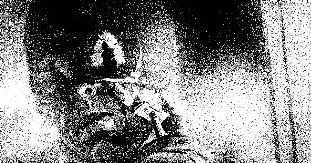
The other plotline is the most harrowing and sparse, only utilizing a few minor SFX while the killer explores Lu’s home. The imagery and actions are clear and concise but speak to the flagrant disregard the killer has for others. He’s comfortable enough to make himself at home, taking from the fridge, enjoying the bathroom, and even lingering in the dark, his mask silhouette in the dark like previous issues. RQK is like an old friend with a key, just waiting for Lu to return home, happy to make himself at home.
The art lends to a strong desire to see Phillips draft Spider-Man, in large part thanks to an extended scene where the RQK lifts his mask for a sandwich and a shave. Phillips has done a stunning job of giving life (twisted as it is) to the mask of RQK, and it would be great to see him do that to a mainstream superhero like Spider-Man, whose mask should be a little unsettling. The casual silence of the scene is deeply unsettling, contrasting the transgression of these mundane tasks. RQK is violating the homeowner’s space in these moments, leaving an imprint on the home, which is a microexpression of what his murder has left on the county. Phillips’s art shows incredible restraint in these moments, the lack of calling attention deepening that perversion of the space.
The use of orange in the flashback is both evocative of the Christmas Special (#13), and also an arresting choice in coloring, contrasting the harsh yet calm white of winter. The orange is evocative of summer when the memory takes place, but it also adds an almost sepia aesthetic, harkening to Joe Bob’s use of a “Hollywood movie” framing device. It’s fitting the sequence takes place on the Fourth of July, as the holiday lends connotations of summer and fireworks to the orange hue.
The orange also serves well to highlight the reds of the carnage that occurs, making the action of the shooting, along with the resulting viscera, stand out on the page. It gives the action and the fallout a heft that carries over to Joe Bob, and it becomes clear why he’s been so troubled throughout this arc. It’s a burden of carnage that the hardest of people would have difficulty shaking, and in the intercut panels where Phillips returns to the present-day Joe Bob, that burden is there, on the surface of his face.
The contrast of orange and blue creates two completely separate, but equally engaging sequences, and Phillips heightens that dichotomy on the page through his lettering choices. The sequences in Lu’s home, in the winter, feature no word balloons or captions, populated by sparse, small SFX. On the other hand, the flashback sequence bathed in orange is filled with word balloons and oppressive onomatopoeias that become the background of panels. It’s a great touch that illustrates Phillips’s range as an artist, colorist, and letterer while showcasing the range of violence and violations that Ambrose faces. Both sequences are harrowing, but the flashback in orange is like fireworks, loud and bombastic, while the home invasion in blue is quiet and chilling.
Final Thoughts
That Texas Blood #17 is a masterclass in sparse storytelling and the power color holds over the tone of a comic, using both to tell a story of the trauma violence creates, and the implicit horror of a home invasion. Condon’s script and Phillips's art/colors are a perfect match as always, and never miss a beat in reminding why That Texas Blood is one of the most visually interesting and thematically rich neo-noirs in recent years.
The book’s last page reveal will shake you to your core, letting the imaginary horrors waiting to befall people in pain take root while waiting for the next issue. Writers, artists, and colorists should pick this issue up to see just how powerful the various aspects of the craft can be to enrich an atmosphere. That isn’t to say everyone else should skip this book. Anyone who just wants to be chilled to their core will love this issue and the series at large.
That Texas Blood #17: Fire and Ice
- Writing - 10/1010/10
- Storyline - 10/1010/10
- Art - 10/1010/10
- Color - 10/1010/10
- Cover Art - 10/1010/10