


The Amazing Spider-Man #13

Recap
Hobgoblin’s story comes to a chilling end, and no one is going to be rocked harder by it than Norman Osborn! Witness the birth of the Gold Goblin! What does this mean for our Friendly Neighborhood Spider-Man?!
Review
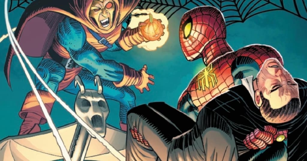
The Amazing Spider-Man #13 – written by Zeb Wells, with pencils by John Romita Jr. inks by Scott Hanna, colors from Marcio Menyz, and letters by VC’s Joe Caramanga – continues its short Hobgoblin storyline, as Peter attempts to reconcile the last issue reveal of both Rodrick Kingsley and Ned Leeds wearing the suits. Meanwhile, Norman Osborn is still in the hospital and struggling with whether or not to get involved in the fight. As Peter is beaten down by the two Hobgoblins, Norman takes action and dons what we know is the Gold Goblin suit, which is set to play a pivotal role in the upcoming Dark Web crossover.
Wells’s script for this issue pulls together better than the previous, still lacking the sweaty tone established with the first issue of this mini-arc. The issue is primarily one long extended fight sequence between Peter and the Hobgoblins, and there’s no execution of Peter’s cleverness or ingenuity in the fight, just a willingness to accept his death at the hands of the foes before Norman arrives. That decision for Peter’s character is a direct contrast to what was established leading up to this run, as the Beyond storyline watched him recuperate and regain his confidence under the direction of Black Cat and Captain America.
The issue, like Peter, feels like a half-hearted attempt at delivering something new, but functions as little more than the building to something else. Wells’s cliffhanger for the issue reveals that someone else is manipulating both Kingsley and Leeds, taking away agency from both Hobgoblins and making them pawns for the next story arc, ensuring that this story was just another bit of prelude to upcoming stories.
These first 13 issues read like a checklist of beats that needed to be laid out before a full story could be told, but then again, Beyond was in a similar position, along with the teases of what happened between the two. There’s nothing wrong with some place setting and mystery, but when it overshadows the entire run, it makes for a read that’s about as interesting as a Wikipedia entry with great art.
The book’s art and coloring are by far the selling points of the series, with Romita Jr., Hanna, and Menyz hitting a stride that lets them tell a cohesive visual story while tweaking their look and formula for the book. The fight between Spider-Man and the Hobgoblin duo is well rendered, with Romita blocking and composing stunning shots that sell the desperate Peter and furious Goblins.
There’s a standout panel where Spider-Man hits the roof of a building after having been in flight with the Goblins, and tumbles across. He’s got a nasty cut across the back of his costume, and Romita illustrates the movement by utilizing six outlines of Peter in the panel. The first and last are colored typically, with the four in the middle rendered with simpler lines and flat colors. Each position of his body is connected by the cut, with his blood creating arcs that sell the trajectory of the body. It’s a stunning use of color and inking to sell the physical toll the fight is taking and showcases the inventive craft of the art and coloring on display in this title.
Menyz’s color is the other strong element of this book, working with Romita’s distinct style to ensure figures don’t appear too blocky or distorted. The use of strong colors that are a little muted fit perfectly with the story that was set up at the beginning of the arc, and it’s a shame that the story moved away from that tone, as it gave a new life to the book. Menyz’s color pairs excellently with the rooftop fights, and his use of muted colors in the described sequence does an excellent job of showcasing his palette’s range.
Menyz also brings in a strong resonance of color in the energy gauntlets that the hobgoblins are using, illuminating half the page with an orange surging energy applied directly to Spider-Man’s face. The coloring goes hand in hand with the brutal art from Romita and Hanna, giving the issue an edge that makes it great to look at in isolation.
Final Thoughts
Amazing Spider-Man #13 is a slightly more cohesive, but just as disinteresting installment of the web-crawlers ongoing story. Like many of the other stories in this run, the issue reads like a prelude to another story coming down the line and tries to mask it with an extended fight sequence. The sequence is well illustrated and colored, but can only do so much to keep the reader engaged. It’s a shame that Romita Jr., Hanna, and Menyz are doing some of their best and most innovative work on such a bland story, as it could be an opportunity to visually refresh Spider-Man for a new era. The next issue kicks off the Dark Web crossover, and it’ll be interesting to see if the book shifts gears, as it seems Wells has been building this entire run to that story in particular.
The Amazing Spider-Man #13: Beyond Prelude
- Writing - 5/105/10
- Storyline - 5/105/10
- Art - 8/108/10
- Color - 8/108/10
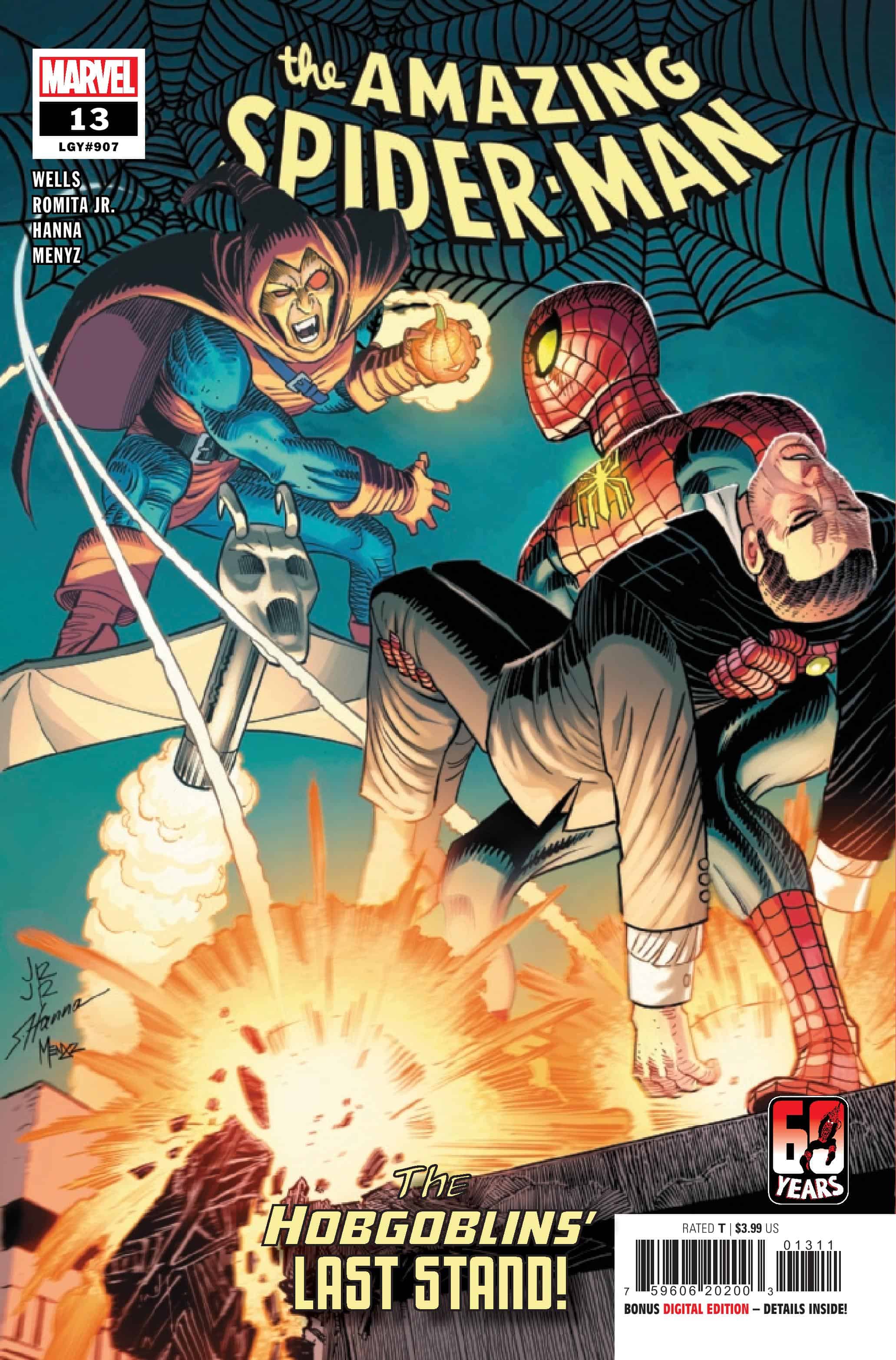
- Cover Art - 8/108/10