


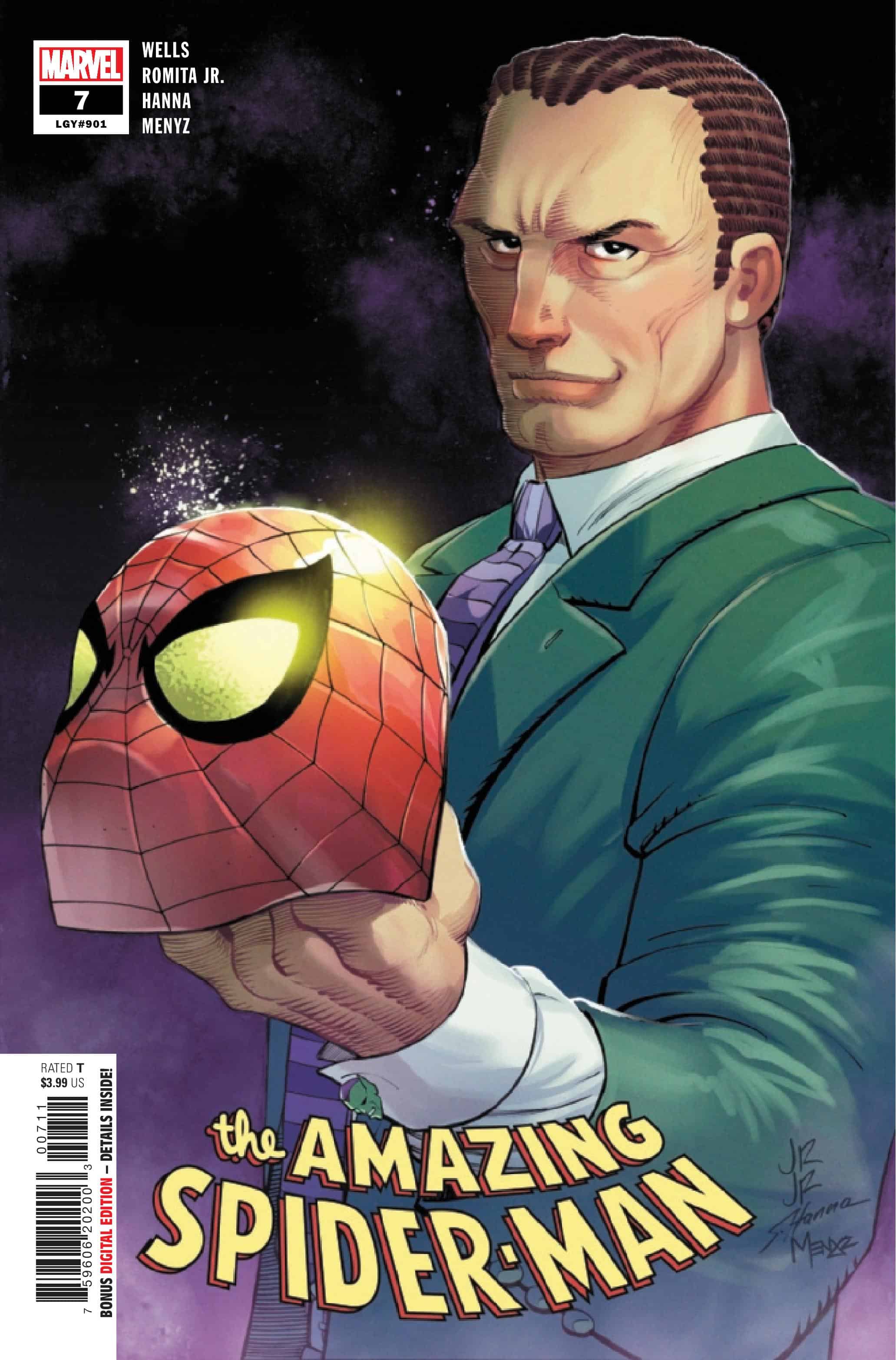
The Amazing Spider-Man #7

Recap
Norman Osborn is back! But what does he have planned for Spider-Man?! One of the biggest Spidey status quo changes in years is here!
Review
The Amazing Spider-Man #7 (or 901 according to Marvel’s legacy numbering) is written by Zeb Wells, with pencils from John Romita Jr., inks by Scott Hanna, colors from Marcio Menyz, and letters by Joe Caramagna. The story picks up with Norman inviting Peter to see the new Oscorp and sees the former trying to recruit Peter to work for him. Outside of a fun cameo from Kamala Khan, the storyline serves as a preamble for future issues, based on information surrounding Norman’s role in the upcoming Dark Web crossover. The back half of the issue then deals with the Vulture and his quest to kill Spider-Man after their shared adventure in the previous issue. It’s a route, by the Spider-Man plot, that Wells executes in the tamest way possible. This could be a description of the entire run at large, which is a middling story paired with some of the best art from Romita Jr. in years, that serves to just set up future events and storylines.
This issue takes place before the Hellfire Gala one-shot, which sets up plotlines for an upcoming crossover with the X-Men. In reality, this arc is one big fill-in story, working to catch readers up to the Gala and the Dark Web Free Comic Book Day issue. That’s a problem for a series that has struggled to feel like more than treading water to events and landmark numberings. In a time where Spider-Man is less a must-read series, and more a chore, having the series feel flat does a disservice to one of Marvel’s most iconic characters. In a publishing landscape where The Eternals, Daredevil, and more are enjoying a renaissance with passionate creators and seminal runs in the making, the fact that Spider-Man’s not a bedrock of the line is troubling.
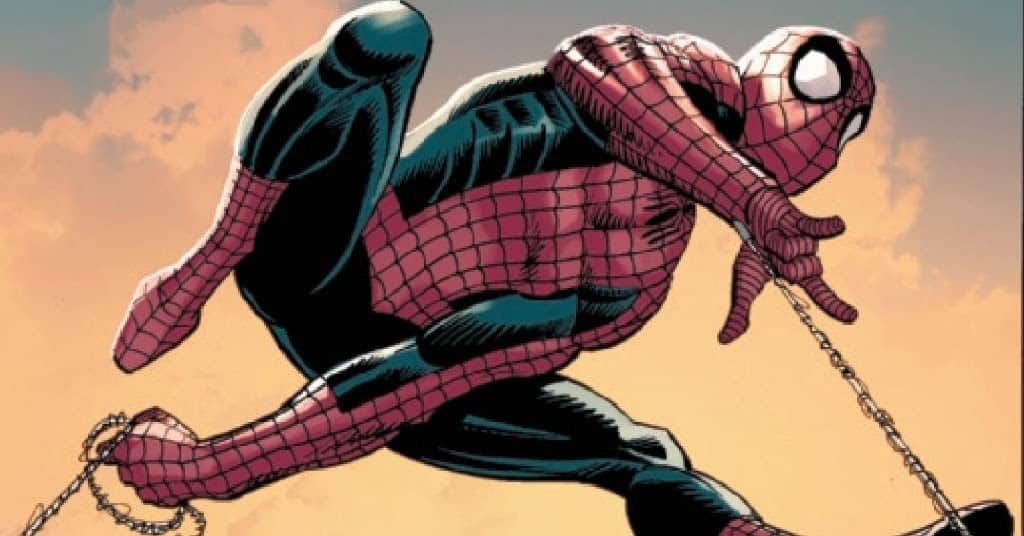
Romita Jr. is at his best when he gets to take big swings in his compositions and panel layouts. Romita Jr.’s method of rendering web-swinging, shown from a distance with Spider-Man in silhouette, a web moving forward, and another behind, is a simple but effective way to give motion and a strong shape within a panel. That image paired with a fun splash page of Spider-man and Vulture locked in an aerial battle over New York is great, and Romita Jr. tilts the page in a sequence reminiscent of the Court of Owls maze from Greg Capullo’s time on Batman. It’s a moment that forces the reader to reorient their perspective toward the page and sells the height of the fight. The shame of this series is Romita Jr. is inspired by the character and his return to Marvel, and his talents are wasted on this book.
Final Thoughts
The Amazing Spider-Man #7 is another lifeless entry into the multi-year, multi-run wheel spinning of Peter Parker. Between a script and storyline that feels like bait for more interesting stories and loosely defined status quos for characters, the issue is only saved thanks to Romita Jr.’s excellent pencils and sequential storytelling. With Dark Web only a few issues away, the crossover will be a make or break for this run. It can still deliver by finding its footing and delivering a compelling story to match the art, but based on the previous entries into The Amazing Spider-Man, that seems more unlikely with every issue. There’s almost no instance where this issue can be recommended, other than to enjoy the Romita Jr. art and layouts, but the story, characters, and tensions all leave a lot to be desired.
The Amazing Spider-Man #7: Leap of Quality
- Writing - 4/104/10
- Storyline - 4/104/10
- Art - 9/109/10
- Color - 8/108/10
- Cover Art - 8/108/10