


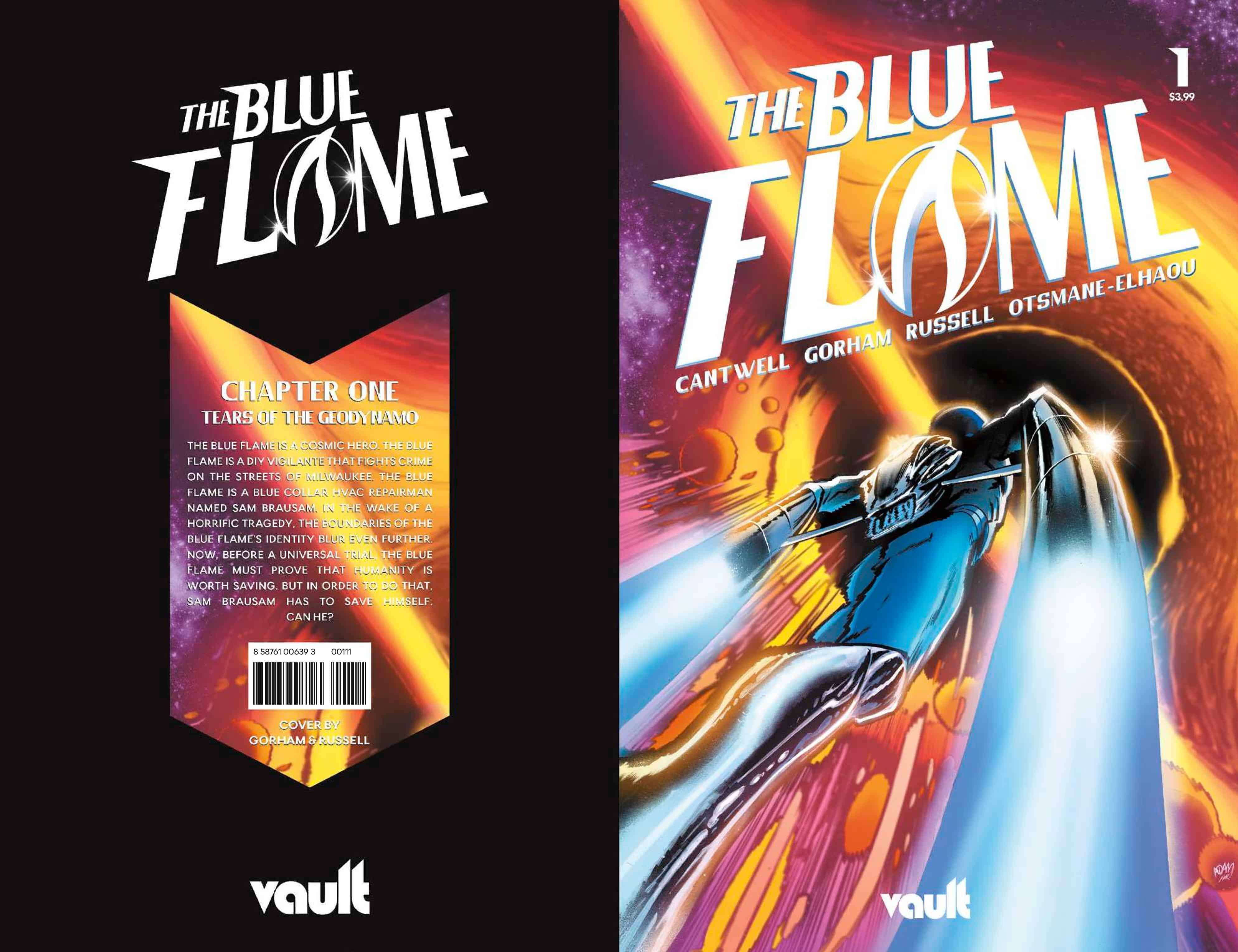
THE BLUE FLAME #1

Recap
The Blue Flame is a cosmic hero. The Blue Flame is a DIY vigilante that fights crime on the streets of Milwaukee. The Blue Flame is a blue collar HVAC repairman named SAM BRAUSAM. In the wake of a horrific tragedy, the boundaries of the Blue Flame’s identity blur even further. Now, before a universal trial, the Blue Flame must prove that humanity is worth saving. But in order to do that, Sam Brausam has to save himself. Can he?
Review
I wasn’t going to review this comic if I’m being honest. I read it over the weekend in that quick cursory way of someone that’s got too many chores and not enough time and my initial reaction was…not too sure what they trying to do here so let’s leave it…but it stuck in my mind and I found myself thinking about it more and more so I came back to it and read it again and I am really glad I did.
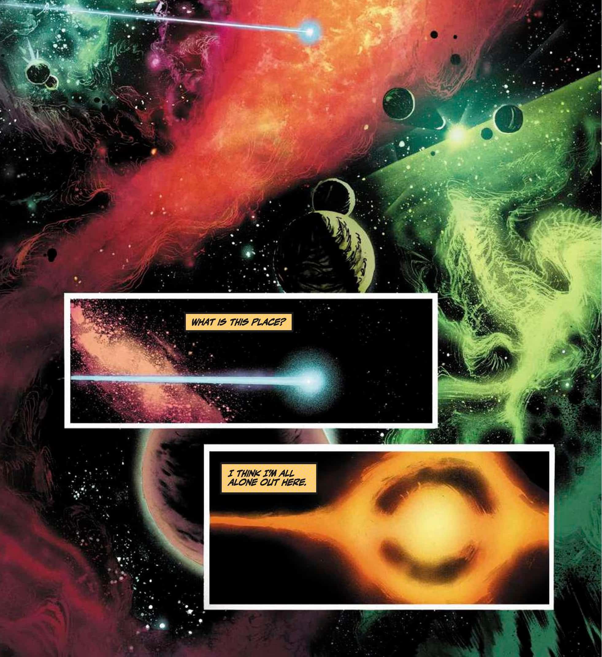

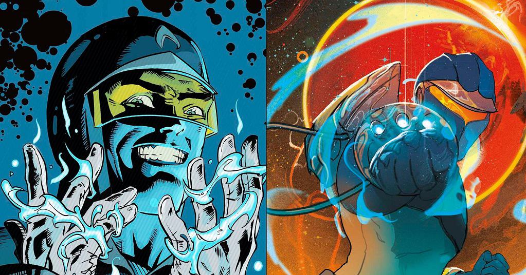
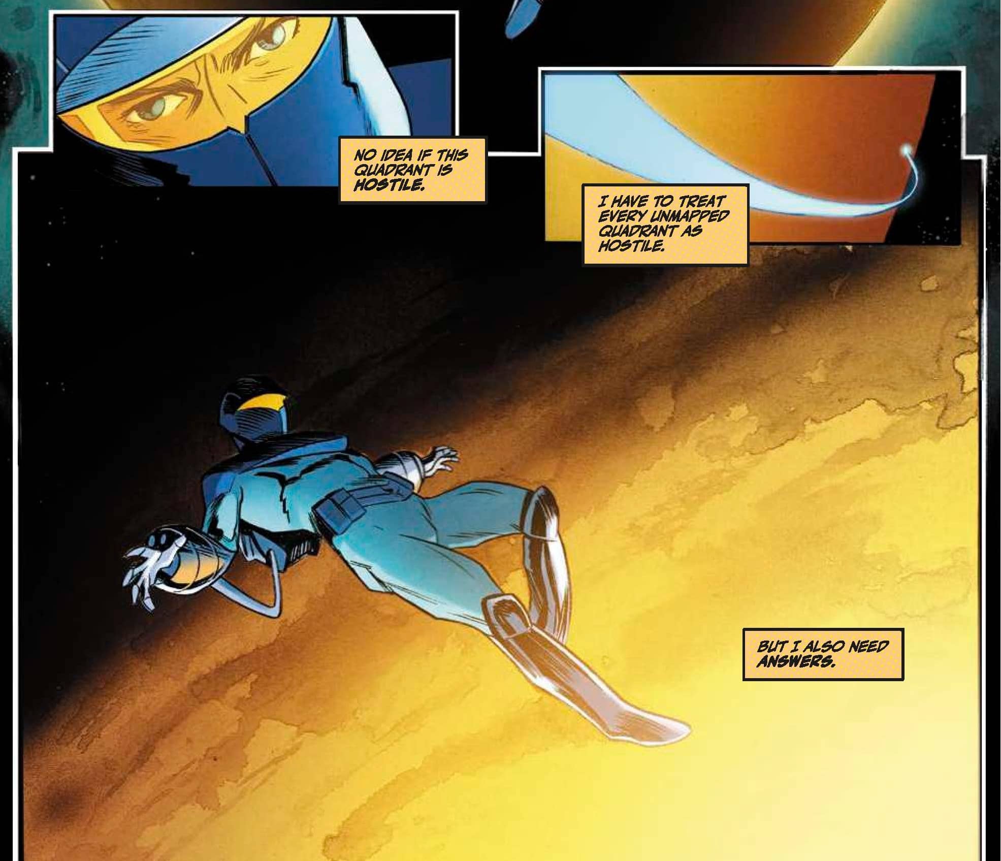
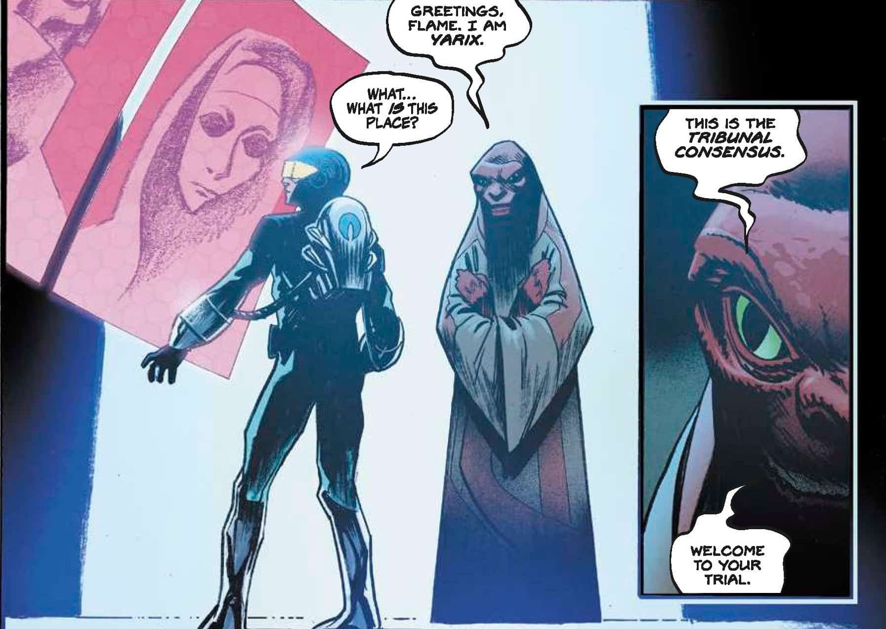
On the face of it, the issue seems like two completely different comics…One is a majestic grandiose space epic and the art team of Adam Gorham, Kurt Michael Russell, and Hassan Otsmane Elhaou draw it like space operatic reminiscent of things like Flash Gordon, Warlord of Mars, or Calvin & Hobbes Spaceman Spiff (yes you heard me right and we will come back to that comparison in a bit) as hero THE BLUE FLAME finds himself adrift in an unknown section of space, landing on an alien world and encountering an alien species before being put on trial… and then as you get comfortable with that idea a few pages in all of a sudden the story and art change completely and we wake up in Milwaukee in bed with blue-collar repairman by day, popular vigilante by night Sam Brausam as we follow him through his day fixing boilers and into the night as he joins his fellow masked vigilantes The Night Brigade who head out to public appearance. It gives you whiplash as a tragedy strikes it cuts to black and we have the first storyline up side by side with two specific panels.

So what exactly are Christopher Cantwell and the art team doing here? Here’s what I think is happening. Nonlinear storytelling for a start…The opening pages with all of their spectacle and grandiose nature are all happening in our character’s head. If you have ever read Calvin & Hobbes. You’ll know about Spaceman Spiff. Bill Watterson always made these flights of sci-fi fantasy Calvin goes on in his head very elaborate from the alien planets in the background, the strange sci-fi landscapes, and the inevitable weird-looking aliens… the opening of this book reads just like that…a pulp sci-fi idea rooted in the imagination of its central character, in this case, Sam Brausam. Other clues that point to this are the opening narration, the character does not know how they got there or how they will get back.

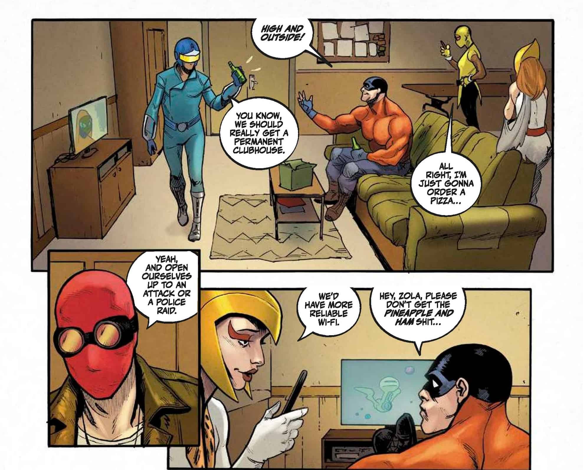
Jump forward to the other part of the story which is the real world and feels like what comes before the opener, we meet the character see his life, meet the people he is involved with and then tragedy strikes. Cantwell does an amazing job of writing the two as completely different. The opener is pure sci-fi pulp while the real world stuff is far more grounded in real-world concerns and characters that talk to each other like they live in the real world. My theory here is that Cantwell and the art team are going to use the pulp adventure in Sams’ head to help him navigate the horrific event he was just involved in by putting humanity on trial with Sam having to defend his species but what he is really doing is using the process to rationalize the horrific event of the shooting he was involved in. Well, that’s what I think at any rate.

Adam Gorham is one of those artists that is hugely talented, criminally underrated and brilliantly versatile. He once again just completely nails every aspect of this book from an art perspective, he’s matched very nicely by colorist Kurt Michael Russell and letterer Hassan Otsmane-Elhaou. The opening pages are pure sci-fi pulp glory ( even the lettering for the opening has that wonderful pulp sci-fi movie font from Otsmane-Elhaou) before changing into a slice of life look and feel to show Sam in his life running up to the events that end very badly. The juxtaposition of the two different feels to the art add a very strong psychological element to everything when you read it more than once.

Special mention here to the covers of this book, The Vault review copy comes with the various covers and I have to say every single one of them is a Rocketeer meets Spaceman Spiff meets pulp sci-fi work of glory.
Final Thoughts
This is a strong compelling opening salvo of an issue that brilliantly uses the sci-fi pulp superhero idea as a gateway to tell the very real story of someone that has to deal with the consequences of a horrible tragedy in real life in an exceptionally unique way. If you like brilliant art and clever storytelling this is one to pick up.
THE BLUE FLAME #1: Lost
- Writing - 9/109/10
- Storyline - 9/109/10
- Art - 9.5/109.5/10
- Color - 9/109/10
- Cover Art - 9.5/109.5/10