


THE SEASONS HAVE TEETH #1

Recap
In a drab, colorless world, the seasons bring change… and also destruction. Andrew, a retired conflict photographer, lives deep in regret after an unthinkable tragedy, but when the seasons arrive–each one a god-like creature–everything transforms. As he risks everything to track down Spring, Summer, Fall, and Winter, will capturing the perfect picture of each be enough to find redemption… and ultimately bring color back to his world?
Review
Some comics rely heavily on the bombastic nature of the stories they tell, then some comics are quieter, deeply mired in introspection, and swaddled in metaphors. The Seasons Have Teeth is the latter type of comic. Its central fantastical conceit is that the seasons themselves are physical entities that move across the earth in seemingly predictable paths, bringing a certain amount of inevitable destruction with them, which humankind avoids by simply evacuating the area till they have moved on. Writer Dan Watters does not address how or even why this occurs but focuses the story through the arrival of Spring in a town where our central character lives. Andrew Bates is a retired conflict photographer, widowed and still profoundly grieving about it. Andrew is a man, arguably in the winter of his life, who wants to see Spring’s touch one more time and to capture that through his camera.

Watters beautifully contrasts the physical and often explosively destructive nature of Spring’s bloom, made frighteningly real with the rebellious brutal arrogance of youth. This time could be called the springtime of one’s life. Watters reflects on this as Andrew remembers his youth and time with his beloved lost Cindy as he moves through the town, seeking to capture a shot of the godlike Spring, leading Andrew to a familiar and special place that stirs his memory. It’s a profoundly reflective comic that captures the true essence of youth and that unshakable belief that we all have when we are young: That we will live forever and why it’s essential for youth to feel that way. This is physically made manifest through silent kids that Andrew encounters and through their willful, destructive action and fearlessness starkly contrasted against Andrews’s own keen awareness of his mortality and the idea of how we become more careful with age, yielding to the “wisdom” of authority and how we stop questioning and defying that authority as we do in our youth. Watters’ writing, combined with the art, does an incredible job of cutting to the nature of things and the ideas it wants to explore. It’s superbly written and captures the melancholy regret of its narrator as it dissects the themes it wants to tackle smartly through the writing and the art.
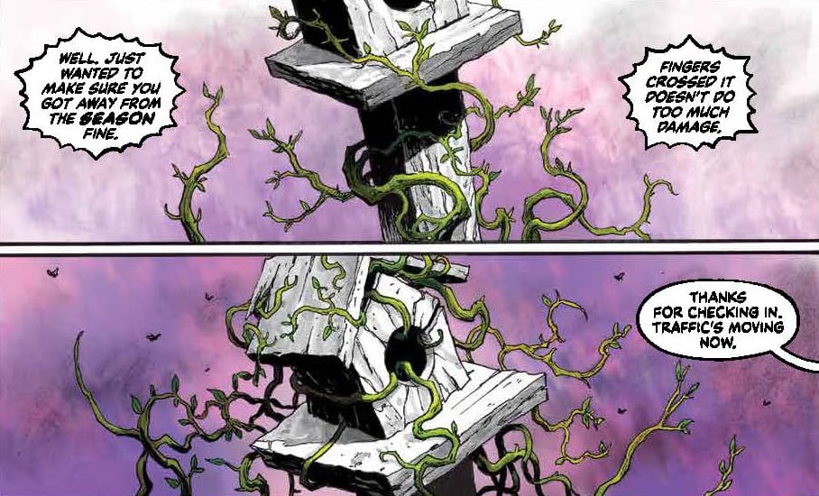

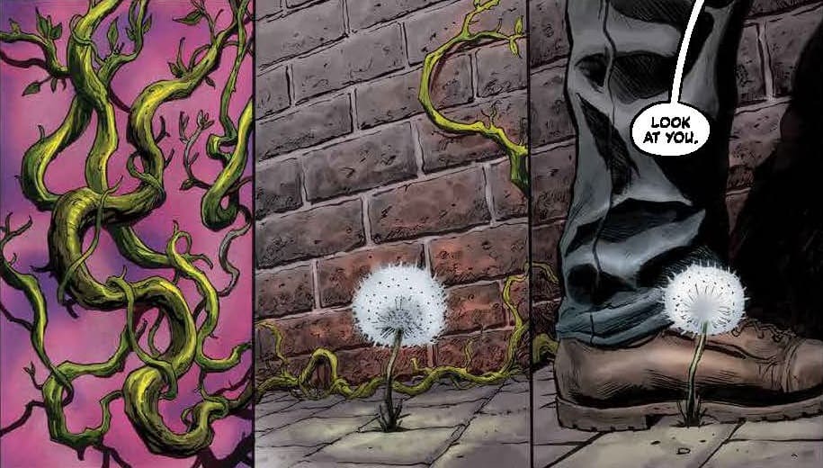
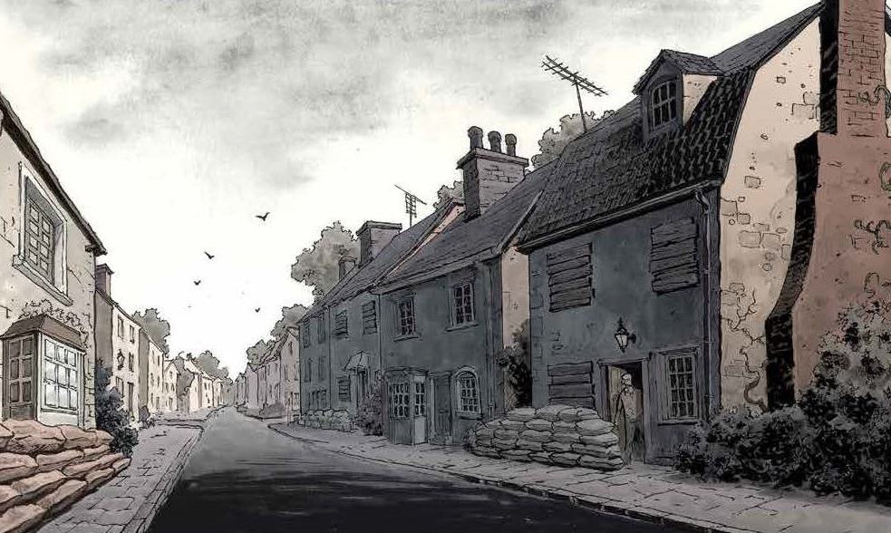
Sebastian Cabrol and colorist Dan Jackson are tasked with bringing this world to life. Cabrol’s style is marvelously photorealistic early on, and he does a superb job of bringing to life the home and small English town in which our story takes place and Andrew himself. There is an atmosphere from the first page that deepens with the appearance and manifestation of Spring. Cabrol then takes the ideas Watters talks about in the script and physically manifests them on the page. That violent, explosively destructive nature of Spring is brought to life by curling green vines that wrap and wind themselves around things and cut a swath of destruction in some places. The silent youths and the destruction they bring when Andrew comes upon them at the park bring physical punctuation to the idea of that arrogance and destructiveness. This is capped perfectly at the end, as Andrew comes face to face with our first season (in a design that’s beautiful and horrible in its eldritch nature) and captures a perfect expression of the ” going to live forever” spirit of youth through a photograph that marries those ideas and the nature of Spring together. On top of this,, colorist Dan Jackson contrasts the story. Andrew’s world is colored in drab browns and greys, reflecting Andrew’s older mindset and the drabness of the world around him with deep greens and purples that reflect the blush of Spring. He doesn’t stop with that use of color for physical reality but then takes the idea of green as a reflection of memory and colors Andrew’s memories of his time with Cindy in their youth and paints them in green from top to bottom. It’s brilliant stuff from the team. Nate Piekos plays with font styles to reflect the “voice” of who’s speaking in the dialogue boxes, and there’s a brilliant use of partial newspaper clips to contribute additive moments to the story.
Final Thoughts
The Seasons Have Teeth #1 is a brilliant examination of several themes including the necessary arrogant nature of youth, the violent clawing nature of rebirth and the effects of loss on the human spirit brought remarkably to life through a central conceit that overlays a fantasy nature to a storyline that uses it's intended metaphors to brilliant effect. A superb effort from all involved.
THE SEASONS HAVE TEETH #1: Spring
- Writing - 10/1010/10
- Storyline - 10/1010/10
- Art - 10/1010/10
- Color - 10/1010/10
- Cover Art - 10/1010/10