The Unchosen #1

Theron Couch
Recap
MINISERIES PREMIERE 13-year-old Aida wakes in a city laid waste by a massive explosion-a scene of devastation that SHE caused. Pursued by rival forces wielding incredible powers, she must discover who truly wants to help her, who wants to control her, and the truth behind her own mysterious past. Acclaimed creator DAVID MARQUEZ (Uncanny X-Men, Miles Morales) makes his highly anticipated debut as both writer and artist on his first creator-owned series.
Review
The Unchosen #1 is reminiscent of many things found in comic books, manga and RPG and JRPG video games. The reason The Unchosen #1 calls so many other things to mind is that it has little to say for itself. The issue has no real hook beyond the general type of story that it offers.
Much of this owes to The Unchosen #1’s near total lack of world building and character development. Only a few things are definitively established. The most important of those is that there is something called “the word” which is the means by which people use supernatural powers and only certain people are capable of using the word. Indeed, at times it feels like Marquez is going out of his way not to supply information. When it comes to the identities and nature of the people fighting over Aida, the writing feels almost deliberately evasive.
Character development is likewise thin. Aida has a power that has done something that no one understands. She is apparently friends with a student named Daniel. There is another student named Ezra who treats Aida poorly. That is nearly the extent of things. A further problem is that Aida, the seeming main character, is more of an object to be fought over in The Unchosen #1 than a character with agency of any kind. As a result, while it is easy to sympathize with her situation, it’s hard to find anything to truly like about her or any reason to want to root for her.
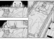
Story construction is the narrative highlight of The Unchosen #1. Marquez introduces Aida in the present day before flashing back to her mysterious origin. Since she has precious little to say for herself during the flashback that makes up almost half of the issue, letting the reader get to know her first is a very smart choice even if there is little for the reader to get to know.
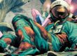
Art is Marquez’s real success story here. He leans into a manga style. The young characters’ faces have minimal detail. They are frequently wide eyed. When they are speaking excitedly, their mouths are often wide to the point of exaggeration. Adult characters are more detailed and less exaggerated–for instance their eyes are thinner and never open as wide, and their mouths are shaped more realistically and never opened wide to the point of disproportion to their face. Marquez applies some shading and additional lines on their faces to accent features. It also ages them (slightly) relative to the younger students. The adults’ eyes are thinner and never as wide.
A similar high level of detail can be found on clothing, objects, and settings. Marquez is very proficient at creating the illusion of depth through a combination of shading techniques such as patches of short, thin lines and areas of straight black. The world comes alive visually even if narratively it is quite thin.
Marquez also knows when to step away and let the book’s colorist shine. His outlines for characters’ use of their supernatural powers are vanishingly thin such that the color choices hide them completely. Marquez does frequently contribute blurred background lines to indicate speed and power. In most cases these are set at angles that correspond to the strike one character is making against another. This kind of emphasis can sometimes come across as superfluous and ineffective, but Marquez uses it to great effect.
Louise’s coloring steals the show in every fight sequence. The color palette she uses for characters’ supernatural powers is bright to the point of neon. Her choices for the rest of The Unchosen #1 are much softer. As a result, these intensely bright whips and staffs and blasts overwhelm everything around them. Combined with Marquez’s emphasis, they radiate power.
Easily overlooked is Louise’s more subtle work with color transitions from light to dark on characters’ faces and bodies. Throwing areas of characters into shadow, especially with rounded borders between dark and light, enhances the detail already present on the characters.
Despite its very limited exposition, The Unchosen #1 is surprisingly text heavy. Even the action sequences are full of dialogue. Hopkins does an excellent job keeping the dialogue bubbles well organized and as out of the way of Marquez and Louise’s work as possible.
Final Thoughts
More than anything else, this is a high quality visual spectacle. Readers who get lost in a comic’s art, especially when it is leaning into a manga style, will find a lot to like. Unfortunately the narrative can’t hold a candle to it. Perhaps there is potential in the future, but it is not evident here. The Unchosen #1 appears to want readers who like a type of story as opposed to trying to win over readers with a unique story.
The Unchosen #1: Gorgeous Art, Limited Story
- Writing - 4.5/104.5/10
- Storyline - 4/104/10
- Art - 7.5/107.5/10
- Color - 8/108/10
- Cover Art - 7/107/10