


Underheist #1

Recap
After his gambling addiction brings David to the lowest point in his life and decimates his personal life, he'd do anything for one last chance at setting things right but the road to hell is paved with good intentions.
He may just be in luck-if he can call it that; the grapevine yields illicit fruit as he learns of a heist, one involving a tunnel system that no one knows better than former NYC subway veteran David...
In this brand new hardboiled heist series with a supernatural horror twist perfect for fans of Phantom Road and Newburn, the hit Stray Bullets creative team of David & Maria Lapham explore how seeking atonement can lead people to do desperate and dangerous things.
Review
Pulling off the perfect heist is hard enough. Add in a character with an old wound from a special, perhaps mystical dagger, and things might not go as planned. Curiosity is piqued in Underheist #1 as a crime story meets up with the supernatural.
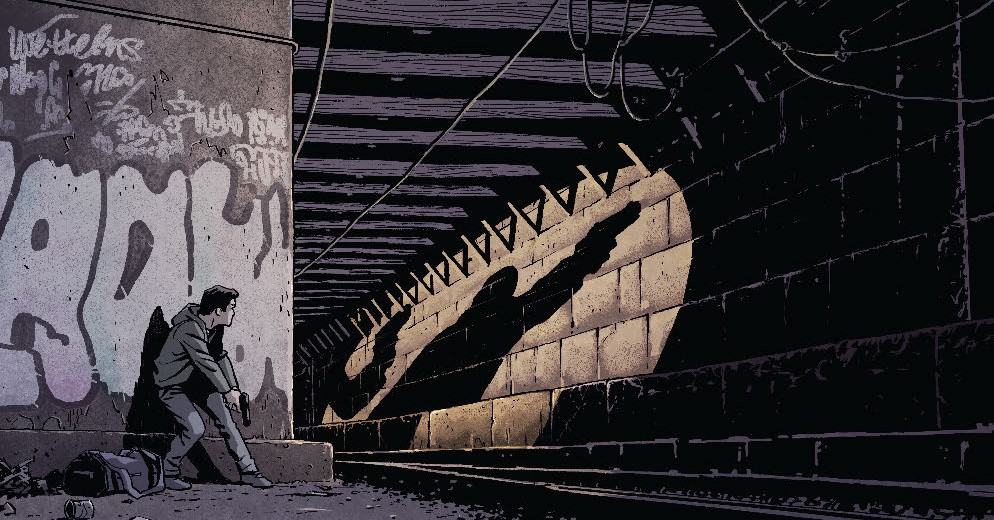
David, Underheist #1’s main character, works construction in old subway tunnels beneath the city. His friend and coworker heard about an upcoming heist via multiple conversations between several family members. This innocent conversation between the two men sparks a thought in David’s mind. He owes a significant amount of money to a bookie who, in the recent past, harassed David and his wife and stabbed the back of David’s neck with a dagger. David hopes to use the money to pay off the bookie and take care of his wife. He recruits friends who likewise have money problems. The thieves carrying out the heist are planning to use the same old subway tunnels to break into a bank and get away with the money. David’s plan is to steal the money from those thieves.
Underheist #1 is a relatively straightforward crime story. As far as this first issue is concerned, there are no sub-genre qualities at work–noir, hardboiled, detective, etc. Focusing on ordinary people robbing criminals who robbed a bank is a nice setup. It also switches the preparation sequences. Since David and company aren’t doing the heist themselves, the writers can dispense with the complicated description and explanation of how the bank heist will go down. Instead, Lapham and Lapham turn the prep sequences into an opportunity to learn a little bit about the characters involved.
These get-to-know-you sequences are still very short, though. It’s a symptom of the issue’s one main problem: it tries to do too much. The sequence introducing David’s group to the readers goes by quickly. We don’t get to know any of them very much with the exception of Lil who gets a two page sequence with David. The relative attention between Lil and the rest telegraphs Lil’s greater likelihood to survive any difficulties because the writers never give the reader a chance to know anyone else. None of them are particularly memorable. If things go wrong will the reader miss them?
The heist suffers in the same way that the character introductions do. It unfolds haphazardly. It’s possible that this is intentional to reflect its amateur nature. But if that’s the case, it is equally unclear. Even a couple more pages would have cleared this up.
Conversely, Underheist #1’s bare minimum suggestion of the supernatural is very effective. Its introduction is subtle and easy to miss, only blossoming into anything truly noticeable at the issue’s very end. This is the largest driving force to push the reader toward a second issue–the sense of curiosity these moments invite.
Character depiction is the strong suit of Underheist #1’s art. Lapham doesn’t use much linework or shading to create significant detail. However, he does nail the intricacies of characters’ mouths and eyes to provide emotional nuance.
That lack of shading overall, combined with Jenkins’ rich and sometimes bright colors repeatedly results in a flat quality with many of the character close-ups–the two dimensional characters look two-dimensional. It’s especially prevalent when Lapham either draws no background or sets a character in front of a plain wall. Background details help significantly–they at least give the impression of layers. And with enough detail–perhaps a landscape–there is enough depth to feel as though the characters do occupy space.
Underheist #1’s lettering possesses an almost handwritten quality. The dialogue rows are not quite straight. Letters in emphasized words and with larger, bolded font aren’t quite even. In a strange way, these choices support the characters’ amateur nature when it comes to their plan. It’s imperfect and ordinary in the way that the characters are imperfect and ordinary.
Lapham also layers dialogue bubbles behind art in multiple places which goes toward adding additional depth to the art in those panels.
Final Thoughts
The crime story elements here are limited. Readers going into this issue expecting an intricate story set heavily in that genre won’t find it (at least at this point in the series). The hints toward the supernatural drive curiosity for the next issue. For now, Underheist #1 suggests a stronger story developing over future issues than a truly gripping issue all on its own.
Underheist #1: A Too-Simple Crime
- Writing - 8/108/10
- Storyline - 9/109/10
- Art - 7.5/107.5/10
- Color - 7/107/10
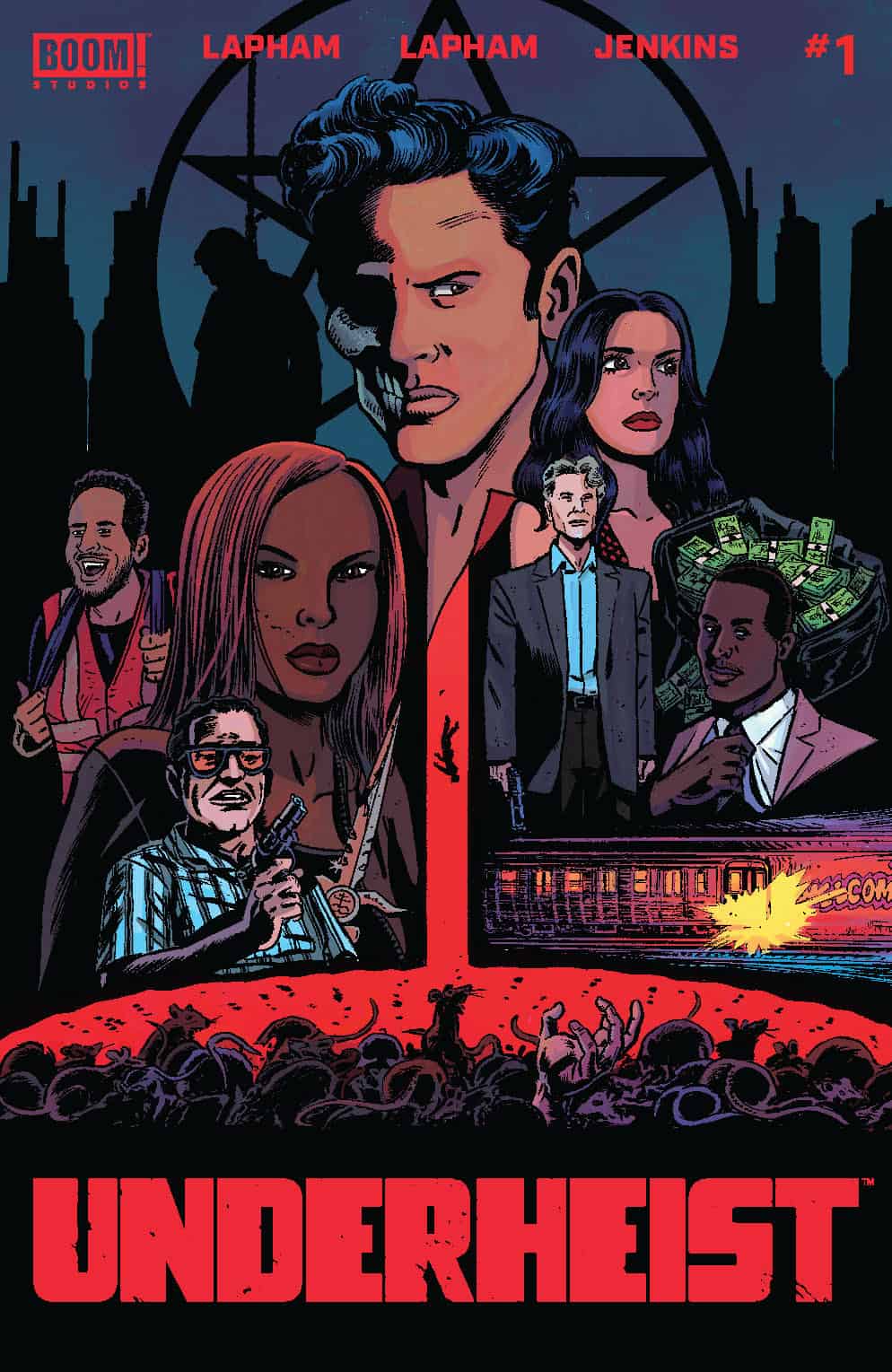
- Cover Art - 8/108/10