


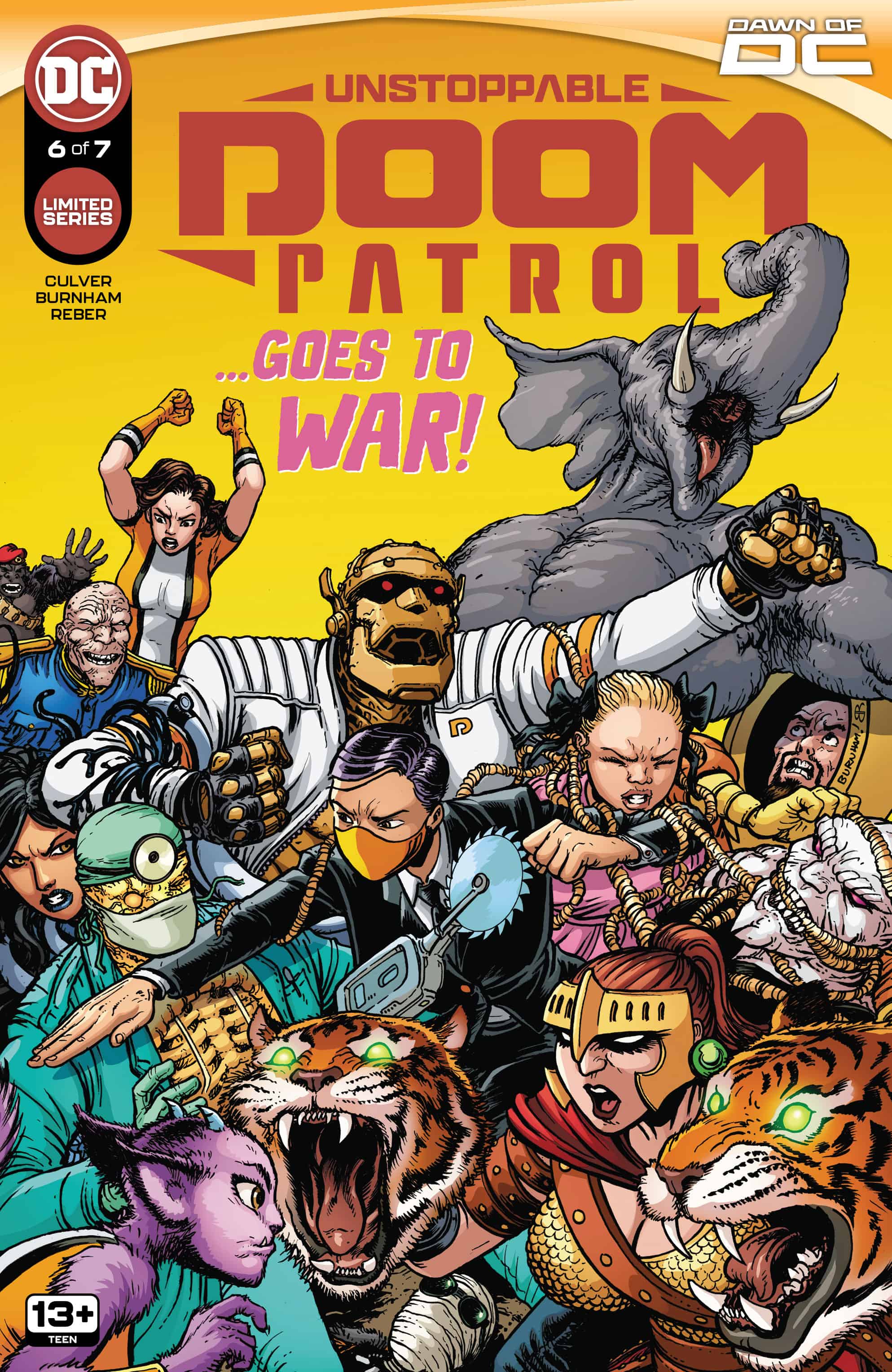
Unstoppable Doom Patrol #6

Recap
General Immortus launches his attack against the Doom Patrol right in the heart of their home base, the Shelter! Caught off guard, the team must stop the general’s army from killing all of the metahumans they’ve sworn to protect. Fortunately, they won’t have to do it alone, as the all-new Flex Force rises to help them! But is this the real threat or merely a diversion? Only Immortus knows for sure!
Review
Unstoppable Doom Patrol has been one of the highlights of the Dawn of DC. This multifaceted series has captured both the essence of the Doom Patrol, while also being a poignant discussion about discrimination. With the newest iteration of the team firmly established, things seemingly are running like business as usual… or as usual as the Doom Patrol can get. In Unstoppable Doom Patrol #6, the team gets to put their skills to the test in a game of capture the flag, but not before the Brotherhood of Evil portals in for an ambush. Meanwhile, mysterious machinations are afoot as General Immortus seemingly tries to resurrect one of the Doom Patrol’s long lost allies.

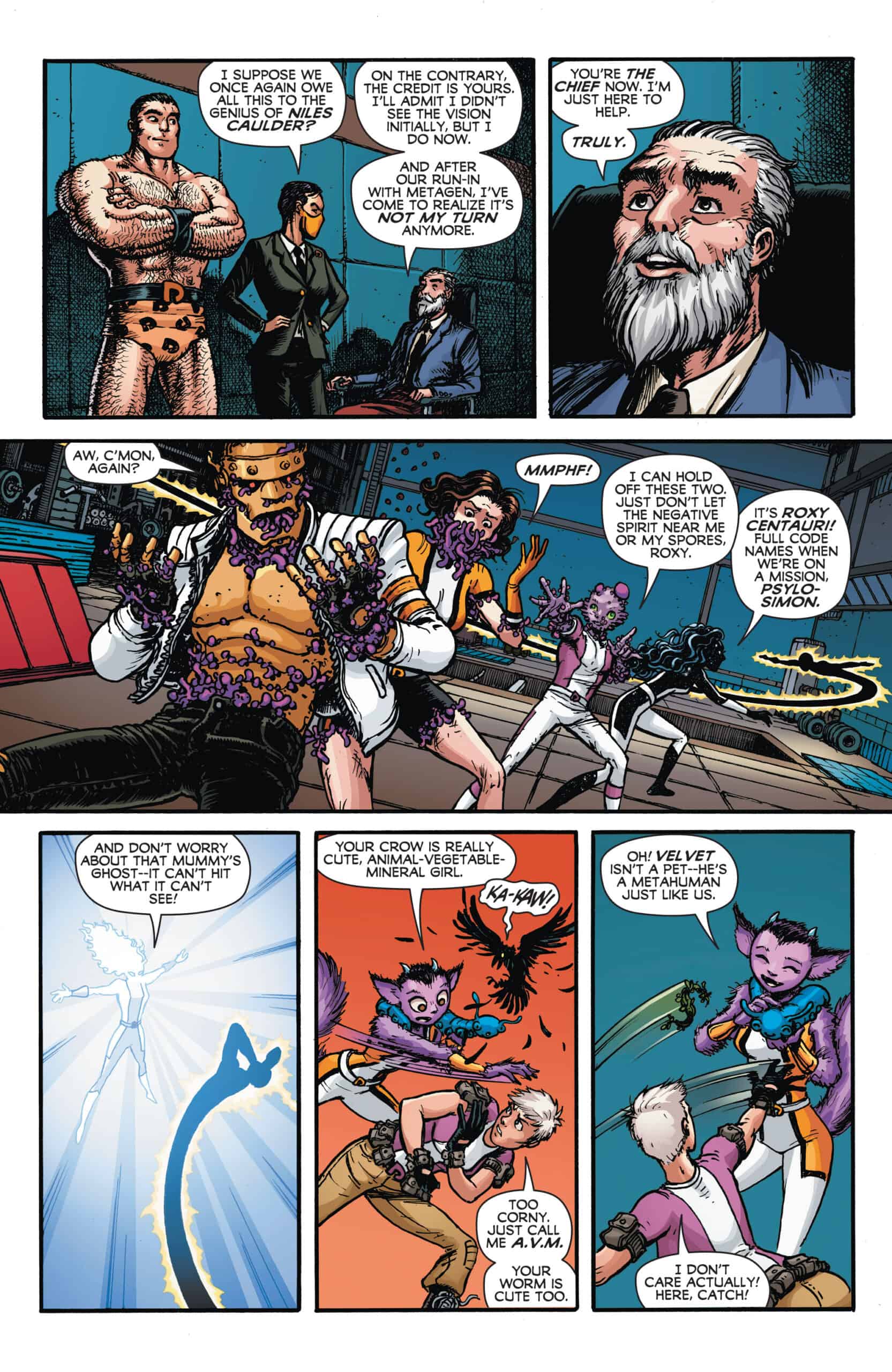
More so than the other issues in this series, Unstoppable Doom Patrol #6 feels the most like a classic comic book adventure. While it is well documented that the Doom Patrol may have been the inspiration for Marvel’s X-Men, most of those similarities stop after the first several issues of both series. Here, Dennis Culver crafts a script that feels like a direct reference to those original X-Men books. Not only does the issue revolve around a training exercise in the Doom Patrol’s headquarters, feeling very reminiscent to the X-Men danger room, but even the dialogue holds some special references. Characters will weave some exposition about their power sets and how they work into the conversations they have in almost a Stan Lee esque manner. This all works very well for the issue, displaying a fun homage back to those stories while poking fun at the history surrounding these franchises.
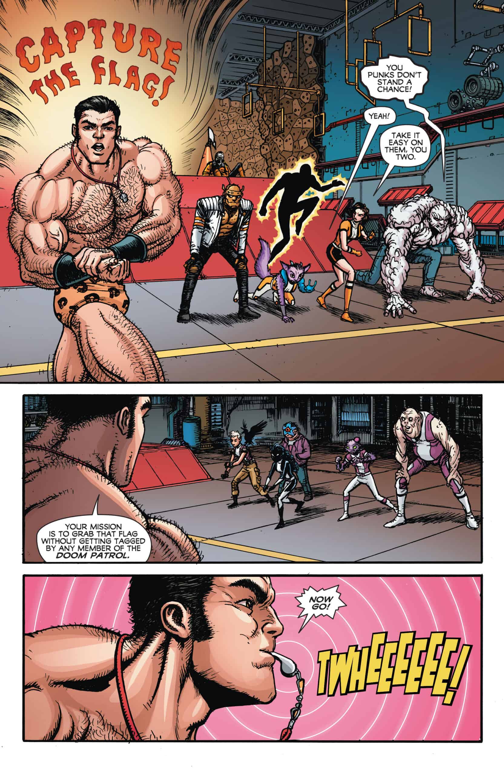
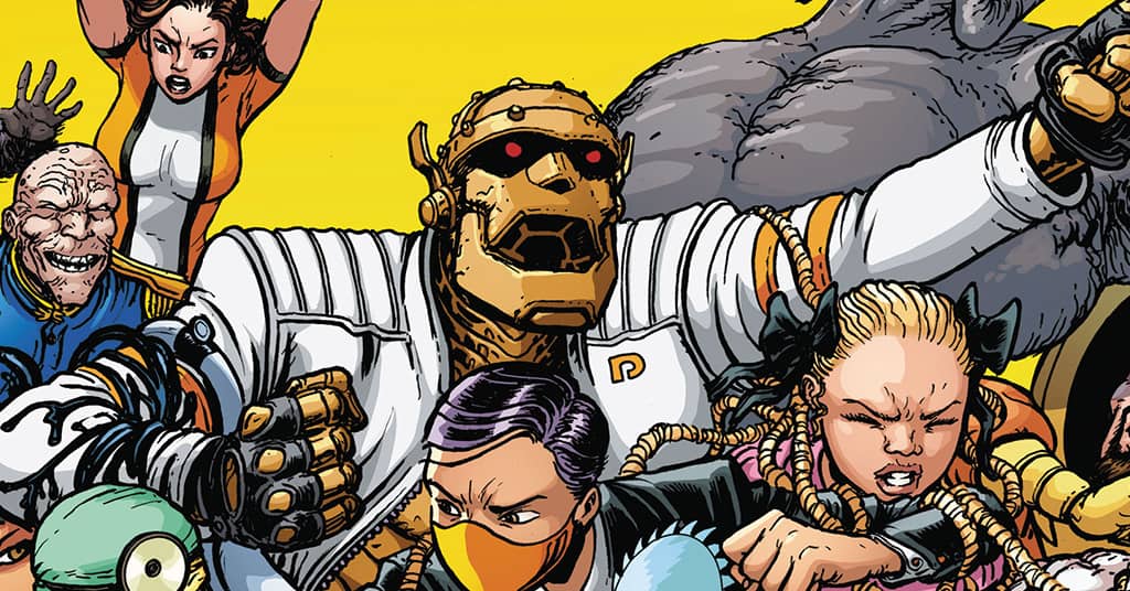
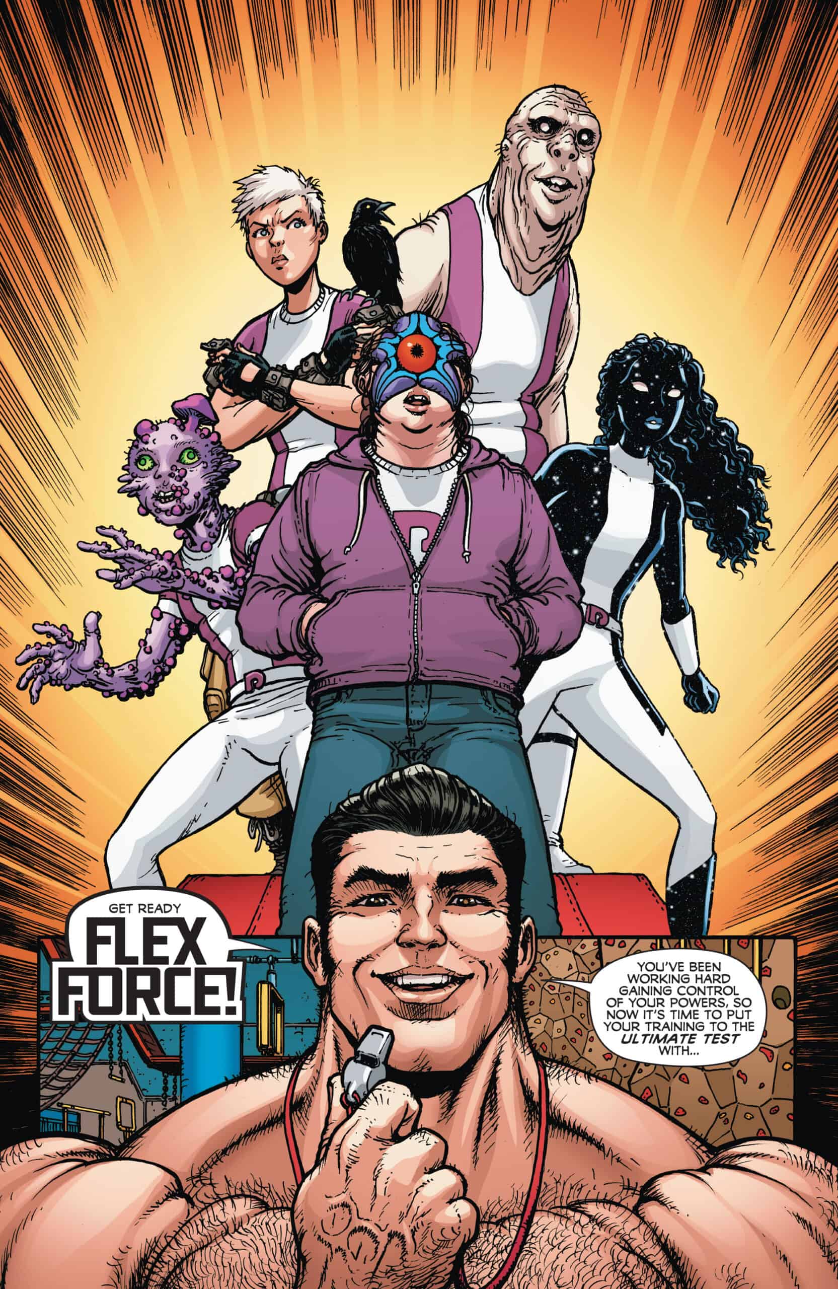
Chris Burnham gets to absolutely unleash his talents on this issue, which is made all the better by the amount of action on every page. Right off the bat, this issue starts at an 11, and Burnham is able to consistently keep up with this velocity, sometimes even ramping up the craziness that you would only see in a Doom Patrol book. Saying this issue contains “face melting action” may be a bit too on the nose, but Burnham pulls out a lot of deep cuts here that keep every page fun and exciting. There is a lot of attention paid to the newer members of the team, both from Burnham’s art and from Culver’s script, emphasizing the aspects of this series that are new and different. This maintains the aspects of the series that keep it fresh, while still paying homage to the familiar faces.
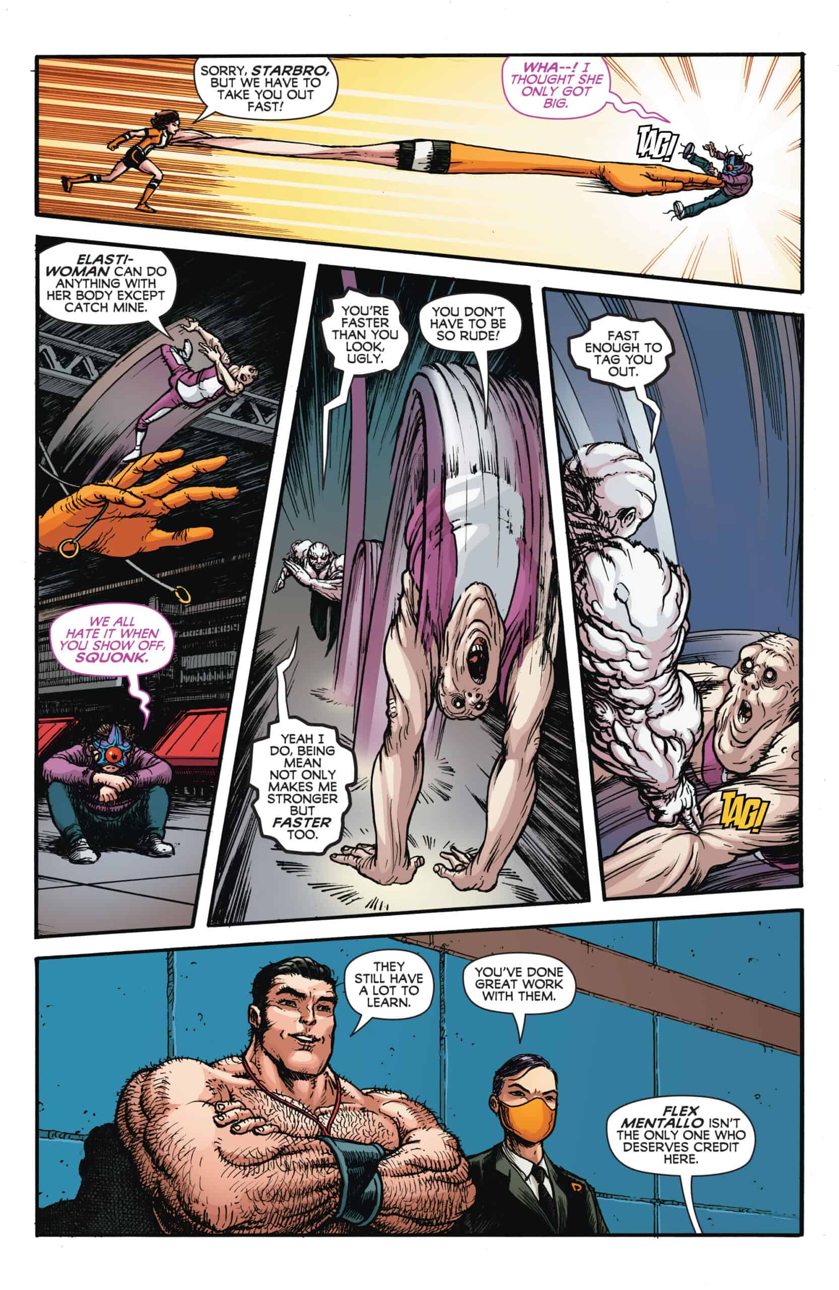
No one ever gives Brian Reber the credit that he is due when it comes to how important his colors are to the look and feel of this series. In Unstoppable Doom Patrol #6, Reber’s colors truly capture the whimsical fun as the team battles their equally powerful opponents. All of these characters get their own, unique look, with Reber using shadow to really enhance the pencils from Burnham. This excellent pairing between Burnham and Reber is on full display about half the way through the issue where half a page is dedicated to a beautiful panel where Robotman punches Elephant Man. Elephant Man’s trunk alone is filled with a lot of nuance and wrinkles from Burnham’s pencils, but it’s Reber’s colors that really make these characters pop off of the page. Reber uses a red background to contrast Elephant Man’s gray and Robotman’s gold-ish orange colors to draw the reader’s attention to all of the excellent detail. Then, the excellent details and shading help contour all the wrinkles and crevices to bring it all full circle. This is just one moment in the book, but it is very indicative of the level of expertise that Reber brings to the series.
Pat Brosseau continues his lettering duties in Unstoppable Doom Patrol #6, genuinely adding to the look and feel. While nothing is done in an extreme manner to make the lettering drastically different from what is done across the comic medium, there is a lot of hidden nuance here that adds to the overall makeup of the series. One aspect that likely flies over the head of readers is how Brosseau draws his word balloons. It’s a very small detail, but none of the balloons are perfectly round and uniform. These balloons seem to be designed perfectly to contain the words within, sometimes having some longer sides or corners depending on what Culver’s script dictates. This, paired with the very comic-booky art style from Burnham, really adds to the subconscious feel of the book.
Final Thoughts
Unstoppable Doom Patrol #6 is a fun homage back to classic X-Men books that were inversely inspired by the original Doom Patrol. The art continues to be the highlight of the series, with Burnham and Reber infusing so much life and nuance into this world.
Unstoppable Doom Patrol #6: To Me My X-Me… I Mean DOOM PATROL
- Writing - 9.5/109.5/10
- Storyline - 9.5/109.5/10
- Art - 9.5/109.5/10
- Color - 9.5/109.5/10
- Cover Art - 9.5/109.5/10