


VANISH #1

Recap
Oliver Harrison was a mythical hero who slayed the greatest threat to his realm before even hitting puberty. But that was then.
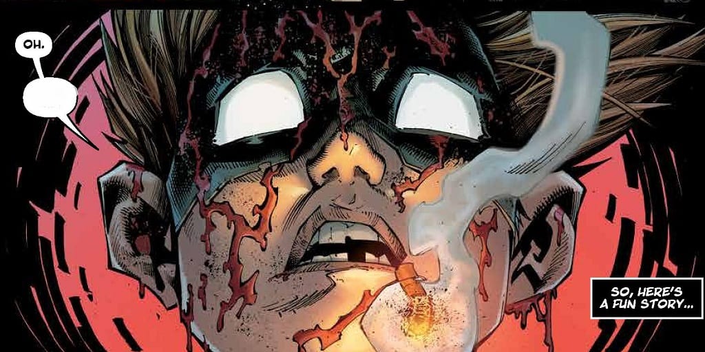
As an adult, Oliver leads an average cookie-cutter suburban life—aside from the fact that he's mentally unstable, massively paranoid, smokes like a chimney, and gets blackout drunk every night to hide from his horrific nightmares. Will the arrival of a superhero team called the Prestige to prove the madness isn’t all in Oliver’s head? And what about all the epic fantasy crap from his childhood?
Review
’90s levels of angst and violence… that’s what this comic is. And if that was all it was, quite honestly I wouldn’t have much use for it. Fortunately, co-creators Donny Cates and Ryan Stegman along with inker JP Mayer, colorist Sonia Oback and letterer/designer John J. Hill have managed to put a spin on this new creator-owned project that elevates the obvious 90’s Image style dark anti-hero idea to something intriguing through an intelligent script layout
and extremely high quality of art that is so reminiscent of early Image titles like Spawn, that it literally does transport you back to that era when reading it. Cates’s script takes the idea of an unseen magical world of magic users and fuses it cleverly with the traditional superhero genre.
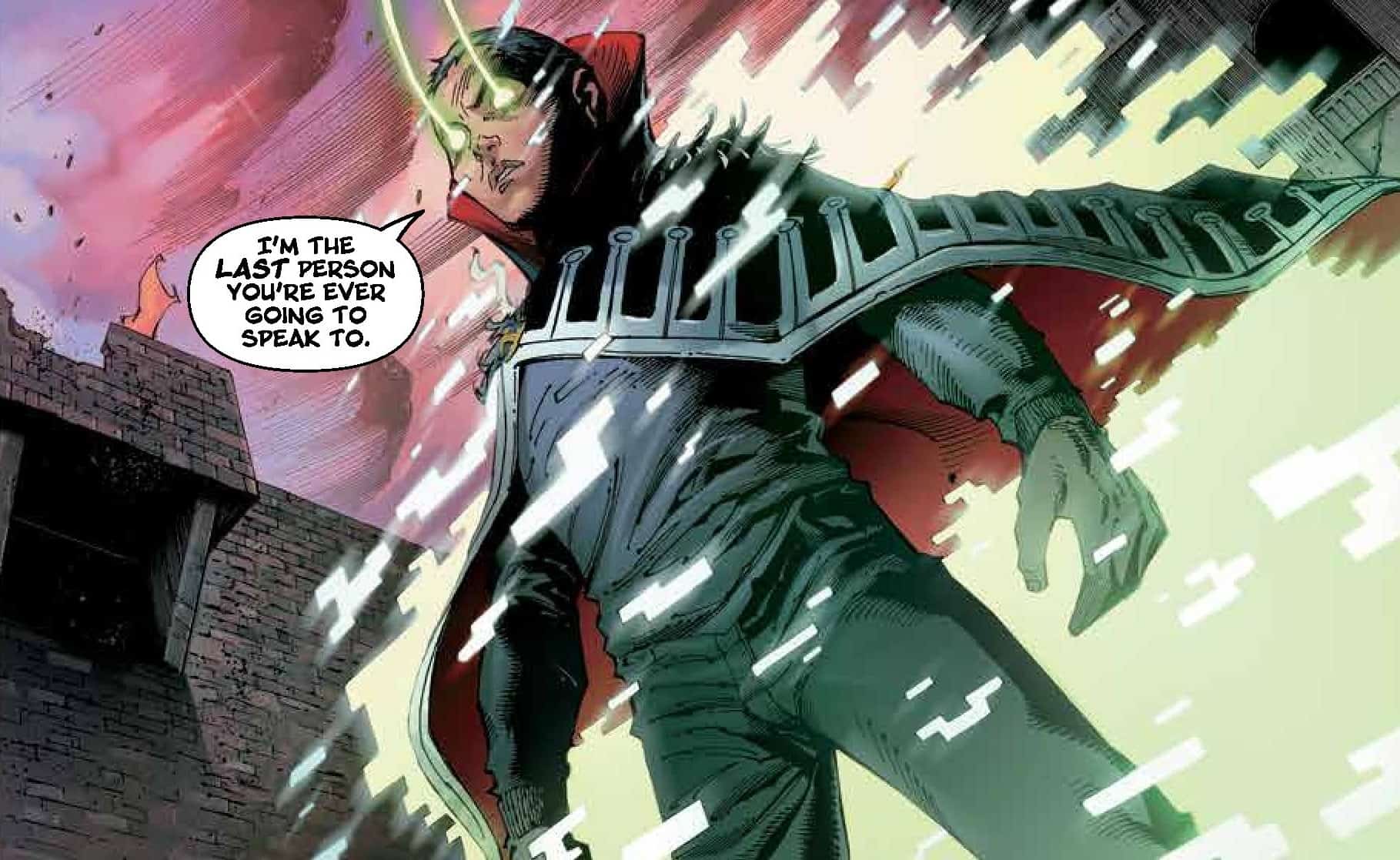

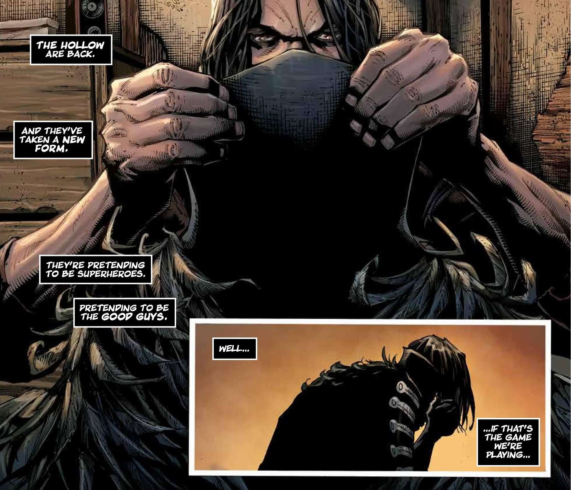
That’s the basic idea. The opener establishes our troubled central protagonist’s history (cue loss of parents etc) through a flashback, the trauma that shaped his life (including killing the main villain early on which doesn’t solve our protagonist’s problem), and then returning us to the point we join him in the present as he and a “superhero” who just saved him from a beating go toe to toe and the connection to the magical world of his past is revealed through violence. The clever part is how Cates and co flip the established idea on its head. The hero is the villain and the villain is the hero. The idea that superheroes are magic users hidden beneath “glamours” opens up all sorts of interesting possibilities as our anti-hero
dons his old magic school uniform and in true nineties style stands on the rooftops in darkness and vows to bring these superheroes (really magic users of the villainous fraternity called The Hollow that disappeared after Oliver our main hero killed Baron Vanish) and so the stage is set.
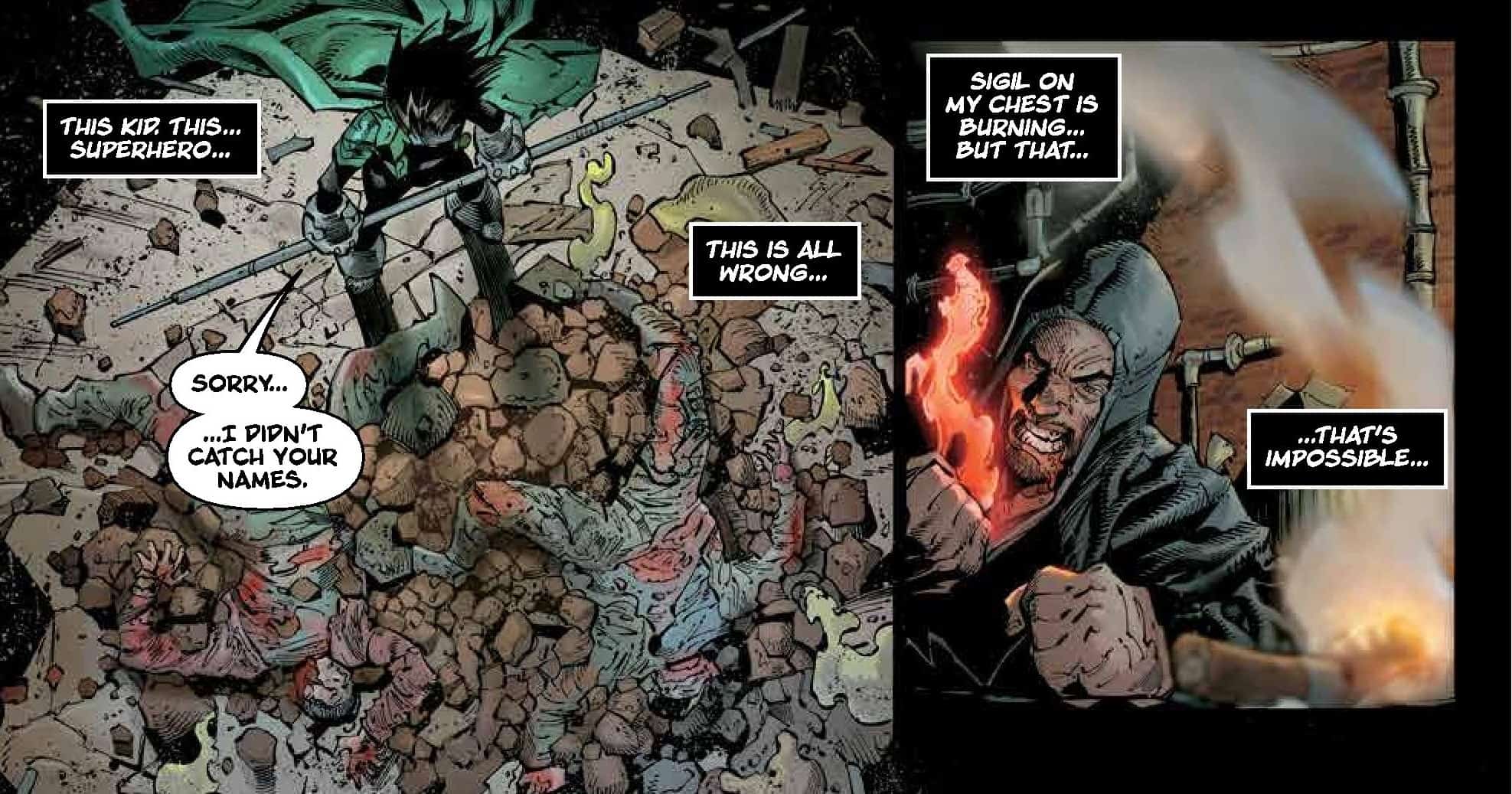

Stegman is an excellent artist, let’s be clear. He can do it all and he shows that off this issue. We have back alley real-world grittiness alongside massive scale, highly detailed splashes of magical worlds, schools, and hidden rooms filled with dark arcana, as well as highly detailed shots of characters’ faces and plenty of blood and dynamic violence. It truly feels like Stegman’s pencils are channeling 90’s books like SPAWN or Shadowhawk while Inker Jp
Mayer and colorist Sonia Oback further this idea with an inking style and a color palette that could have stepped straight out of the aforementioned titles. Letterer John J Hill supplies the lettering which is a white-on-black affair adding to the gritty atmosphere. It’s dark violent fun with the art being of such an exceptional standard that while comparisons to older 90s comics are inevitable, it doesn’t take away from the story but rather helps immerse you deeper in what the entire creative team is trying to do and very successfully pulls it off here.

If it has the appeal to do it for any stretch of time and X amount of issues to come remains to be seen but this opening salvo is certainly a strong enough start that I think has the potential to tap into a demographic that still remembers those 90s comics and will gravitate to those similarities. For me, it’s the magic-user / superhero dynamic that holds the most appeal and how that is explored is reason enough alone to check out the next chapter.
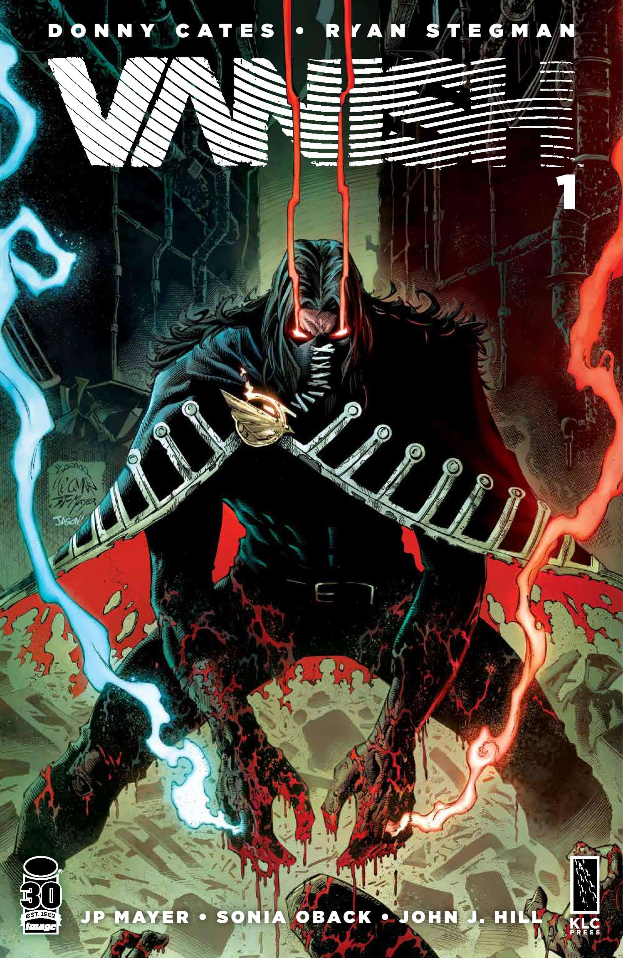
In terms of the production, it’s worth mentioning that while the issue is 44 pages cover to cover, actual comic pages number 30 with the rest of the issue is dedicated to a slew of advertising for everything from The Hero Initiative to Cates and Stegman’s KLC press machine to the next issue. Those thirty pages and the ’90s outrageous blood-spattered cover gets you where the creative team wants to take you and does it in a clear and slick style that speaks to a creative team that knows exactly what they going for and is inviting you along for the wild ride.
Final Thoughts
VANISH #1 is a slick callback to 90s grittiness that checks all the boxes from exceptional art to a cleverly thought out and concise script that paints a clear picture of where the creative team are headed as they take you on a dark violent journey into a world where Magic and the idea of costumed heroes merge violently. Fans of early Image titles like the original Spawn series, andThe Darkness will no doubt feel a sense of nostalgia while newer fans who missed that era will get to experience it through this opening chapter.
VANISH #1: Beneath The Glamour…
- Writing - 8.5/108.5/10
- Storyline - 8.5/108.5/10
- Art - 9.5/109.5/10
- Color - 9/109/10
- Cover Art - 9.5/109.5/10