


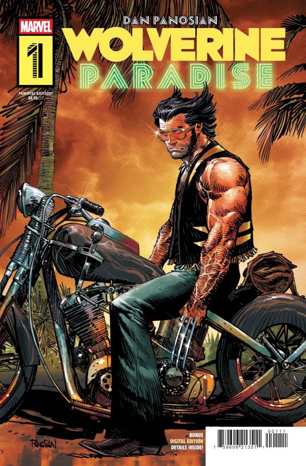
Wolverine Paradise #1

Recap
Dan Panosian finally writes his own Wolverine miniseries. Set many years in the past, Wolverine ventures to Miami, Florida, where he encounters Dazzler in an underworld conspiracy.
Review
Dan Panosian first joined the Wolverine comic series in October of 1992 with Wolverine #64, where he inked the artwork by Mark Pacella. More recently, the artist began drawing the main covers of the concurrent Wolverine series by Saladin Ahmed, beginning with issue #14.
Now, Panosian has finally been given the reins to author and illustrate his own Wolverine comic. And it is incredible.
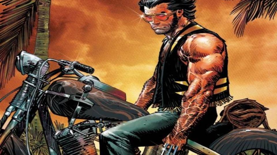
Panosian’s writing style emulates that of both Larry Hama and Chris Claremont, two titans of the Wolverine mythos. Panosian’s Wolverine has that “bad-boy” element that the 1990s Wolverine had. He wears a black leather vest, black leather cowboy boots, and black denim jeans. Logan has the passive-aggressive, confrontational voice that Hama’s Wolverine had. However, Logan still has the more reserved approach toward conflict that Claremont’s Wolverine had; he never starts a fight but always finishes one. Unlike the rude yet kind modern version of the character, this Logan is a bit of a jerk. He’s dismissive, womanizing, and arrogant. The voice that Panosian gives to Wolverine echoes the era in which the artist began working with the character. Logan employs these corny metaphors and one-liners that resemble lines from a Terminator or Die Hard sequel, the perfect amount of cheesiness for how badass the character is.
Furthermore, the plot of this comic possesses that classic 1990s Wolverine vibe: mystery and mayhem. The titular mutant isn’t fighting to save the world; rather, he’s off on his own adventure and cannot keep his head out of trouble. Dazzler makes for a welcome addition to the story, although she is underutilized in this first issue. Ending on a classic Marvel cliffhanger, Panosian sets up an underworld adventure for Logan that would make any fan of the character excited for the next issue.
Of course, the best part about any author-artist story is the artwork itself. Panosian is able to incorporate the art into the story in a way that a writer-and-artist duo simply cannot. Each character has a distinctive artistic style. Panosian’s rendition of Wolverine pulls from the work of John Byrne and John Buscema: the exaggerated and messy hair, the rugged attractiveness, and the balanced stature all harken back to the aforementioned artists. Dazzler is elegant and flashy; compared to the dark panels, Dazzler’s silver and gold radiate off the page and capture the reader’s eye. The villain’s red and maroon color scheme pairs well with the muted greens and gray smoke of Panosian’s interpretation of Miami’s underworld. However, Panosian does not employ much creative panel work, which gives the fight scenes a very “newspaper comic strip” aesthetic. Despite this stagnation in combat, the lack of dynamic panel motion is offset by the exaggerated use of onomatopoeia: a scene of a Tommy gun firing fills the entire panel with “BRAKA-BRAKA-BRAKA,” reengaging the reader.
Final Thoughts
Dan Panosian crafts a Wolverine story that echoes the era when the creator first entered the Marvel comic space: a comic that feels ripped out of the 1990s in the best way possible.
Wolverine: Paradise #1: A Love Letter to the '90s
- Writing - 9/109/10
- Storyline - 8/108/10
- Art - 8/108/10
- Color - 8.5/108.5/10
- Cover Art - 8/108/10