


Ever express a liking for an artist, and have someone just start to trash them? Of course you have. Sometimes we trash an artist because everyone does, hedge our compliments because we fear no one else really likes the art.
Patricia Highsmash
There Is No Better Artist
by Travis Hedge Coke
In the past four weeks, have seen – all online – a man want to punch Brian Bolland, jealous that other people were citing him as a reasonable person to cite regarding The Killing Joke, a man criticize Bolland for being lazy and actually recreating pretty faithfully, covers that DC Comics was paying him to faithfully recreate, and someone suggest that Brian Bolland is, “not a real artist,” because he uses more tools to make art than a sharpened pencil.
I may take another person’s opinion on the quality of an artist, or of artwork – I will give more weight to an educated or experienced opinion – but, it took me a long time to understand that I do not need to take anyone’s. And, neither do you.
Both you and I, though, should be able to gauge someone else’s opinion, and their criteria that lead to that opinion.

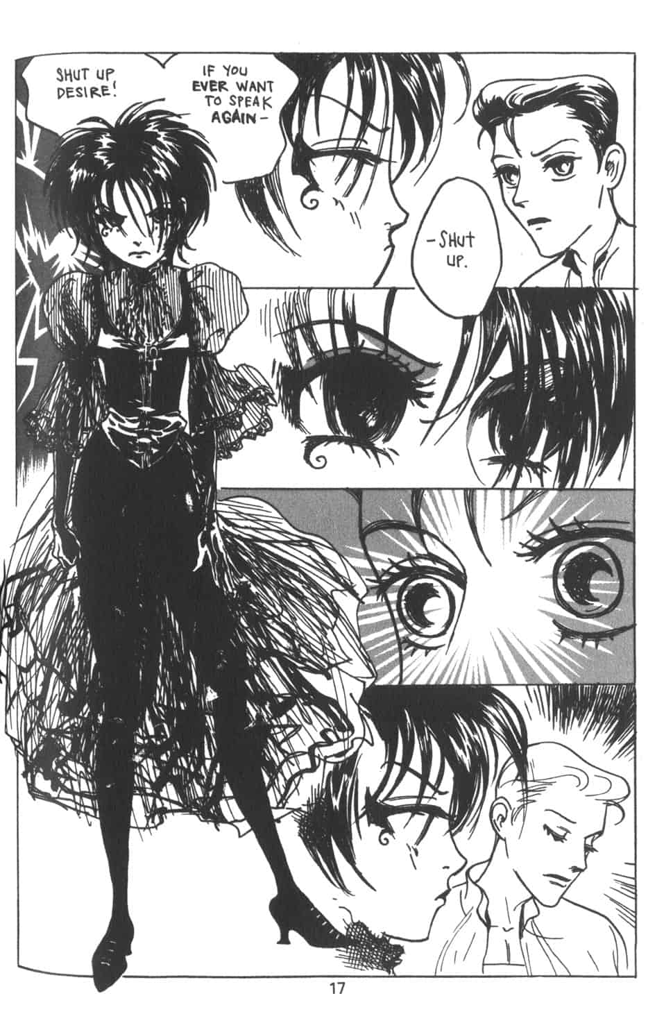
Detail from a Heroes in Crisis cover. Starfire is 6’4″, Dick Grayson, 5’10”.
I think the pencil art on Heroes in Crisis fails to complement the apparent tone of several scenes, and uses storytelling and evocation cheats that weaken the effects of the comic the more you look at them. Tall characters are drawn shorter so that they can rest their heads on the shoulders of men who are canonically shorter than them. Scenes of tragedy, stress, and vulnerability are loaded with an almost cartoonish dose of parodic male gaze.
I find the work of Marjane Satrapi stronger, more considered, and just plainly to be superior art. Simultaneously, I know that many comics readers would disagree with my assessments, especially of who is the better artist.

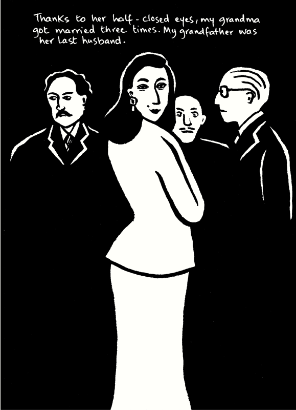
Embroideries, Marjane Satrapi.
I want to say that the primary difference is that I am never conflicted about the intent in Satrapi’s pages, the way the HiC art seems at conflict with the script and story. That is not it. It is not conflict, but cross purposes. Some conflict, even extreme conflict, can be very helpful in artwork. An erotic eye in a grotesque scene can create a frisson that enlivens the whole. A blasé framing of a violent or deranged scene can heighten the sense of abnormality or incorrectness. But, if the art seems at cross purposes, the sense that someone has failed to communicate overtakes the sense that the scene is true or of consequence as a scene.

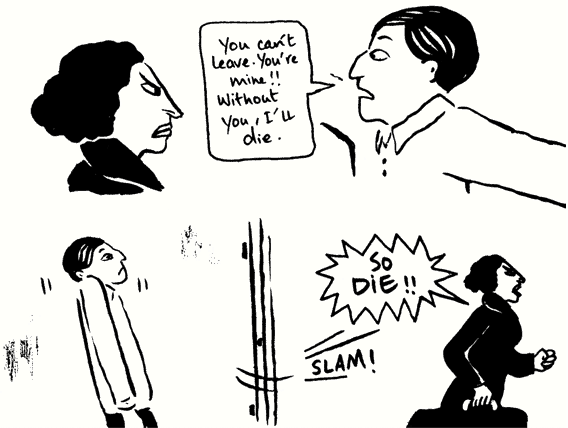
Embroideries, Marjane Satrapi.
Satrapi excites me, and warms me, with her expressive lines and genuine faces and bodies. I am never distracted by “cross purposes,” or by details that add nothing of apparent complementary value, as can sometimes happen or me with the otherwise fabulous Alex Ross or the beloved by many artist of X-Men: Grand Design.
My inclination is to praise Satrapi for having no wasted lines, but “no wasted lines,” is not about actual waste, only, really, preference and expectation. When Ross paints an Electric Light Orchestra allusion into a page about Green Lantern, or places the Tenchi Muyo! logo as graffiti on a city wall, the element may not seem to enhance any other aspect of the page or narrative, but rather stand out as incongruous, but they are incongruous for those for whom they are incongruous.
My own personal preferences value shape and arrangement, and rather direct communication in artwork. Plenty of times, I prefer layouts or thumbnails over even the detailed pencils to be inked and colored, or the color guides or flats. This is going to be good, for me, because my eyesight is steadily degrading, and there will come a time where fine hatching and personality lines of the Jim Lee variety will be unseeable for me, anyway. That kind of detail has never reached inside me, the way that, to stick with Lee and to open it back out to Ross and Satrapi, a beautiful arrangement of figures and objects on a page will.
It is my love of mise en scene that gives me thrills reading Rob Liefeld art, Satrapi comics, Brian Bolland pages. I am, too, more intrigued by the placement of figures than I am by figure work. I like the space bodies take up, and how they occupy the space, much much more than I am at all concerned with whether or not the perspective or biological likelihoods are too carefully observed. I am not asking that a comics artist present us schematics to build a body that could reasonably live and movie, but I do want artists to be conscious of the effects of their art and the choices in making that art as they make it.

The 1973 Vaughn Bod?, Schizophrenia/Bod? “2-for-1 comix book,” comprises two stories, each in a distinct style, each a different mode to communicate if not the same idea, very similar expressions. The two comics are both powerful, funny, endearing, sometimes scary and pugnacious, but what gives the total package its heftiest blow, is that rather than one after the other, the comics are printed on the same pages, one at a 90 degree angle from the other. You see, and somewhat read, despite yourself even, both comics, no matter which you are intent on really reading.
See, though? That’s not the comic. This is not objective. This is me.

Schizophrenia/Bod?, Vaughn Bod?.
I love that both comics are partially readable simultaneously. That you are reading Bod? speak to us directly but also partly reading Cheech Wizard forcing himself his right to his position as The Wizard. I love that the Cheech story is more cartoonish and absurd, but also more grounded on earth, while Bod? is placed in space and motivated to stand up and talk to us by a passing meteorite. I love that it is an interesting arrangement that spurs comparisons and confluence.
I find Brian Michael Bendis’ visual art to be some of his finest work in comics. I could look at pages of AKA Goldfish for ages. Joe Quesada or someone wants to say that Bendis is a terrible artist and a better writer? Quesada can prove his case as it works for him, and probably for large audiences. It does not change what the art gives to, and does for me. It might even be that it is art that feels like it was a serious task.

AKA Goldfish, Brian Michael Bendis.

AKA Goldfish, Brian Michael Bendis.
Another, more ornate artist, very proudly has declared on his YouTube channel that he half-assed some pages on a comic that otherwise took about two years to draw, and I assume the audience he is courting are happy with that. He gamed DC into a lengthy prep time and pay for some pages that took hours and some that took a lot less, but even he admits they look like they took a lot less. The lack of effort is apparent enough it sticks out to me and catches my skin.
I don’t want to read a comic to get splinters.

At Death’s Door, Jill Thompson.
Some comics critics I have loved, have badmouthed Jill Thompson, especially her manga-influenced and her Lil Endless Sandman work. “Incompetent” was applied to At Death’s Door, and have you seen At Death’s Door?!? It is amazing.
Which, again, means that they dislike the work and I love it. But, it means more. To dislike a comic, is to dislike it. To call an artist or comic, “incompetent,” or, “insipid,” is something else. Incompetent implies a lack of awareness and a lack of control, and those are less subjective. We can pretty much demonstrate, point by point, that Thompson accomplished what she set out to, with At Death’s Door and Dead Boy Detectives, but do points beyond that count?

At Death’s Door, Jill Thompson.
I think Duy Tano makes a great case, in Western vs Japanese Comics, for his personal dislike for At Death’s Door, which is in part a retelling of an earlier-published Sandman arc. Focusing on a lack subtlety or complexity of emotions, in bodies and faces, that the original telling exhibits, Tano avoids painting his personal response as an objective indictment. At Death’s Door is intentionally much more broadly cartooned and more than a bit slapstick. As much as I love the comic, I am not going to argue that it lacked the things Tano wants in the comic, that he misses or anticipates. His statement, “The lack of subtlety and nuance in the way they draw faces is what REALLY turns me off,” is not something you can argue. And, as a retelling, that is something that Thompson had to factor into her comic.
No artist is required to grow along the lines and path you expect of them, or desire. Whether a radical departure, as different styles Thompson has chosen to work in, or the progression towards more intricacy and tighter lines evinced in Liam Sharp’s oeuvre.
If your argument against Frank Miller’s latter work being competent, is that you feel his lines and forms do not communicate the concepts he wishes them to, or that the content of his comics works contrary to his goals, you could potentially make a solid case that is not entirely rooted in personal taste. If the stylized nature of his figures bug you, it is reasonable and acceptable, even helpful to say that they bug you. To declare his latter work, or any work, incompetent, you have a burden of proof that, “it bugs me,” does not.
We become afraid, as professional or armchairs critics, to say something feels a certain way, seems a certain way. “It strikes me as,” or, “I come away feeling,” carry a stigma of uncertainty. Worse, they can make us feel or come off as ignorant. Worse than ignorant, as subjective and emotional.
You are subjective and emotional.
Own it.
There is no necessity in proving one artist is better, overall or in one instance, than another or all others. There is no requirement on you, to enjoy anyone’s art, ever. But, if you are insulting an artist or their work, the onus is on you to present and defend your position. I want to make a comparison to being served a sandwich or a steak and telling the cook and the server it’s shit and they are crap, because there were two too many capers or your BLT had tomato on in it, but some of you do that.
If Alex Ross embedding a shoutout to ELO in a comic is the extra two capers, how much of the flavor and texture really changed? And, what worth is there, in the people who enjoyed it more because of the capers, compared to your dietary standards?
If you buy Embroideries and read the first forty pages expecting it to turn into an Ivan Reis comic, or I am ten pages into a twenty-two page superhero issue penciled by Reis, expecting it to start looking and playing like Marjane Satrapi’s work, it is not the artist’s fault, nor is it a failing of the artist.

Embroideries, Marjane Satrapi.
If characters in a scene think they are in the middle of something sexy, but the art seems scary or threatening, it is worth asking if the scene is meant to be scary. We should question why we veer in one direction and not another, when critiquing particular artists or one collaborator out of several. Why do we ask if Frank Miller is being homophobic, with The Dark Knight Returns, but not Klaus Janson (even if we do not know that Janson is gay)? And, if the artist flat out says, outside the comic, that scene was meant to be scary, we ought to take their word for it, and adjust our response to the scene accordingly. We must adjust our appraisal of their competence and execution accordingly.