Event Horizon Dark Descent #1
Theron Couch
Recap
An all-new cosmic horror story set in the universe of the terrifying cult-classic film! The Event Horizon was a revolutionary spaceship designed for one mission: faster-than-light travel with a top secret and experimental gravity drive. But upon activating the device, the ship journeyed across the borders of Hell itself. In a nightmarish realm of torments beyond imagining, Captain Kilpack and the first crew of the Event Horizon must resist all manner of demonic forces including Paimon, the eyeless King of Hell, and their own descents into madness and bloodlust, if they've any chance of escaping back to their own world. Abandon all hope and board the Event Horizon with multiple Eisner Award-winner Christian Ward and powerhouse sci-fi artist Tristan Jones, in this unbelievable story of the true and final fate of the original Event Horizon crew. This original five-issue miniseries serves as an official prequel to the film!
Review
Getting to know the characters plays a significant, if abbreviated, part of Event Horizon: Dark Descent #1. The most important character in this issue is Doctor Weir, the man constructing the Event Horizon’s engine. Many of his appearances are already accompanied by horror imagery. And given that Weir is helping to build the Event Horizon, this imagery portends danger for the ship and everyone on it.
Event Horizon: Dark Descent #1 is a very accessible comic. Readers familiar with the Event Horizon movie know what the titular ship’s ultimate fate is. However, new readers will find this an easy to digest first issue with a slow burn toward what already promises to be a rich science fiction horror story.
Spoilers for the movie follow in the next two paragraphs.
Carolyn Weir’s death is a strong starting point for Event Horizon: Dark Descent #1. The movie’s final act revolves around Doctor Weir’s corruption, made possible as the ship taps into the love he had for his wife and his guilt for not being there for her when she was ill and how it led to her suicide. The result is that this series, regardless of how it unfolds, already sets itself up as coming full circle with Weir’s emotional state as the catalyst and climax.
The characters’ introduction, revealing their secrets to the reader before they reveal them to each other, strikes an ominous note and serves as a good callback to the movie. In the movie, Miller, after seeing (or thinking he saw) a crewman he left to burn alive during an evacuation, remarks that the ship knows their secrets and knows their fears. Will the ship do the same thing to these characters?
Art in Event Horizon: Dark Descent #1 might best be described as “rugged.” Jones gets there via an excess of thin, oftentimes relatively short lines that add dimension to everything. An example is characters’ clothing. Thanks to an almost excessive use of this linework implying wrinkles and folds, it seems to actually sit upon the characters the way real clothing does on people.
This style can sometimes be a detriment to backgrounds and settings overall, though. In many cases Jones’s work does add a welcome lived-in feel; however, the same style makes the interior of the brand new Event Horizon look old and used.
Ultimately it’s the characters that benefit the most from Jones’s art choices. In the most basic sense, Jones’s linework communicates relative age. But it’s also easy to interpret the excess lines on older characters as them being worn down by experience or stress. From both of those points of view, though, Weir looks strangely unaffected by his wife’s death
Martin uses a somewhat limited color palette, leaning heavily on blue and gray. The coloring is also muted overall, at times seeming almost drained from the pages. The choices do connect with Event Horizon itself which is a bleak, cold, and almost industrial age looking spaceship.
Most successful, though, is how this generally limited and muted palette creates contrasts with the deep and dark reds present in all of the more horror oriented imagery. Certainly there are elements of body horror present, but what drives the horror in this particular issue is the insistent red and the color’s overall association with hell.
Ray uses a dark silver/gray for the caption boxes containing Weir’s internal monologue. Despite it being a darker color, these boxes actually stand out against the muted coloring Martin uses. That said, the color doesn’t contrast with Martin’s general palette. It’s a nice balance of form and function.
Final Thoughts
Event Horizon: Dark Descent is obviously a prequel series to the cult sci-fi horror movie. And yet Event Horizon: Dark Descent #1 is surprisingly accessible. No knowledge of the movie is required to get into the story, but certainly readers familiar with the movie will find the issue more rewarding, of course. Either way, fans of sci-fi horror series should absolutely pick this up.
Event Horizon Dark Descent #1: Dark Origins
- Writing - 8.5/108.5/10
- Storyline - 7.5/107.5/10
- Art - 8/108/10
- Color - 7.5/107.5/10
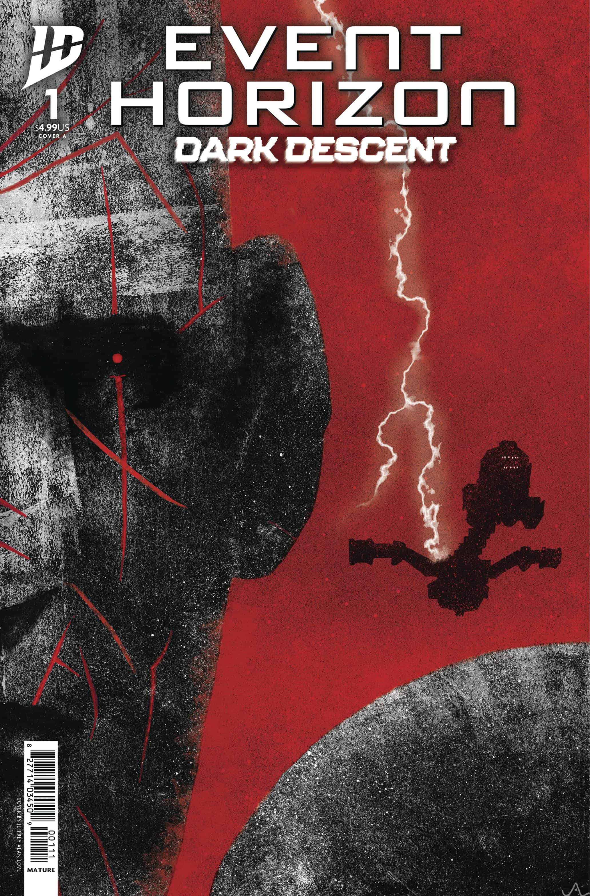
- Cover Art - 6.5/106.5/10